
We used our service blueprint - Lucidspark and future service map - Lucidspark to consider what a good academy transfers application service could look like.
Service blueprint

Future service map

We looked at other applications services to give us some design ideas, including Apply to become an academy and Tax your vehicle - GOV.UK.
We also looked at the Prepare conversions and transfers (Prepare) casework management system, where DfE delivery officers (DOs) currently create transfer projects by answering a series of questions.
What is the outgoing trust name - Prepare conversions and transfers

We used these to design an application form prototype, consisting of a:
- start page, with an explanation of what the service is for and a link to guidance about the transfers process
- your applications 'dashboard', where applicants can create transfer applications and see their progress
- linear journey, split into 2 stages - select academies and the incoming trust
- check your answers page, showing the questions and answers from the 'select academies' and 'incoming trust' pages
- confirmation page, including an application reference number and assurance that the user has received a confirmation email
Start page

Dashboard

Linear journey (just the select academies pages)
A selected academies page, with an inset text stating that no academies have been selected.

A text input page with the title 'Which academy do you want to add to this transfer application?'. It has some hint text advising users what they can search by.

A page called 'Select the academy from the search results'. It has a list of radio buttons. Each button has an academy name, and a URN number as hint text.

A yes / no radio button question, with the title 'Is this the correct academy?'. It has inset text before the radio buttons, with an academy name and URN.

The 'selected academies' page. It has a table with one row and 3 columns. The first column says 'Academy 1', the second has an academy name and URN, and the third column has a 'Remove' link.

Check your answers page

Confirmation page

User research
We did usability testing of this journey with external applicants and DfE delivery officers.
The main insights we gained were:
- whilst the start page was clear and easy to read, most users missed the link to the guidance. They also weren't sure if they should use this service or Apply to become an academy
- users liked being able to track the progress of their application on the dashboard
- they found the linear journey clear and straightforward, but users felt it was "too easy" and needed "a bigger application form". Applicants also need to share the application form with others for input
- they felt re-assured by the confirmation page, particularly by the reference number and email receipt of their application
Iterations
We added more guidance on the start page, including 'what this service is for / not for' headings.
This was to:
- reassure users wanting to transfer an academy that they have come to the right service
- signpost users to Apply to become an academy who want to convert a 'maintained' school into an academy

We also created this design hypothesis about the linear journey:
If we add more questions to the journey, we'll put too much cognitive load on users and make it difficult for them to share the form with others for input.
To test this hypothesis, we used as-is Word document for transfer applications to add more questions to our prototype. After adding 3 more questions about finance, the journey was starting to feel too long.
 A text area with the title "How will the trust be financed and how do you intend to finance the growth of the trust over the next 3 years (if applicable)?".
 A text area with the title "What will be your approach to managing schools you are intending to take on which currently have deficits (if applicable)?".
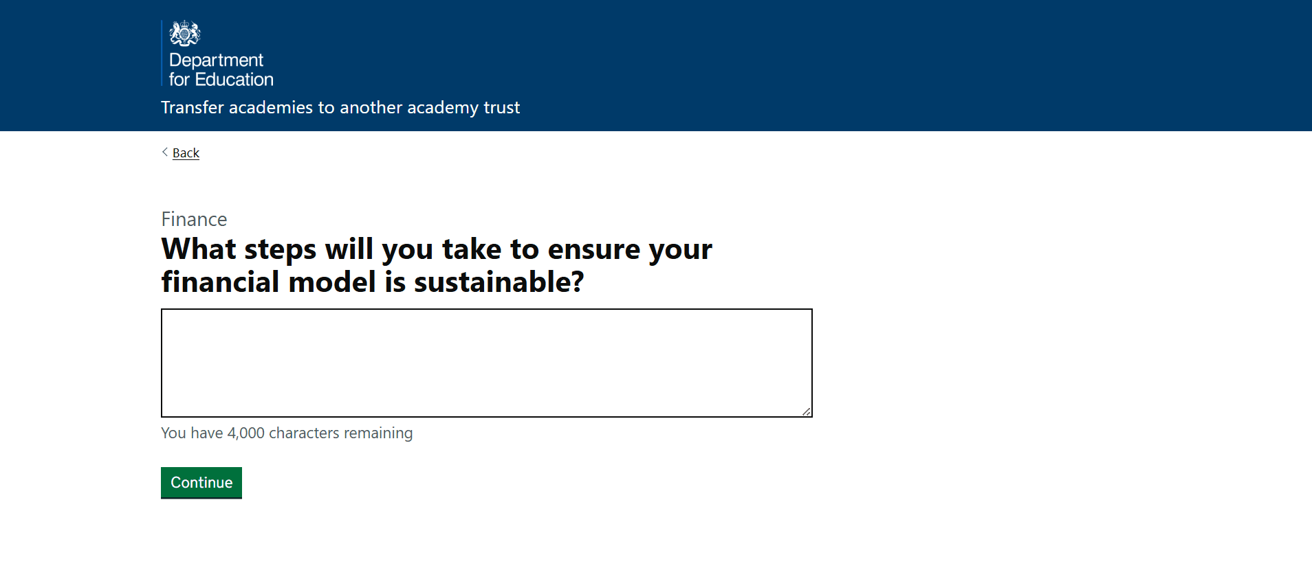
 A text area with the title "What steps will you take to ensure your financial model is sustainable?".
We decided to group questions into a task list – GOV.UK Design System. This would also allow users to leave the 'answering questions' journey and access their incomplete application from the dashboard.

When doing usability testing, we included the same application questions from the first round of research, as well as the 3 finance questions we added.
Here's what we learnt from the second round of research.
The:
- iterated 'start' page helped users to engage with the guidance, but they need more re-assurance that they are completing the right application form
- task list helped users to "know what needs doing" and felt "very familiar". However, some felt it wasn't clear who needed to complete which section. For example, the academy transferring or the trust they are joining.
Although we've only had 2 rounds of user research, we are confident that a task list-style application will help solve the problem we identified in discovery and meet our core users' needs.
Things to design and test in user research
- how to reassure users that they have come to the right applications service
- a way of telling users who should complete which parts of the task list
- more questions and task list sections
- an 'invite a contributor' design, using design ideas from other applications services