Background
We needed to design a way for users to complete the support task when a teacher reference number (TRN) request matches an existing record with one or more of the following:
- qualified teacher learning and skills (QTLS) status
- early years teacher status (EYTS)
- an alert
In these cases, the user must complete checks outside the service before progressing the request.
These checks might include:
- contacting a funding team to confirm whether the person is eligible for a TRN (for example, if they already hold QTS)
- notifying a team that the person has an alert that may prohibit them from teaching
We needed to show users when this scenario occurs and what steps they need to take to complete the task.
First iteration
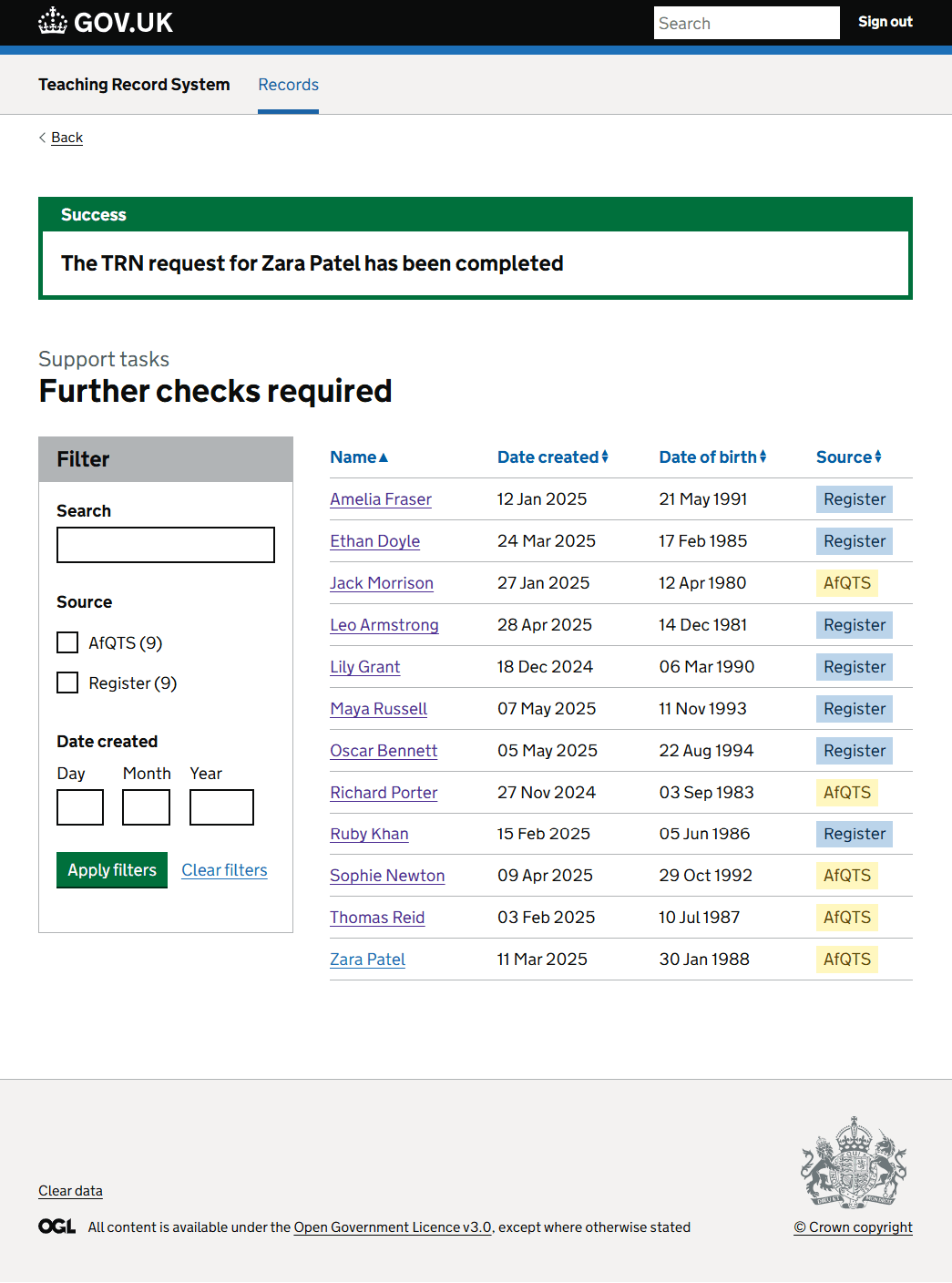
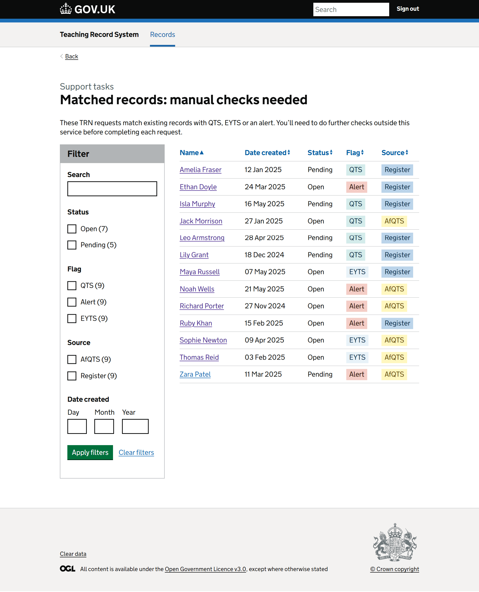
We added a ‘Further checks required’ tile to the homepage. Clicking this took the user to a task list showing all requests flagged for further checks. It included:
- filters for status, flag type (QTS, EYTS, or alert), source (Register or AfQTS) and the date created
- a table showing the person’s name, the date created, flag, and source
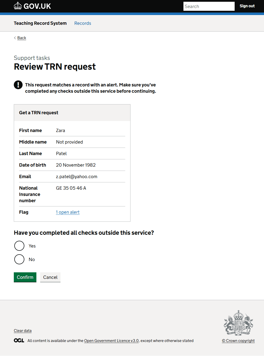
Clicking on a name took the user to a detail screen with:
- warning text saying “This request matches a record with [QTS, EYTS, or an alert]. Make sure you’ve completed any checks outside the service before continuing.”
- personal information about the person for whom the request was made
- a question asking if they've completed all checks outside the service
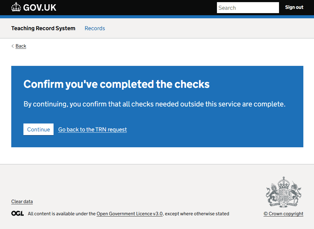
If the user clicked yes, we showed an interruption page to add a deliberate pause to ensure users complete the checks.
Clicking ‘Go back to the TRN request’ returned the user to the previous page. Clicking ‘Continue’ progressed the request.
After submitting, the request was removed from the task list and a notification banner said that the TRN request had been completed.
What we learned from user testing
We tested this journey as part of our research into how users find navigation in the service.
The task was as follows: “You've resolved Zara Patel’s potential duplicate record. The system has raised there is an alert on their record that needs to be reviewed by someone. Where would you go?”.
Users expected to search for a person first
Most users didn’t go straight to the ‘Further checks required’ tile. Instead, they tried to:
- search by name or TRN using the main search field
- look for the person in other task lists first (such as ‘Duplicates via API’)
“I’d search for the name first.”
“I thought maybe it was a duplicate, so I went there first.”
Tile-based navigation was often skipped
Several users didn’t immediately understand what the ‘Further checks required’ tile meant or that it was the right place to go.
“I wasn’t sure what the task was for. I’m just trying to work it out.”
“It felt like a duplicate thing at first.”
In some cases, users only chose the correct tile through process of elimination.
The page label caused confusion
Users didn’t immediately understand the ‘Further checks required’ list. It wasn’t clear what these checks referred to or why the records were listed.
We saw that:
- users often paused to scan the page before interacting
- the label ‘Further checks required’ didn’t clearly indicate the context (that matched records needed offline checks)
The task page messaging helped, but only after some effort
Once users landed on the Review TRN request page, the message about performing offline checks helped anchor them, but it still required effort to interpret.
Some users found the alert about QTS or EYTS helpful once they noticed it:
“Oh, I see, it’s because they already have QTS.”
“Now it makes sense why I need to check this.”
However, others were still unclear what action to take:
“I’m not sure what they’re asking here.”
“It feels like I’m missing a step. Is there something I need to do with this alert?”
What we changed
Following user research and internal review, we made several changes to the designs to improve clarity and usability.
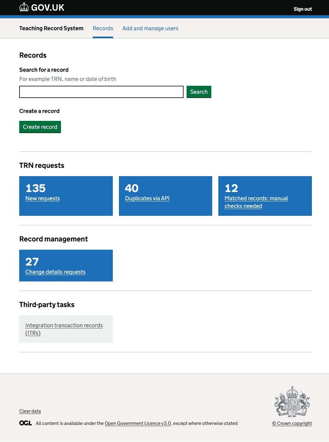
The team agreed to group all TRN request-related support tasks into their own section.
We changed Tasks to complete to TRN requests and moved the ‘Change details requests’ tile into its own section, called Record management.
We changed the ‘TRN requests’ tile to ‘New requests’ and changed ‘Further checks required’ to ‘Matched records: manual checks needed’.
We added the following line of text to the list page: These TRN requests match existing records with QTS, EYTS or an alert. You’ll need to do further checks outside this service before completing each request.
We also:
- removed the ‘Flag’ column and filter - users found the flag information cluttered and not useful for filtering
- added a ‘Date of birth’ column - this helped users cross-check records more quickly and reduced the need to click into each item unnecessarily
- updated the notification banner to say that the TRN request had been completed
- refined the content on the Review TRN request and interruption pages
These changes aimed to:
- make the purpose of the task clearer
- reduce information overload on the list page
- support overall comprehension of the task
What’s next
This work will be picked up by developers.
As part of our ongoing post-MVP work, we’ll continue to review the design, journey and content and recommend any further improvements if needed.
Screenshots
Homepage
List view
Review TRN request
Interruption page
Success