

The Provider verification process is how staff at Further Education (FE) providers review the eligibility of individuals working in Further Education (FE), applying for Targeted Retention Incentive (TRI) payments.
Why we are doing this work?
In year one of FE TRI claims, providers received an individual email per claim containing a magic link to a verification form. With no way to see an overview of claims, no option to save partially completed forms, and no way to revisit verified claims for reference, providers created their own workarounds (usually spreadsheets) to track progress. With that in mind, how might DfE give agency to further education (FE) providers to support and simplify the verification process?
Our approach
We ran four rounds of research between May and July 2025 with provider staff responsible for verifying claims.
- Round 1 explored providers’ experiences during the first claim window (Oct 2024 – Mar 2025) and tested an early dashboard concept using low fidelity static screens.
- Rounds 2–4 iteratively developed the dynamic dashboard prototype through usability testing. Each round introduced changes informed by findings from the previous round, plus features that emerged from UR, designed by the UCD team.
Findings from each round were documented in reports with recommendations. These were discussed and actioned by the wider project team (policy, project management, and UCD).
Round 1
What we did
8 user research sessions with FE providers to explore their experiences of verifying claims and to test a rudimentary dashboard concept.
What we learned
- Participants were generally positive about the TRI policy and their role in verifying claims, despite the effort required.
- Managing claims via incoming emails was challenging; many feared missing claims. Some suggested a dashboard before it was introduced in testing.
- More organised providers created spreadsheets to capture verification information and track progress; others relied on ad hoc methods and struggled more.
- Verification typically followed a two-stage process:
- Gathering data from HR systems.
- Requesting information from line managers (e.g. teaching hours, courses). The proposed “save and come back later” feature was seen as highly supportive of this.
- Participants wanted visibility of all claims needing action and a record of those already verified.
Round 2
What we did
10 user research sessions testing the dashboard updated from round 1.
What worked
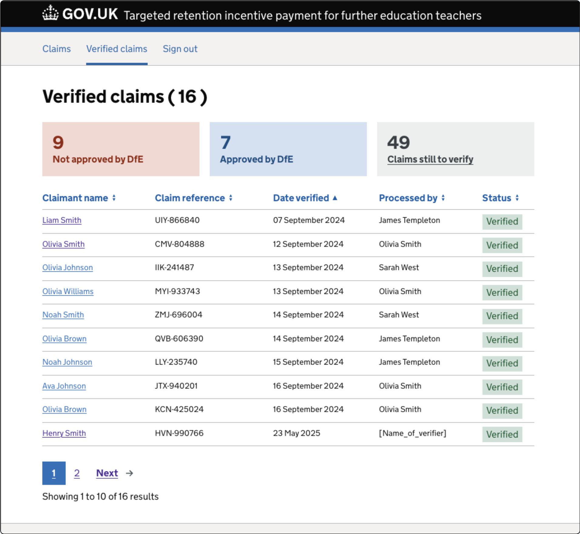
- Separate lists for unverified (action needed by FE provider) and verified (reference of actions by DfE ).
- Overview panels showing statuses
- All Claims (not started, in progress)
- Verified claims (pending, approved, rejected).
- Ability to save a claim “in progress”, allowing partial completion while waiting for input from colleagues or to pause and retrieve information from HR systems.
- Splitting provider verification (PV) form into meaningful sections and in particular redesigning the questions around performance & discipline to make more them understandable, increasing accuracy of answers.
- A “Check your answers” screen with a direct “Change” option was found to be useful by all participapants.
What didn’t work (and what we changed)
- Confusion between ‘Claims’ and ‘Verified Claims’ list screens:
- Renamed “Claims” to “Unverified claims”.
- Removed the ‘Verified’ summary panel from Claims screen to avoid mixing contexts. Verified claims are the domain of DfE, not the provider. Users also did not notice the panel was also a link.
- Updated verified claim statuses to: Pending (DfE decision), Approved, Rejected. Applied these new statuses to each claim.
- Removed “Assign” functionality. It emerged during research that the functionality was useful. However, there was no immediate user need but could be in the future as teams scale up with more claims.
- Moved success flash message to the Verified claims screen to more clearly ground the user in the current context.

Round 3
What we did
8 user research sessions with the latest dashboard iteration.
What worked
- Saving a partially complete verification form continued to test well.
- Verified status categories (Pending, Approved, Rejected) and the total value of approved claims gave providers clarity and useful reporting metrics.
What didn’t work (and what we changed)
Employer check required label for One Login failures caused confusion. These were removed and the claim presented as “Not started” with explanation of the check about to happen on an interstitial screen.
- “Have you completed this section” radio button interaction to save progress caused issues for some users. We simplified the design with two buttons: “Continue” and “Save and come back later” .
- Participants struggled to find verified claims due to surname-first sorting. Changed to A–Z by first name for clarity.
- Reintroduced a Date verified column in the Verified list, giving providers a better sense of timelines and processing speed.
Round 4
What we did
12 usability sessions with provider participants, testing the latest updates from round 3.
What worked
- Strong enthusiasm for the dashboard; prototype now rated highly for usefulness, comprehension and usability.
- Simplified “Save and come back later” interaction improved usability and understanding of the functionality.
- Verification form split into smaller steps, reducing cognitive load and supporting careful completion.
- Participants quickly located claims in the Verified list (A–Z by first name).
- Status tags in both tables continued to be understood and deemed useful.
What didn’t work (and what we changed)**
- Footprint of the claim details meant excessive scrolling to reach the PV the form. We reduced this and removed the wordy, generic H1 heading with claimant name and claim referenrce. Other claim details were put inside a details component so users could access them if and when they needed to.
- Confusion between subject area and course questions: simplified by keeping only the course screen.
- Refined status tag styling:
- Overdue tags now red.
- Overdue claim textual prompt included within “Not started” and “In progress” panels, removing the need for a separate panel as these are an edge case so there are often zero overdue claims.
Wrap up and next steps
Across four research rounds, the dashboard evolved from an early concept into a tested, refined design. Feedback shifted from fundamental usability issues to smaller refinements and content clarity.
Providers now have:
- Clear visibility of all claims.
- Ability to save work in progress.
- Confidence that verified claims remain accessible for reference.
The dashboard design is well positioned to meet provider needs for the claim window opening. The remaining work is focused on content design to further align with policy.