
The problem to solve
In recent rounds of research conducted, several issues were identified on the live service. Users experienced significant overwhelm on entry and didn’t see clear correlation between answers provided and recommendations received.
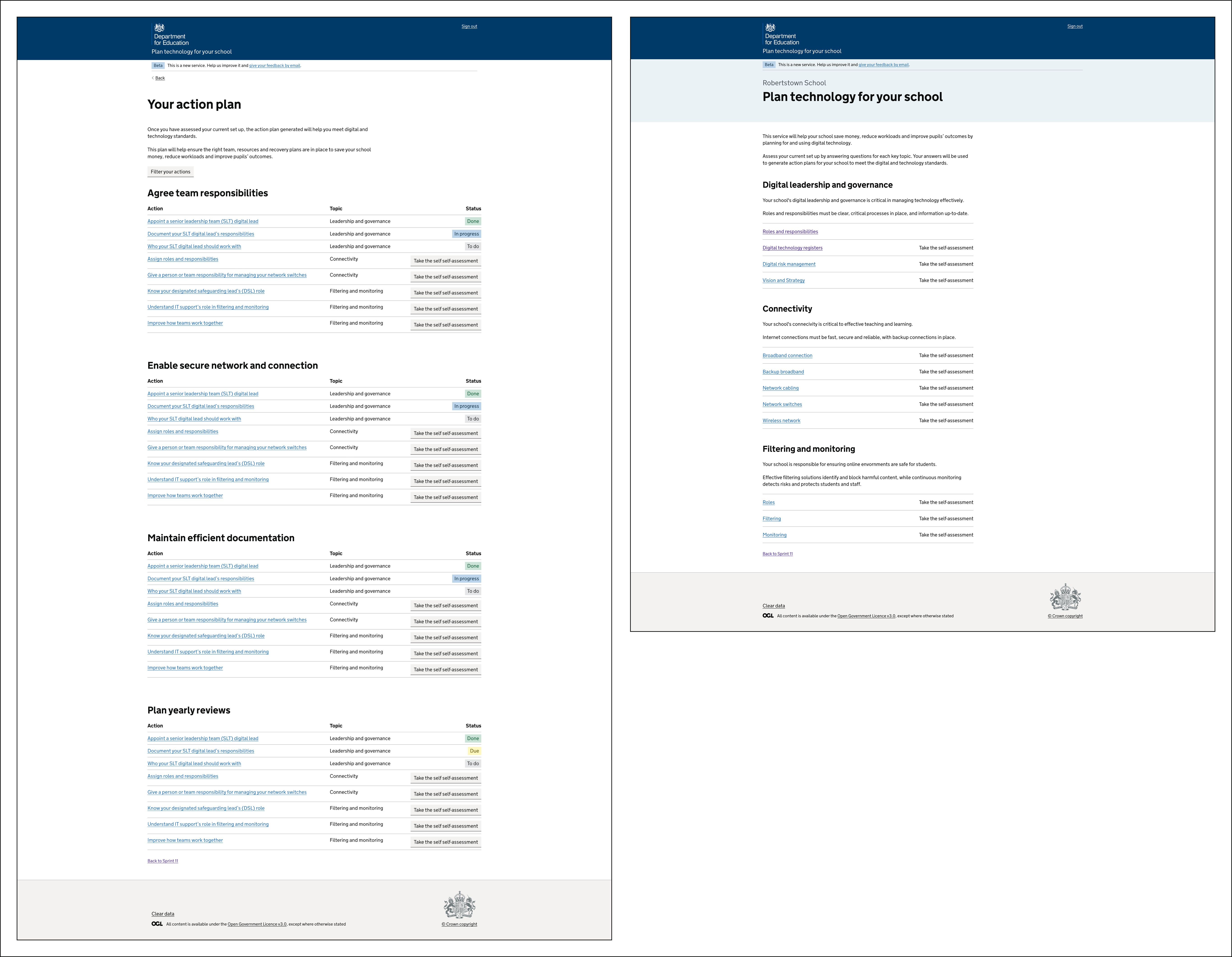
 The homepage design for Plan technology for your school caused users to experience overwhelm and confusion.
Through analysis of the user’s journey through self-assessment to recommendations, we identified critical usability issues.
- Multiple primary calls to action (CTAs) on homepage – making it difficult for users to confidently identify their next step.
- Multiple journeys from homepage - Two journeys were available from each topic: 1) from the hyperlink 2) from the CTA – making it difficult for users to distinguish differences between hyperlink and button link destinations. Data showed that many users restarted new self-assessments even after receiving recommendations – but would not change any answers. Our hypothesis was that users did not intend to re-assess and were simply clicking the wrong link.
- Complex journey to change answers – Users were forced to restart and re-submit self-assessments as they were unable to see answers they provided in their previous self-assessment.
Our design process
We ran a series of workshops to look into data and research insights, and ideated around possible solutions.
We explored different design options for the homepage, a new landing page for recommendations, and the recommendation pages themselves. Following cross-programme crits, the decision was made to user test those with the most positive feedback from the team.
 Design issues, user needs, pain points and other considerations for each step were mapped and used to facilitate team ideation sessions.
 We tested a homepage design where cards were used to simplify the homepage and align the information architecture to the DfE standards.
 We tested a homepage design where accordions were used to show all recommendations on a single page, contextualised by of the different topics.
 We tested a recommendation page design where related recommendations were grouped together to show all information about a given subject on a single page.
 Design exploration also included a landing page design where all actions were made visible, and a simplified version of the existing homepage, routing users to self-assessments or recommendations depending on their given scenario. However, these designs were not tested due to usability issues.
Our design implementation
User research insight highlighted that the homepage card design (where each card was aligned to a standard) was most successful in reducing overwhelm, working best due to its simplicity.
To create value for our users while also continuing to refine and test recommendation landing page designs, an adjusted homepage card design (with existing categories and topics) was proposed for build. This is the first iteration of a series of design changes aiming to reduce overwhelm and increase confidence and motivation.
The card design, commonly used in DfE services, simplifies the user journey and reduces overwhelm by providing a homepage overview of the content available in the service, and a single-entry point to the most appropriate next step.
- If a user has not started the self-assessment, they are directed to the topic start page.
- If a user has not finished the self-assessment, they are directed to the next question they need to answer.
- If the user has completed the self-assessment they’re directed to their recommendations.
 The updated homepage design for Plan technology for your school went live in June 2025.
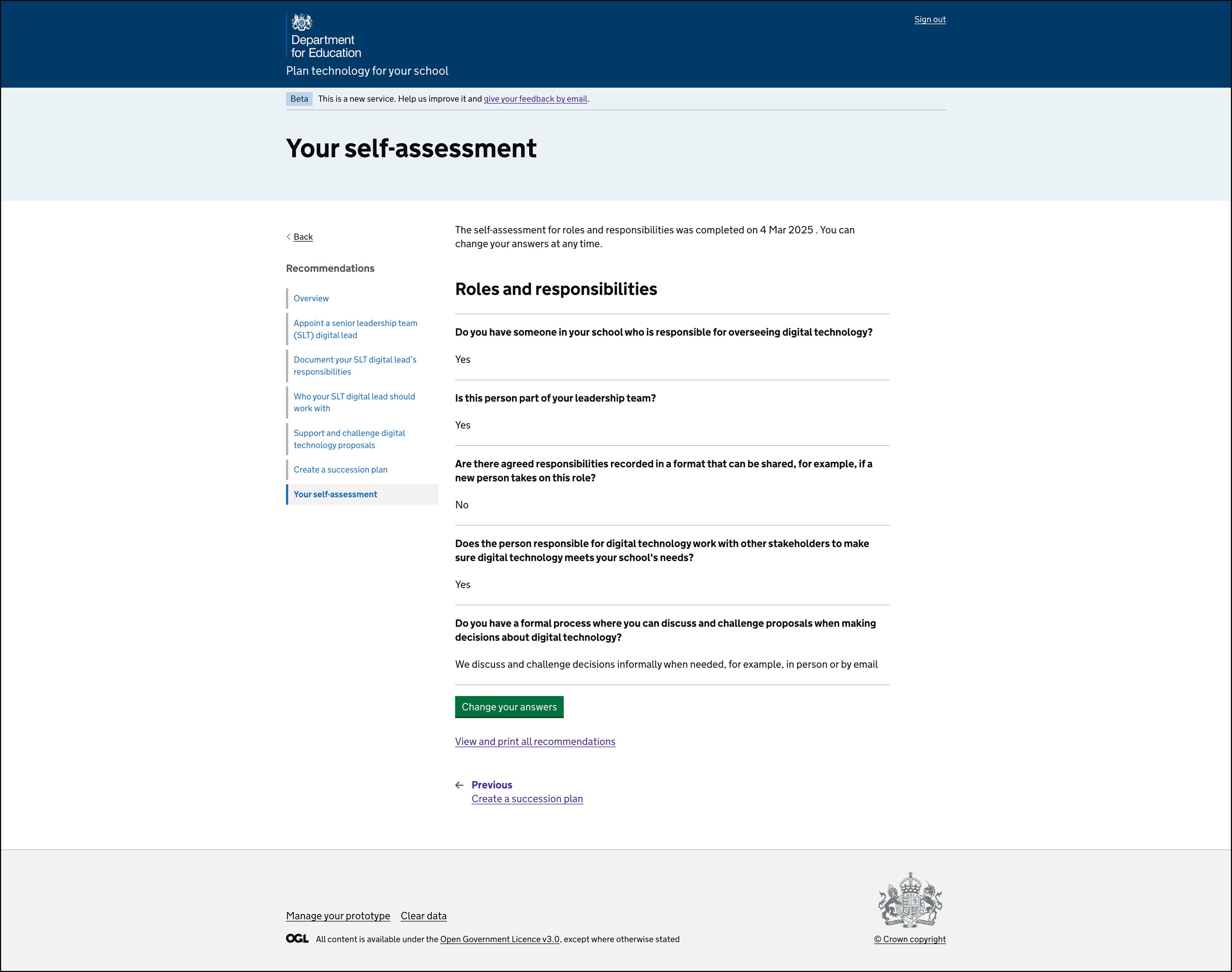 A new 'Your self-assessment' page was added to the recommendation section to let users see answers they provided during their previous self-assessment, and a CTA to change their answers.
 A new 'Change your answers' page was added to the onward user journey, allowing users to see questions and select and change a given answer.
Next steps
We will be measuring data to assess changes to user behaviour, including a hypothesis around a reduction in the number of unnecessary self-assessment re-submissions.