
We’ve talked in separate design history posts about how we’ve helped users to enter good prompts for the AI search and also how we’ve explored the best ways to help them set up and refine their search filters. In this post, we’ll look at the third big theme of our alpha – how we can support users to take the next step and avoid dead ends.
This relates to how the service displays search results and signposts users to the relevant provider to explore additional information and – potentially – make a course or apprenticeship application.
The challenge
The AI model has the potential to provide highly relevant results for users, from an unprecedentedly large pool of options (as our tool uses a superset of data from existing finder services). We wanted to test how best to present these results to users in a way that doesn’t overwhelm them or lead to confusion about their next steps.
We paid special attention to testing how users might react to ‘bad’ results – where their search prompt led to no results, or only a few results. We knew from our desk research that teenagers are likely to immediately disengage from a service if they get results of this sort.
On the other hand, too many results, or too much information, can be overwhelming. So throughout our design process we were striving to find the ‘sweet spot’ in terms of how to present the best results in the best possible way. The ‘best’ results are not necessarily just the most immediately relevant ones, though, as we’ve found that young people often don’t know all their options and value seeing things they hadn’t previously considered.
What we tested and found
First attempt at search results
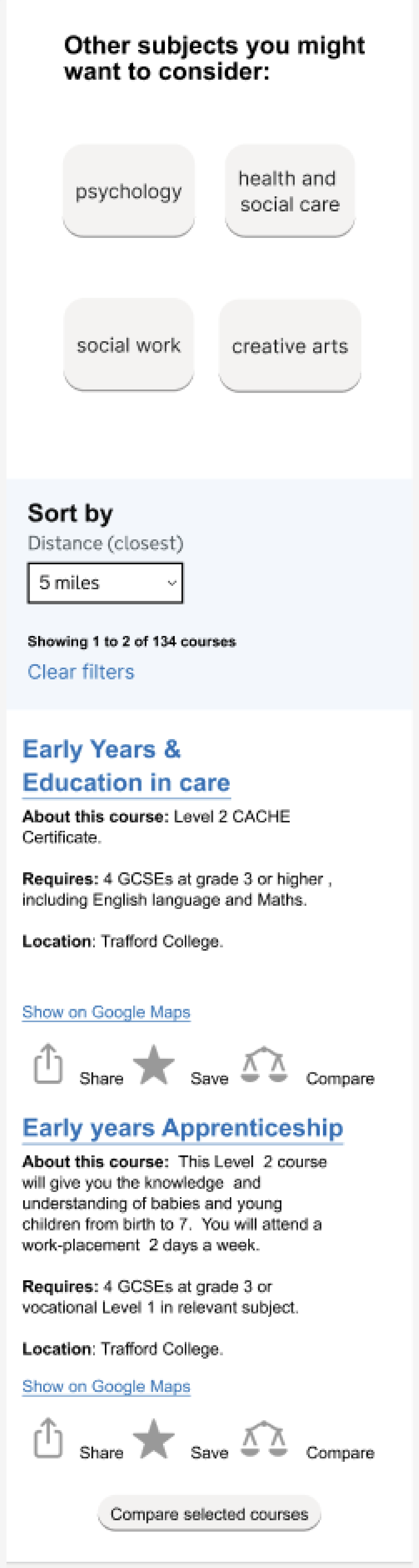
In our first Figma design for the search results screen, we included the information that had consistently been identified from the quantitative research as important – entry requirements, location and travel information (through Google Maps).
We wanted to explore how young people, especially those who were NEET (not in education, employment or training) would respond to results. So we purposefully included a mix of results, including some vocational ones.
We also looked at whether we could nudge users into widening their options into other subjects they might want to consider.
Finally, we tried testing some approaches that could help to link up online and offline user journeys – the share and save options would allow users to involve intermediaries like parents and teachers in their decision-making processes.
We found that the level of information, which was fairly minimal, felt right for our users. Young people particularly hone in on entry requirements as this helps them to not waste time looking at options they wouldn’t be able to do. One participant said “"I like that the requirements stand out – I can skip past if I don’t meet them – would not waste my time."
Users were quite interested in the suggestions for other courses but tended to skim these in favour of going straight to the search results. As one person said “I like the other suggestions but only if they were quite relevant. If they weren’t relevant, I’d just ignore it. Be useful if it was something I hadn’t thought of."
Most of them assumed they’d need to set up a user account in order to use the save option but we didn’t explore this further at this stage.
There was not a lot of interest in the compare option, which we envisaged would allow users to easily compare several courses against each other.
Calling out the course types
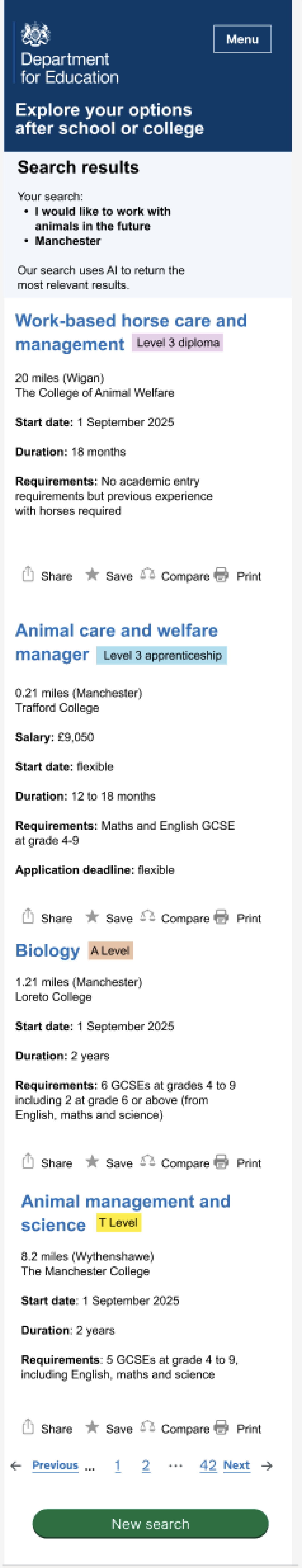
We introduced the course type tags, based on the GDS component, to make it easier for users to differentiate course types. This was partly to address feedback that many users were keen to see vocational courses and apprenticeships.
We also moved the search results to the top of the screen as earlier UR suggested some users hadn’t found them due to the need to scroll. We also moved the ‘other courses you might want to consider’ off this screen as users hadn’t felt they were at the right point in the journey.
The new print icon was to further explore possible offline journeys.
NEET young people were generally neutral about this screen. They appreciated the variety of options but mostly didn’t understand what things like a level 3 diploma actually were.
In general, some young people struggled to engage with hardcoded course results that didn’t reflect what they’d typed into the search. This is a challenge with all prototypes but seems to be a particular issue with younger users.
Share, save, compare and print options were often skipped, skimmed or missed by users. The compare feature continues to be confusing, with users unsure how different types of courses could be compared – for example, an apprenticeship and an A Level. Creating a shortlist of courses, though, is something which has come up as an interest point for users.
Better differentiation of results

In the Heroku prototype, we focused on providing better visual differentiation between search results, which users had previously told us was an issue.
We also added the details components to provide short, contextual explanations of the different course types. Based on card sort results, we also added the start date field.
Quantitative testing indicated that this version was popular with users, with findings that:
- 82% of users strongly agreed or agreed that 'The site clearly presents what course options are available for me'
- 78% of users strongly agreed or agreed that 'It is easy to find the information I was looking for
- 63% of users felt that the amount of information provided on the site was the right amount
- 86% of users felt open or very open to considering options they wouldn't have considered before (such as technical and vocational options) after seeing the site
One participant said “It shows all the possible courses for biology that I can do in the area which is good. It shows 6th forms, btec, a level, I definitely would have used this if it was around when I was looking."
In other findings, users kept missing that the title of each course was a link. They thought that this screen was the end of the user journey and were therefore missing out on the course details. For some of them, though, they expected to be able to go to the provider website directly from the search results.
It was apparent that some young people think about results in groupings, such as by provider or course type.
Supporting ‘bad’ results
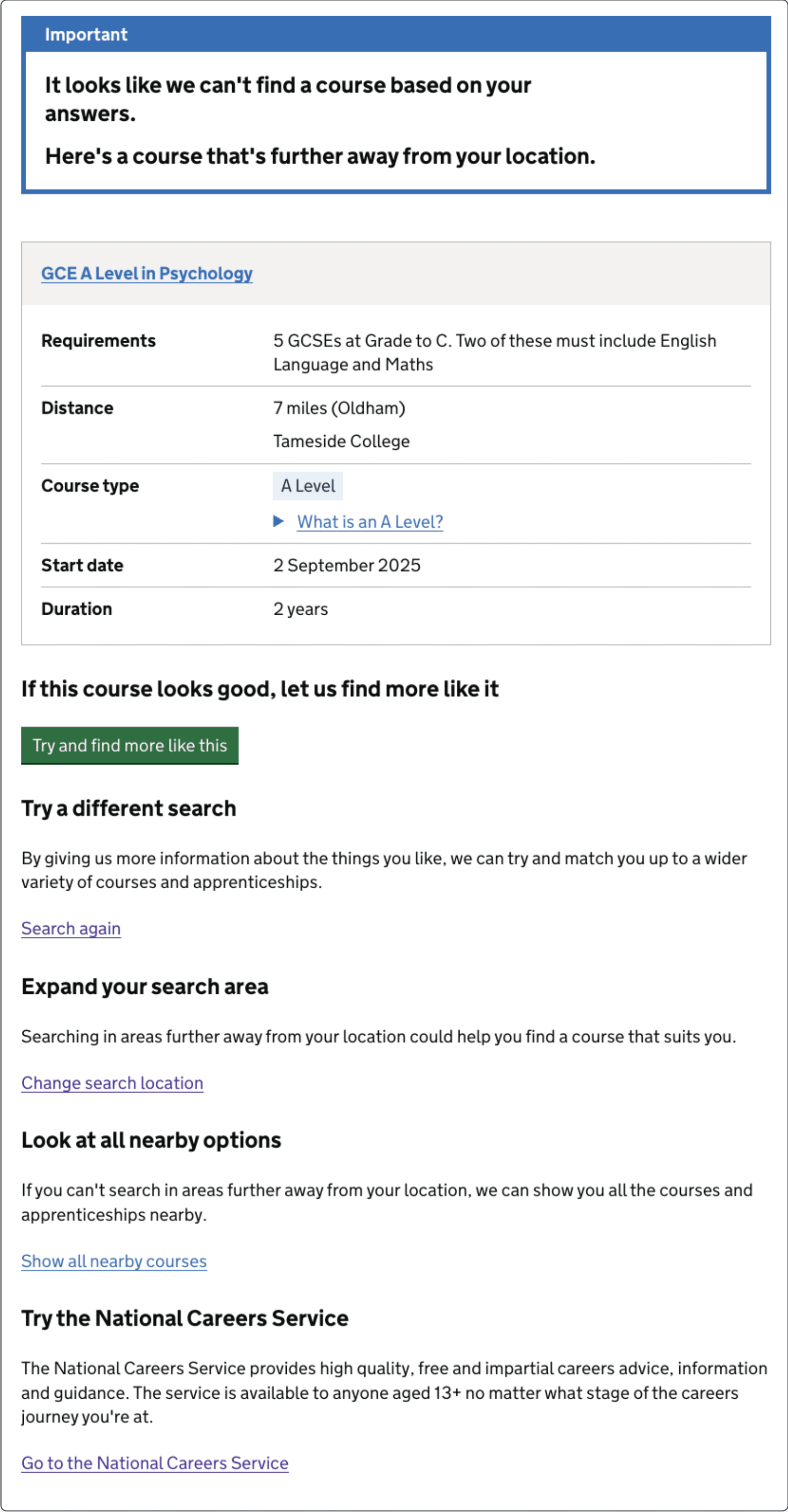
This was our first attempt to support users where a search returned no results. We designed the screen to better understand user reaction to bad results and their preferences around what to do next.
We wanted to give users at least one result, even if that result was less relevant to their search criteria. In this case, we showed a result that’s further away but we could also show less relevant results that are closer.
Quantitative testing showed that:
- 15% of users would leave the website immediately after seeing this page
- 39% would go to Google and search instead
- 46% would have searched again with wider search radius
- 49% would have searched again with different search terms
- 40% would explore other subject areas
What we’ll do next
Based on what we’ve learnt, our initial priorities for beta are to:
- link up the AI to the front end so that users can see actual search results during UR sessions
- consider ways of grouping search results to better align them with user mental models
- further refine the exit points from the service to ensure they make sense to users – and that they can get back to our service again if they need to
- review the card sort results to check if there’s any further information we could usefully include on courses (without making the amount of content overwhelming)
- do more research into user responses to bad results, specifically around whether users would prefer to see more relevant results from further away or less relevant results that are closer to home