
One of the things that makes this service different to what’s already in the digital landscape is our use of AI. Rather than just matching keywords, the AI understands the meaning of a user’s search prompt and finds relevant courses, even if they’re called something entirely different.
For example, searching for ‘car’ on other course finder websites, returns results relating to ‘adult care’, ‘carbon awareness’ and ‘carpentry’. These are not likely to be what the user had in mind. This service, however, would return results such as ‘vehicle technician’ because it would understand the semantic similarity between the word ‘car’ and ‘vehicle’.
The challenge
For the semantic search to provide the most useful results, we need users to enter appropriate prompts. The more detail they provide, the better the results are likely to be. For example, if someone just enters ‘business’ they’ll get results around general business-related courses. But if they enter their interests as ‘business and playing football’ the results would include courses specifically around sports business management, which might be particularly interesting to the user.
So our challenge during alpha has been to explore different ways to encourage users to provide useful search prompts, while minimising cognitive load and supporting users with different mindsets. This is as part of our guided journey – as opposed to the browse journey which was purely based on a user’s location.
We already knew that users were likely to search in very different ways, with some expecting to search by skills, others by career aspirations or favourite subjects. And while most users would be familiar with keyword-based search, the AI tool can support more complex inputs like whole sentences. So we wanted to find out if we could explain all of this to users in a simple way.
We also knew from our initial desk research that many young people have poorly developed research skills and need extra support in this area.
What we tested and found
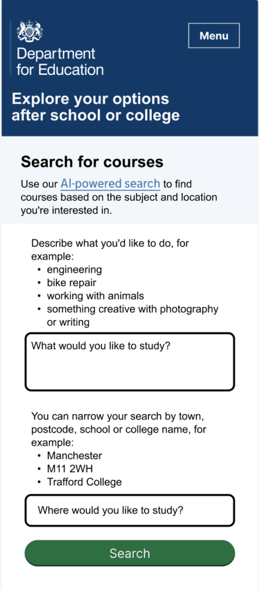
1. Dual input boxes with hints

In our initial Figma design, we used the approach common to many job and course finder websites of searching by the ‘what’ and the ‘where’.
We used hint text to encourage users to think creatively about what they wanted to study, showing examples that ranged from a single word to a short sentence.
We found that users understood the difference between the input boxes but many didn’t notice the hints and still expected to just put keywords into the topic box. Generally, this search concept was seen as most useful for those young people who already had some idea of what they wanted to do.
2. Larger input box and expanded hints
We wanted to experiment with a larger input box for what the user wanted to study, to see if this would encourage them to enter more expansive text than just a keyword. We also removed the reference to ‘keyword’ in the hint text and, after talking to our data science colleagues, changed the examples to things we knew could generate good results.
Rather than encouraging longer text input, though, the larger box felt intimidating to users. Many of them worried they needed to fill the whole field with text.
None of the users realised the flexibility in terms of what they could type in, or that they could skip this and just search by location.
3. Separate screen for 'what' question using ‘add another’ component

In the first Heroku prototype, we separated the what and where questions onto separate screens. We returned to the smaller text box but used the add another component from the Ministry of Justice to allow a user to build up a list from smaller pieces of text. Having previously tried asking users to add their hobbies as a separate question (which they didn’t respond well to), we now tried explaining to users that they could enter a combination of:
- school subjects
- career aspirations
- hobbies
In general, this question was overwhelming to users and particularly those with experience of being NEET (not in education, employment or training). These users didn’t want to limit their options, making us realise that the browse option rather than guided journey might be more relevant for them.
The concept of adding hobbies, even in the context of providing all the relevant information to the AI in one go, was still problematic for some users.
One user said "Not sure I'd be able to say what hobbies I do - might stop myself searching for things that I don't think relate to a job."
4. Splitting the question into 2 parts

Having found how overwhelming a single question was to understand what users want to study, we tried splitting it into several more specific questions. As hobbies felt problematic, we decided to get rid of this for the moment (possibly returning to it in beta to see if there were better ways we could incorporate this sort of information).
The 2 questions became:
- What jobs or careers are you interested in working in?
- What school subjects are you good at or enjoy?
We considered the best order of these questions, ultimately choosing to put the jobs question first as it seemed to set the scene better. We also didn’t want to alienate users who didn’t enjoy any of their school subjects.
The good news was that users were able to enter responses for these 2 questions much easier than in previous iterations and didn’t have the same ‘deer in the headlights’ moment. The questions seemed to coincide quite closely with their existing mental model, where they often thought about next steps based either on a career aspiration or a favourite subject.
When they saw the question about jobs, one participant said “I feel like whatever I put in here will have an important influence on search results. This is one of the most important questions in the whole thing."
Unfortunately users continued not to notice that both questions were optional.
5. Clearly showing the optional nature of the data input


Asking the first question of ’Are there any jobs or careers you’re interested in working in?’, with clear yes/no answers, makes it obvious to users that they can skip this question by saying ’no’.
While making it clearly optional we’ve also included content to explain that the more text users provide to prompt the AI, the better their search results are likely to be.
What we’ll do next
Based on what we’ve learnt, our initial priorities for beta are to:
- test the final design iteration to determine if users do now realise the questions are optional
- look at what users enter into the text boxes once the front and back end prototypes are connected as this will give a much better picture of their true behaviour than asking them speculatively, which is what we’ve done in alpha
- explore whether the ‘add another’ component is understood – and useful – or if a single text box per question would be better
- consider whether we could add a prompt about hobbies after a user has seen their initial search results, as this might allow them to better understand the impact