
What is the table tool?
The table tool on the Explore education statistics platform provides a guided route to creating custom cuts of data from the many data sets hosted on the service.
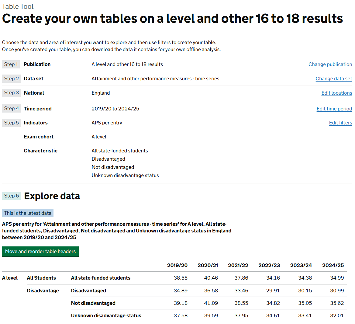
It uses a wizard-style interface that guides the user through narrowing down large data files (often with millions of rows) following a journey through 6 linear steps as follows:
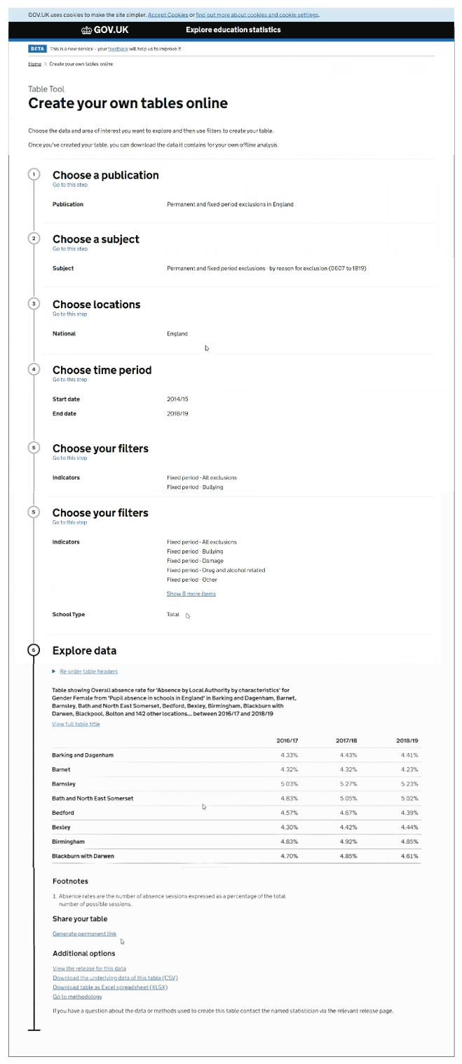
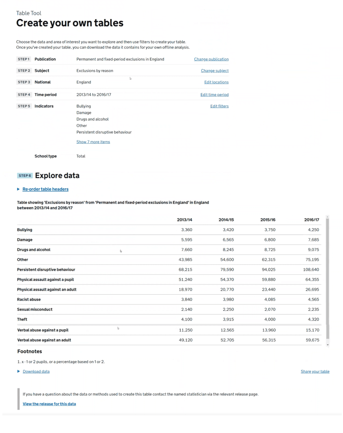
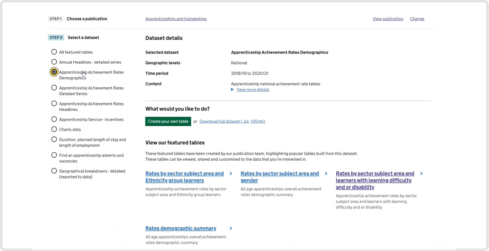
- step 1: Choose a publication: Search by title or browse by theme (e.g. "Teachers and school workforce")
- step 2: Select a data set: Pick the specific underlying file (e.g. "School level attendance" vs. "National attendance")
- step 3: Choose locations: Filter by geographic level—ranging from National and Regional down to Local Authority, Ward, or even individual School level
- step 4: Choose time period: Select specific academic or financial years
- step 5: Choose your filters: Allowing you to slice data by "Indicators" (the numbers, like absence rates) and "Filters" (the categories, like Gender, Ethnicity, or SEN status)
- step 6: The final step generates a live, interactive table.
Once a table has been generated, the user can also do the following:
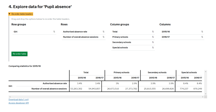
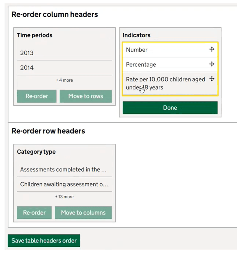
- reorder table headers: Drag and drop rows and columns to change the layout
- download: Export the custom view as an Excel file or CSV
- permalinks: Create a "Permanent Link" to that exact table view to share with colleagues or cite in reports
View the current version of the table tool on the live site.
How the table tool has changed during public beta
Since its full launch in early 2020, the table tool has evolved from a basic minimum viable product (MVP) into a more robust data service.
| Start of public beta March 2020 | Now, early 2026 | |
|---|---|---|
| Speed and performance | Building tables with large data sets (like school-level data) often resulted in long loading times or browser "hangs" because the processing was less optimised. | The underlying infrastructure was overhauled to handle "big data" more efficiently. High-frequency data (like the weekly attendance series) loads significantly faster despite containing millions of data points. |
| Geography | Many early data sets were limited to National or Regional levels | The tool increasingly supports a wide range of geographic levels (like local authorities, parliamentary constituencies and devolved areas) and establishment level data (like individual schools, multi-academy trusts, higher and further education institutions). |
| Step 1 publication search | Search functionality was very limited and precise to user input | Auto-suggest search: The search functionality in Step 1 has been significantly improved to include "fuzzy matching," helping users find publications even if they don't know the exact official title. |
| Validating data combinations | Users could easily select invalid combinations of selections across the steps that could combine to give no data | Step-by-step validation: The tool now prevents "empty queries" more effectively by greying out combinations of filters that have no data, saving users from reaching Step 6 only to find an empty table. |
| Introduction of featured tables | Users often had to start from scratch every time they used the tool. | DfE analysts now pre-build "Featured Tables" (common queries) that act as "shortcuts". Users can click a featured table link from a release page, and it will pre-load all the settings into the Table Tool, allowing the user to simply tweak one or two filters rather than starting at Step 1. |
| Permalinks and sharing | Sharing a table was difficult; you often had to share the raw data file. | The Permalink system is much more sophisticated. If you create a link to a table, EES tracks whether that data has since been updated. If a user clicks an old link, the system can notify them if a newer version of that data is available. |
Accessibility
User experience with screen readers and keyboard only navigation can be a particular challenge when working with data, tables and visualisations. We have run testing with the Digital Accessibility Centre to review our site as a whole including user journeys through the table tool. Following feedback from DAC's testing sessions and Web Content Accessibility Guidelines (WCAG 2.2), the tool has seen significant updates to work with screen readers and keyboard-only navigation.
Design evolution during 'Alpha'
Ideas generation and collaborative workshop sessions
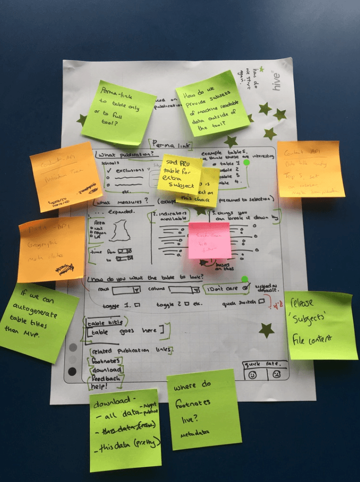
This shows the output from one of our collaborative sketching workshops, the image shows one of the initial ideas that helped us develop a working prototype.
These workshops consisted of a cross section of statistics producers from internal DfE teams together with a mix of our own design and development teams. These sessions gave everyone a chance to generate and iterate ideas based around defined user needs.
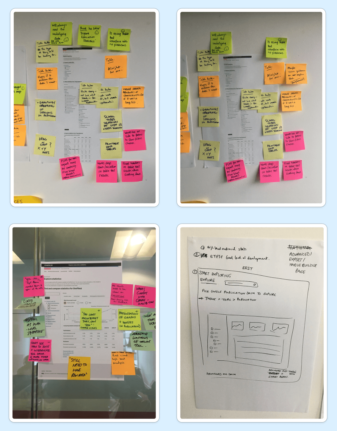
Developing an initial prototype
We immediately started usability testing of our designs and gathered as much feedback as possible to uncover all known 'pain points'
The team watched sessions live in real time and grouped all the issues as they unfolded. This helped give clear direction on the next iterations and working prototypes.
Design evolution during 'Private beta'
Screenshot showing the table tool structure with filters and an example table
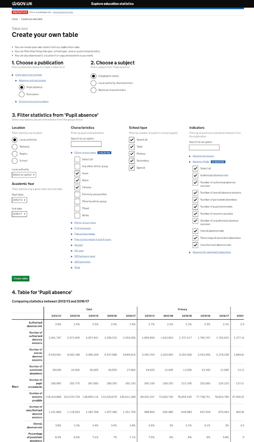
The screenshot above shows one of our first working prototypes.
Initial feedback during usability testing showed that the filtering and the number of options on screen at one time was a little overwhelming. Some felt there was the potential to get lost in this section as it's not clear what table you’re building at this stage, and what the table will look like.
"It took a moment more than I would’ve expected to find what I was looking for”
Screenshot showing the original table re-ordering feature
The image above shows a screenshot of the first working prototype of table re-ordering. This used drag and drop functionality to move elements around, and when updated would then restructure the table, for instance swap columns and rows or reorder within a section.
Usability testing was carried out, most users really liked the drag and drop functionality in principle.
However, pain points were identified via the testing and included feedback such as:
“re-order table headers” labelling is not clear enough, not obvious what table headers refers to"
"not clear where the change rows button is on the page and a few users did keep missing it"
"spacing and formatting needs refining"
Design evolution during 'Public beta'
The first public version of the table tool
Based on the user feedback we gained during the 'private beta' period, we worked on improving the design to make the whole process more intuitive.
We found that introducing a linear step by step process made more sense and helped guide users through each step of the process making it feel less over whelming.
To implement this step by step user jounrey, we turned to the GDS 'step by step' navigation pattern, which both helped simplify the building process and conform to UK Government standards.
User feedback
With the first public version live, we continued to gather feedback and carry out further rounds of usability testing.
- Users said the the process was quite intuitive after you've been through it a few times.
- Some users reported that if they'd realised that certain features were present (e.g re-ordering, sharing with permalink, table highlights) they would have found it more useful.
- Many users commented on the length of the page, and the vertical space taken up using the GDS 'step by step' pattern.
Layout iteration
Based on user feedback we made some iterations. Significantly among these, we now use the GDS summary list pattern, which helps to reduce vertical spacing so users can see more information on the page at a glance.
User feedback
We continued to gather feedback and carry out more usability testing. At this point in time (June 2024) the tool had been established for several years.
Positive feedback included:
"finding the raw data is so much easier through the interface of creating tables"
"it's pretty good, really it serves the purpose very well, the mix of create your own tables functions versus going in to download the underlying data"
"I find it actually easier and quicker to create your own tables multiple times, than downloading the whole data and then having to pivot it or manipulate that"
Pain points
"maybe it's not always as easy to do that as it could be"
"Creating your own tables can be frustrating, because you never seem to get quite what we were after, but I think that's improved"
"There's certain combinations where you can't get local authority data for some data sets, it just produces blanks"
Featured tables
Featured tables are basically pre-configured sets of data, produced by the publication teams. Selecting a featured table allows the user to jump straight to a pre-built table, and from there they can edit further, share or download. This allows users to quickly access common data, without having to create tables from scratch every time.
Screenshot showing 'featured tables' across an entire publication
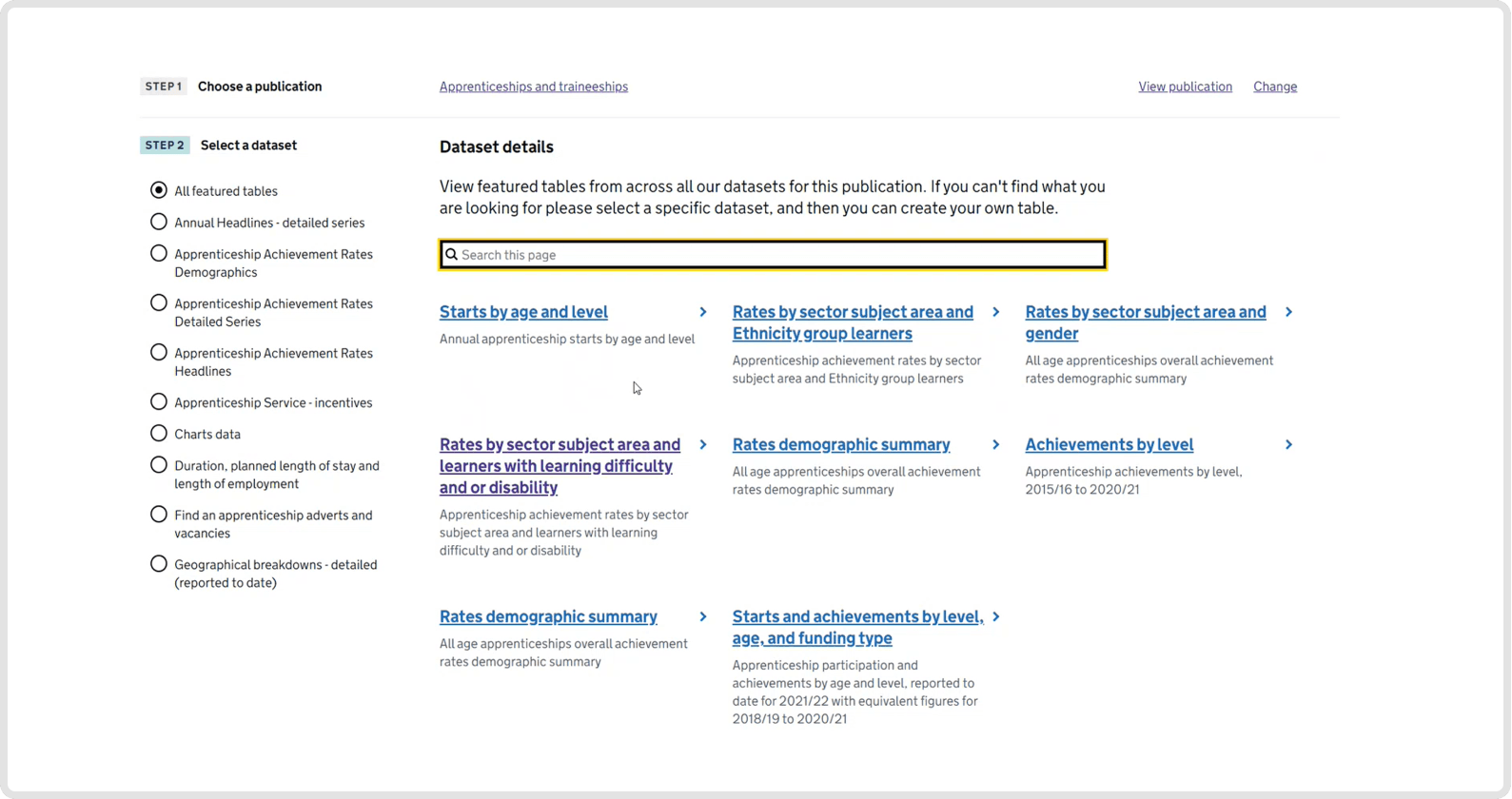
Screenshot showing 'featured tables' from a selected data set
User feedback
We continued to gather feedback and carried out more usability testing.
Positive feedback included:
"Would rather save time by using featured table, than building from scratch"
"Like the way it spreads across the page, can still search if not sure where to look."
"Like that the featured tables are shown within a dataset."
Pain points
Some users hadn't realised that you could edit featured tables.
"Hadn't thought of using a featured table then editing"
There was a split in opinion on using a grid to display the featured tables.
"With a grid or list, don't mind as long as I can see more at once without scrolling."
"Have a toggle between list and grid."
Table reordering
The table reordering feature had used drag and drop as core functionality.
The original versions relied on use of a mouse or touch device to control, this issue was raised in an independent accessibility audit.
This relates to WCAG (Web content accessibility guidelines) 2.2 Dragging movement
For any action that involves dragging, provide a simple pointer alternative, because some people cannot use a mouse to drag items.
Screenshot showing an older version using only drag and drop control
Screenshot showing updated version allowing for drag and drop as well as keyboard only control
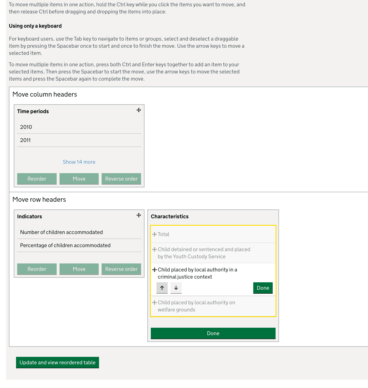
We have updated the feature, so now drag and drop can still be used, but we have also incorporated clear CTAs (Calls to action) so every element can be used with keyboard alone as well. For instance, moving elements up or own or blocks left or right.
Filter hierarchy
Some underlying data can be a lot more complex than others, where some filter options are a subset of others. The original table tool didn't have the ability to show the relationships between these 'subsets.' This led to the issue of some users applying lots of filters, but potentially getting no results out, hence causing some frustration.
"There's certain combinations where you can't get local authority data for some data sets, it just produces blanks"
We set about looking at ways to show these relationships in what we call 'Filter hierarchies.'
Users can now see filters at different levels, they may be interested in just high level data or want to drill down to very granular subset of data at a lower level. The important factor from the UI (user interface) point of view, is that the user shouldn't be able to select a combination of filters that would produce no results.
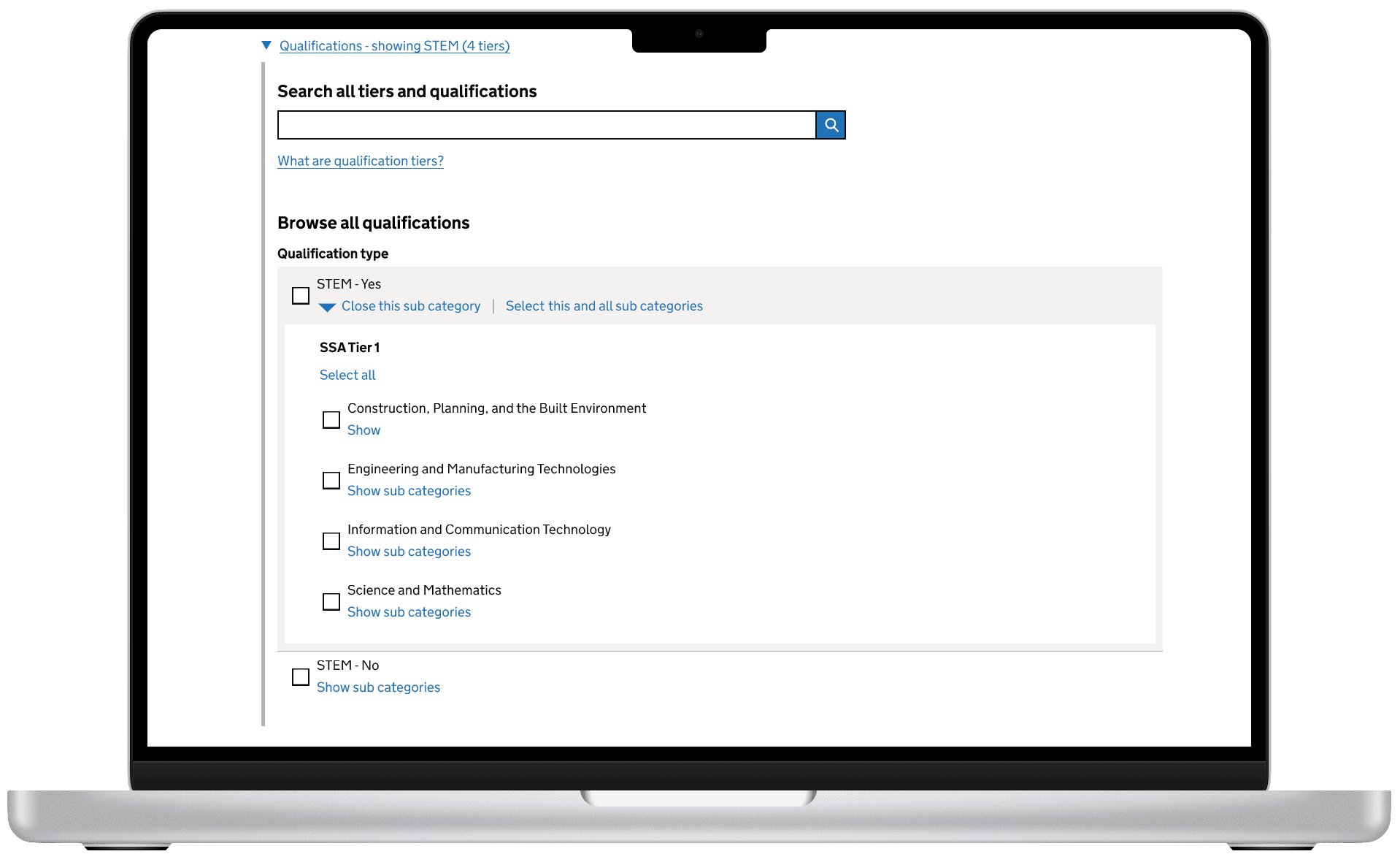
Example filters with a hierarchical structure, step 1
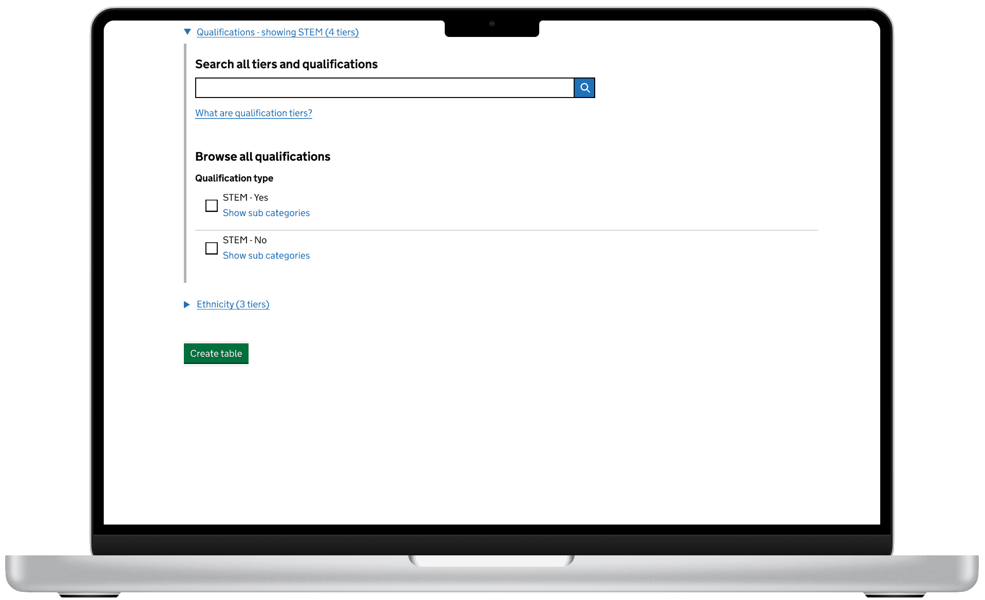
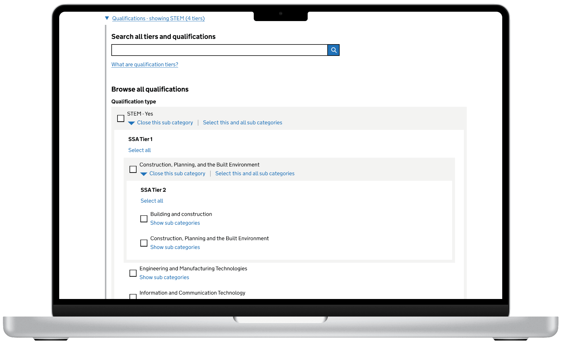
Step 2, choose next level (Tier 2)
Step 3, choose last level (Tier 3)
We how have the ability to show the different levels of filters and users can easily select the level of data they need.
User feedback
We ran several rounds of usability testing and made iterated based on feedback, with generally positive results.
"Intuitive"
"Once you've tried it a couple of times, you'd get to grips with the way that it's working in terms of the the tiers of the qualifications and then actually getting to the qualifications themselves.
"I've seen the way it's changed over the past few years, I say, just keep on doing what you're doing, because it's become very impressive in terms of what's produced now"
What's next?
We will continue to make improvements based on user feedback, and also investigate incorporating more functionality based on using the API and potentially using the table tool as a visual API query builder.
We are also surfacing the 'featured tables' and data sets with links to the table tool within the context of a release page, allowing more routes to creating tables.
We will also continue to prioritise all currently known pain points and update the design accordingly.