
Why have we redesigned the release page?
The first iteration of the release page was introduced in March 2020 at the start of our public beta phase. The content that these pages deliver is created and managed by over 200 statisticians publishing new analysis and data publicly across over 60 different statistics series every year.
The fundamental layout had remained relatively unchanged since first launch, apart from minor iterations. However, user research over the years identified a number of consistent and repeating issues and pain points, prompting us to undertake a more holistic and coordinated redesign of the release pages.
Research showed users wanted quicker access to headline statistics, avoiding introductory text. They expect to see those headlines at a glance, without having to scroll past other text content to find them. However, the original release template allowed for content creators to add a summary or background description at the top of their release and between the statistical teams and policy colleagues this feature was often over-used, pushing the content users were interested in out if the initial view or beyond "the fold".
In addition to the summary info and headline statistics, each release page generally provides in depth commentary and insights around the underlying data. This is one of the key areas where DfE analysts can bring their expertise to the fore and where many invest a significant effort in creating written and visual content. However, usability testing showed many users were not reading this commentary. The existing design embedded this content within collapsed accordions that were positioned after the summary info, headline content and links to access the data itself, meaning users faced significant cognitive load and navigational options before even reaching this somewhat hidden content. Indeed, some users were unaware that the content sections were in expandable accordions, assuming instead that they were links that would take them to another page (and so hadn’t tried clicking them).
Further to this, usability testing also showed professional data analysts often want quick access to the underlying data and traditionally want to simply download all available data. However many were unaware of the ability to ‘create your own tables’ or quickly view pre-made ‘Featured tables’. Once made aware many users could immediately see the value in using these features.
Screenshot showing original release page template
Pain points
From our user feedback and further rounds of usability testing the key pains can be summarised with the following quotes.
"I don’t want to scroll far down the page to read the headline data"
"I want to see the associated data in context without having to navigate to other areas of the service"
"I didn’t realise there was more written commentary on the release - the accordions looked like links to other pages”
Prototype design iteration 1
Release page home
Quick link page, explore data

Key updates
- reduced amount of content in the header area, to enable headlines to be viewed at a glance
- single page showing all commentary (without using accordion sections), together with left-hand navigation for quick access to all sections in the main body of text
- grid of useful links ‘Quick links’ to key features and functionality including data downloads
Usability testing findings
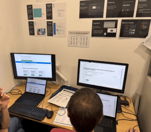
We tested this prototype with a range of users including external professional analysts from a range of local authorities, data managers from schools and academies, non-professional users and internal users from the DfE statistical production teams.
Positive findings
- most users preferred this layout, typical comments were:
“It looks a lot more engaging”
- persistent left-hand navigation for page contents
“The menu on the left - it helps you get to the to see what's in the publication, rather than having to go through all the page”
- many users said they were now more likely to read more content in the release
“It's not not off-putting having the long page, because it’s easy to navigate.”
Negative findings (Pain points)
- many users expected the left-hand navigation to highlight when scrolling down the page. This would make it more obvious where you are in a long body of text
- there was a general feeling that the quick links at the top of the page didn’t stand out enough and needed more distinction or hierarchy in importance
“Behaviour of these 'quick links' is a bit confusing at the moment and I would expect them to be tabs, didn’t notice it at the top of the page at first”
- some users commented on losing the ability to see the ‘quick links’ when scrolling down the page.
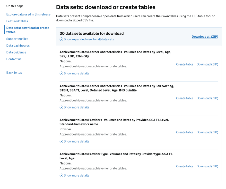
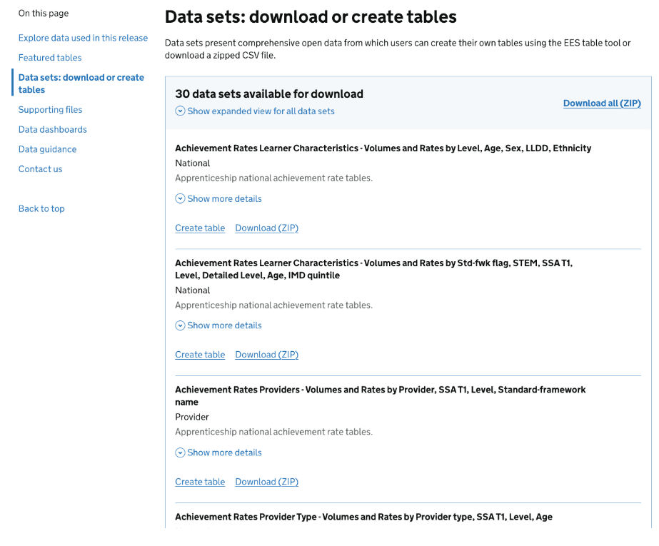
- on the explore data page, some users wanted to see more information in context, for example showing links to the available ‘Featured tables’ and the available data sets without the need to go to the table tool or data catalogue pages first.
Prototype design iteration 2
Taking stock of the feedback from the first iteration, building on the strengths and tackling the known pain points we created the second prototype.
Release page home
Explore data page
Key updates
- highlighting sections in the lefthand navigation when scrolling down the page
- simplifying the header area, reducing the number of ‘quick link options’
- using a horizontal nav (using secondary navigation style from x.gov.uk) for quick link options at the top of the page
- improved page structure for exploring data, including clear signposting for different types of data and full listings of available featured tables, data sets and supporting downloads, without the need to use the data catalogue or table tool to get started.
- updating styling to be inline with latest GDS header and GDS footer
Usability testing findings
As before, we tested this prototype with a range of users including external professional analysts from a range of local authorities, data managers from schools and academies, non-professional users and internal users from the DfE statistical production teams.
Positive findings
most users immediately noticed the explore data link in the horizontal navigation bar on this design.
“It's an improvement, feels more intuitive”
in general the horizontal navigation was a positive experience
“Prefer having the tabs at the top, rather than scrolling down to find this information”
persistent fixed lefthand navigation makes it easy to navigate
“Like the way the navigation expands to show sub-sections, makes it easier to find content”
the explore data page is more useful now that it shows more data in context
"Summaries of data are good, especially seeing the geographic coverage at a glance, it’s now more obvious you’re looking at the correct data set"
Negative findings (Pain points)
- some users felt the term ‘Explore data’ in the horizontal navigation wasn’t description enough if all you wanted to do was download data
- some users felt like the horizontal tabs were too close together
The final decision
We have proceeded with and iterated ‘Prototype design iteration 2’ (based on user feedback) and moved this into development, using the GDS component library where possible.
We have also been conducting thorough internal quality assurance (QA) testing and ensuring we are meeting current accessibility standards of WCAG 2.2 (AA) using both manual and automated testing.
Empathy lab
The team has also spent time using the DfE empathy lab in Sheffield to build further accessibility awareness through using specialist software and hardware to emulate various conditions including visual impairments, motor issues and neuro diversity.
We made some design tweaks to the data set listings (on the Explore and download data page) based on our session at the lab. We found that using ZoomText at high magnification there was no cue that the call to action (CTA) to download data was on the right hand side of the page. This would mean the user could see all the details about a data set, but no obvious way to download or create a table from it. Subsequently we have aligned all the CTAs to the left, so all actions are inline with the data set details.
Right aligned calls to action (CTAs)
Standard page with no zoom
High magnification using ZoomText
When using a high level of zoom using ZoomText it wasn’t obvious that the download option was going to be located on the right-hand side of the page
Left aligned calls to action (CTAs)
Standard page with no zoom
High magnification using ZoomText
When using a high level of zoom using ZoomText the download options are fully visible to the user

Deployment
We introduced the new design to the live production environment under a feature flag to allow for further final feedback before making the redesigned page live. We gave a 4 week period for DfE analysts to review their existing releases presented in this new design, gaining some additional iterative improvements:
- Add quick links in the header area to "download all data" and "create tables"
- Tag data sets that are available via our public-API prominently in the data listings
- Add departmental logos at the top of releases to highlight authorship
- Make the releases in this series page more dynamic, allowing for filtering of released and different numbers of results to be shown on a single page
The new design is now fully live and we are continuing to iterate through the above requests and further feedback collected via a GDS notification banner located at the top of the page.
We will also carry out an independent accessibility audit of the new page design.
Summary of changes
Navigation
The new design introduces horizontal navigation at the top of the content area and splits the release into distinct areas, so users can find specific areas of interest faster.
Key sections of interest
These are now separated into individual pages rather than been contained within a single page - reducing scroll fatigue in trying to find content in a long page
- release home for headlines, narrative and context
- explore and download data, all relevant underlying data, featured tables and relevant documentation and guidance
- methodology, process information
- help and related information, for contacts, support and any other relevant information
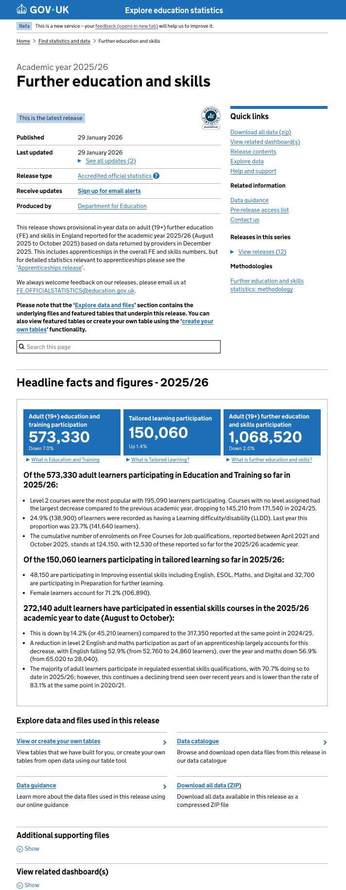
High level information about the publication
This information is more visually structured. It includes a more prominent "Latest release" tag and a clearer "Last updated" section with a dedicated link to a full list of updates, making the history of the release easier to track
On this page (Table of contents)
The "On this page" section acts as a secondary navigation for the "Release home" tab. It clearly distinguishes between high-level sections (e.g., Headline facts) and detailed commentary (e.g., Characteristics, Region, Provider Type). This makes it easier to navigate the page content and also clearly highlights the current section when scrolling through the main body of text.
Visual Hierarchy
The new design uses horizontal navigation to categorise the highest level of information. This helps to reduce the vertical height of the page, making the "Headline facts and figures" the most prominent element of the page when first viewed.
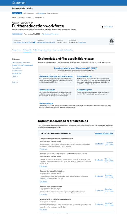
Data, methodology and help pages
Data, methodology and help are now broken into separate pages acknowledging they are equally important entry points depending on the user type. Users no longer have to leave the context of the release to view data sets, featured tables or start to create your own table. Most importantly the data sets and featured tables are all listed with clear calls to action together with meta data, enabling users to make an informed decision on downloading the correct data set first time all within the context of the release, rather than viewing them in a different area of the service (data catalogue or table tool)