
Communicating impact
Having updated our service blueprint to demonstrate the ‘as is’ and ‘to be’ and explore more detailed insights, we now needed a way to communicate the evolution of service changes and their human impact on providers and stakeholders. To do this, we used storytelling techniques – specifically storyboarding and ‘from/to’ statements to showcase the benefits and value of the work.
The 4 key scenarios
Looking at all the changes involved, and their associated impacts on external providers and internal users in operations and product teams, would quicky have become an unmanageable amount of information. So, we focused on 4 specific points in the funding communications journey.
Accessing the latest allocation statement
Using the new funding index page to navigate to the latest information published, rather than using the existing allocation index page.
Comparing previous versions
Navigating allocation statements within the history panel, rather than having to find them in the larger existing allocation index page.
Understanding calculation factors
Seeing a clear breakdown of how an allocation was calculated in the statement rather than using separate calculator tools. Accessing guidance where needed from one link rather than looking through multiple links.
Viewing and downloading a month-by-month breakdown of payments
Accessing payments from the statement hub page and seeing a specific breakdown by funding stream rather than accessing one long list of (almost) all payments.
Illustrating the change
For each of the scenarios we clearly defined the specific transaction that both external providers and internal users are trying to achieve. We ensured that we aligned the language used in the scenarios with that used across the funding service, looking at journeys, transactions and tasks.
We used ‘from’ and ‘to’ statements to frame these scenarios. The ‘from’ (current) state showcases the current pain points and inefficiencies experienced by both providers and internal users from operations and product teams. The ‘to’ state demonstrates how the new designs resolve these pain points and improve the experience.
We then used storyboards as a visual way to showcase these changes – these were well-received as a way of digesting multiple changes across each scenario quickly and clearly. To make sure that these stories were grounded in real experiences, we used direct quotes from our user research rounds in each storyboard.
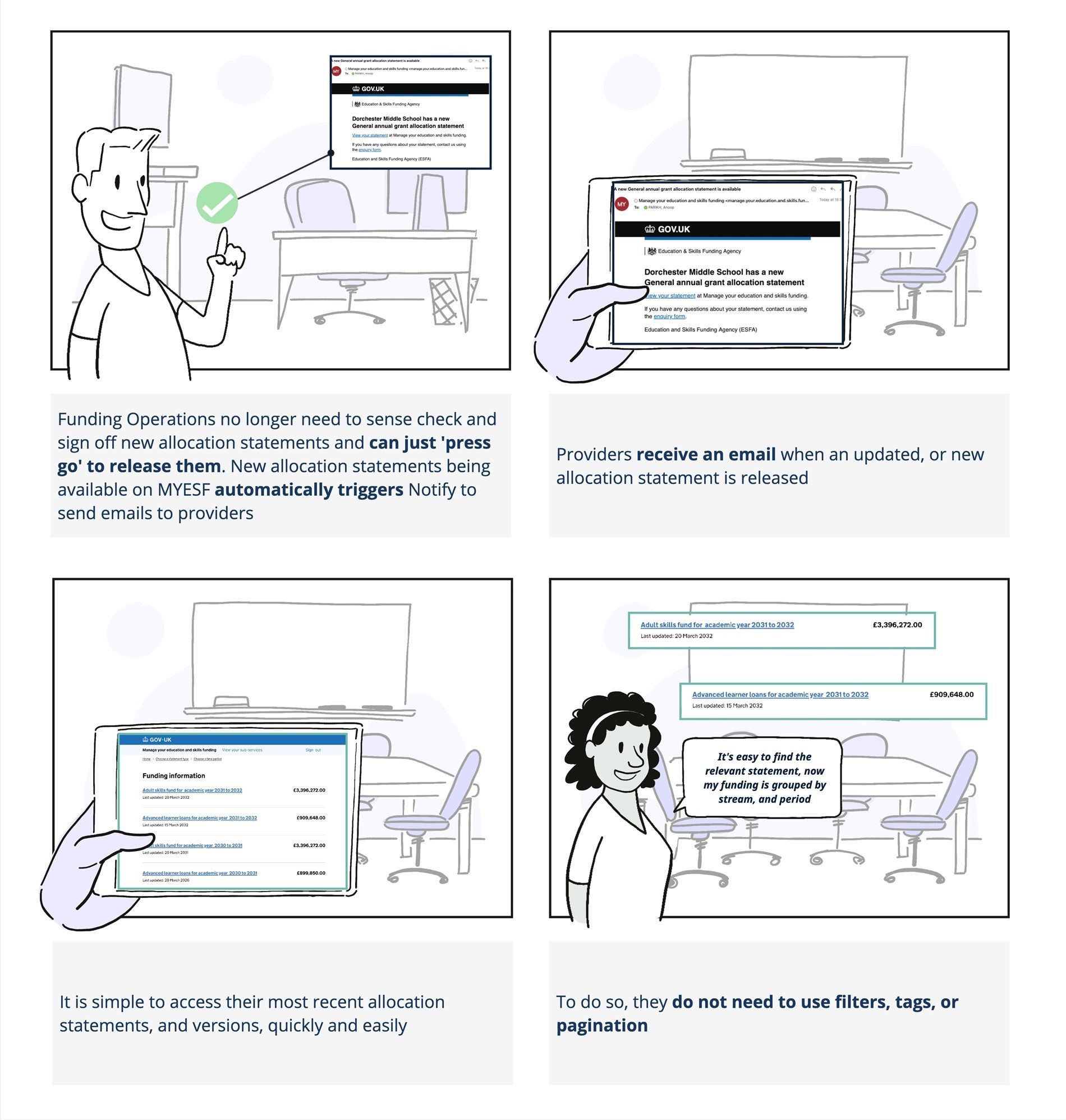
Story board example:
Frame 1 - “Funding Operations no longer need to sense check and sign off new allocation statements and can just ‘press go’ to release them. New allocation statements being available on MYESF automatically triggers Notify to send emails to providers”
Frame 2- “Providers receive an email when an updated, or new allocation statement is released”
Frame 3 - “It is simple to access their most recent allocation statements, and versions, quickly and easily”
Frame 4 - “To do so, they do not need to use filters, tags or pagination - ‘it’s easy to find the relevant statement, now my funding is grouped by stream and period’”
Next steps
We can now use this ‘narrative pack’ to help us communicate the impacts of our work to stakeholders as we look to roll out the data-driven pattern to funding streams beyond our adult funding beta group.