
As part of our work on the Get help buying for schools website, the digital team looked at how we present buying options to users and whether that could be improved.
What’s the problem?
Each category page on the website houses a list of links to products and services that schools can buy. For example, the ‘catering’ category page hosts links to procure things like vending machines, food and outsourced catering services.
Analytics showed that 70% of users who visited a category page don't select one of the buying options - they either exit or go elsewhere on the site.
Our hypothesis
We ran a card sorting exercise in spring 2026. Results showed that users expected to find guidance to help them buy goods and services on the relevant category page. For example, if they needed help writing a specification for catering services, they’d first visit the catering category page.
Based on that insight, we hypothesised that users may not be ready to buy goods or services on the category page and instead want more guidance on the procurement process and/or the right way to buy compliantly.
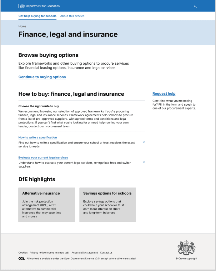
To improve the 30% clickthrough rate (CTR), we tested the hypothesis by designing a single ‘catch-all’ category landing page. This contained links to buying options as well as guidance and further learning.
Testing and insight
We conducted moderated user testing study with 7 participants from a mix of MATs and local authority schools. We asked them to navigate through the newly designed pages and talk aloud as they did so, probing them on their understanding of the page and what they'd do next.
We validated
- the value of providing users with guidance and support, especially for newer users
- the need for support/contact options at different points on the site (Request for Help)
We learned
- content is skimmed or skipped
- next steps are unclear, creating hesitation
- guidance doesn’t match what users expect
As a result of testing, we advised against progressing with the implementation of the page as it appeared to slow down users down at a critical point in their buying journey.
What we’ll try next
To improve the CTR of category buying pages, we’ve implemented a filter to help users refine results.
We’ve launched a survey on the current design to clarify pain points and understand what additional information users need to know before they consider a buying option, as well as the considerations that influence their decisions.
We will conduct a series of A/B tests on small design iterations to identify the factors that best help the user.