
During alpha, we introduced an eligibility self-declaration page to help users understand whether they could receive an early years teacher recognition payment before spending time completing a claim.
Our research suggested the approach helped users engage with the eligibility criteria. Since launching the service into private beta, however, analytics data showed that the way we ask the question may be creating an unintended barrier.
Why we introduced the self-declaration
During alpha research, we found that some users were unclear about the eligibility requirements, even after reading the guidance.
We worked with policy colleagues to introduce a self-declaration page containing two statements that users needed to confirm before continuing.
We deliberately used separate checkboxes. Asking users to actively confirm both statements was intended to encourage them to read and consider each eligibility requirement rather than quickly progressing through the service.
The approach performed well during research, with participants demonstrating a clearer understanding of what was required to make a claim.
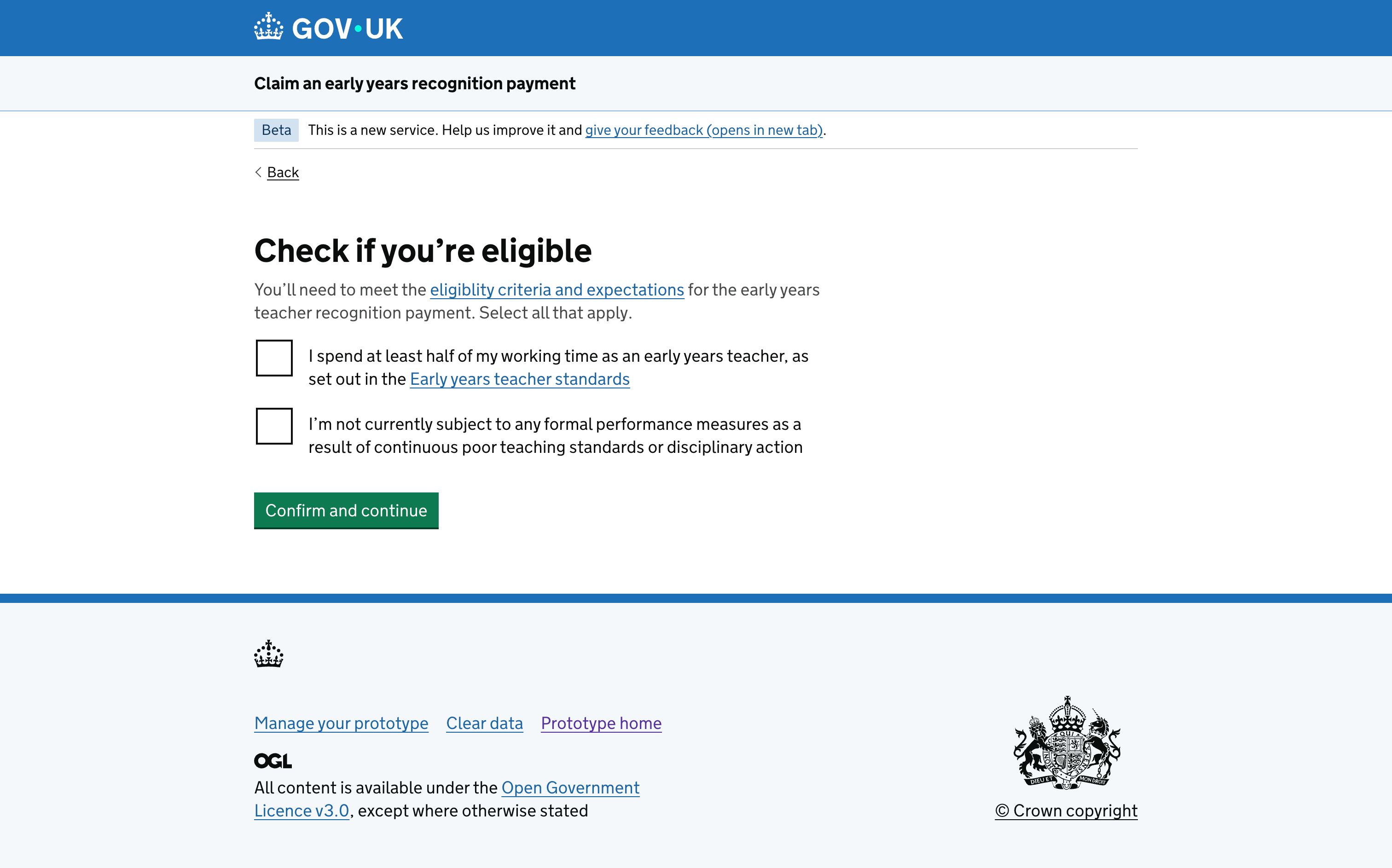
What we saw in private beta
Moving into private beta gave us an opportunity to understand how the design performed with a larger number of people using the service independently.
Using Google Analytics, we noticed that a proportion of users were reaching the 'You are not eligible' page after the self-declaration.
Our data showed that a few weeks after launch, 60% of users who selected only the first checkbox on the eligibility criteria page, and were subsequently shown the ineligible page, returned to the previous page and selected both checkboxes.
This behaviour suggested that some users were recovering from the problem themselves, but it was not the journey we intended them to experience.
Reconsidering the interaction
The original design deliberately required users to interact with both eligibility statements.
However, the evidence from private beta suggested that requiring two separate selections could be creating confusion rather than helping users understand their eligibility.
We therefore reconsidered whether we still needed users to interact with each statement individually.
We are exploring replacing the two checkboxes with a single radio question that allows users to confirm whether they meet the eligibility requirements.
This would reduce the number of interactions required to answer the question while continuing to present the eligibility information users need to make that decision.
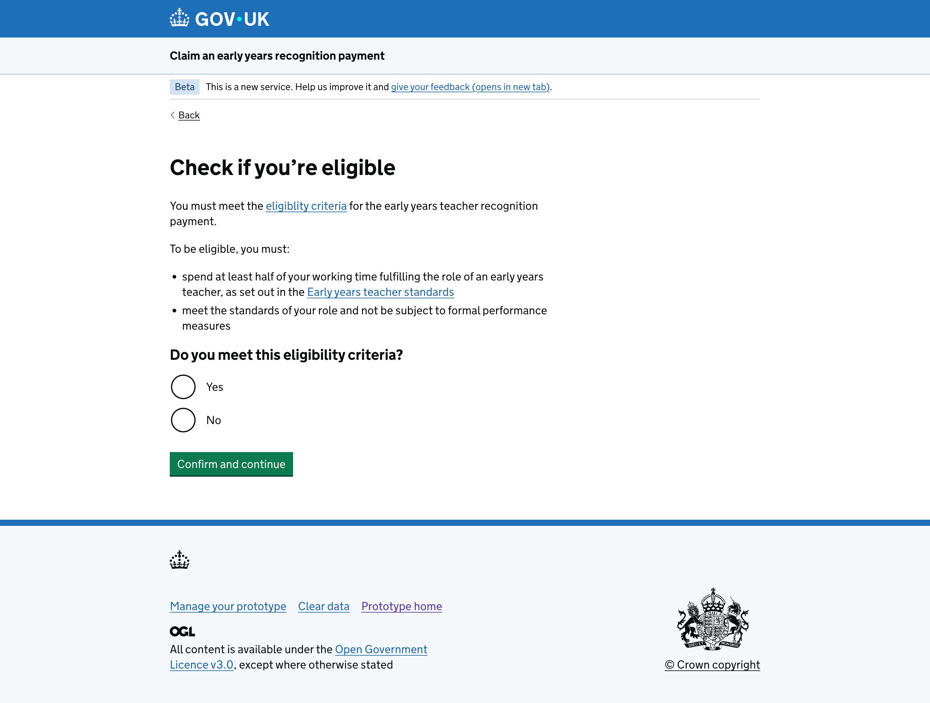
Balancing policy intent with user behaviour
An important part of this iteration has been returning to the intent behind the original design.
The two checkboxes were not arbitrary. They were designed with policy colleagues to encourage users to engage with important eligibility criteria.
The private beta data does not change that underlying need, but it does give us new evidence about whether the interaction we chose is the best way to meet it.
Rather than preserving the original design because it performed well during research, we are using evidence from the live service to challenge our assumptions and explore a simpler interaction.
What we'll look at next
We will continue to use analytics to understand how users interact with the eligibility journey and assess the impact of changing the question.
In particular, we want to understand whether simplifying the interaction reduces the number of potentially eligible users reaching the 'You are not eligible' page unnecessarily.
This is also a useful reminder that passing usability testing does not mean a design is finished. Research helped us make an informed decision during alpha, while private beta is giving us a different type of evidence about how that decision performs when used by more people in a live service.
Combining both helps us continue to improve the service as we learn more.