
Background
As part of post-MVP improvements, we mapped out screenshots of every journey in the service on a Lucid board. This let us see where inconsistencies had crept in and how we could fix them to create a more cohesive user experience.
These fixes included updating:
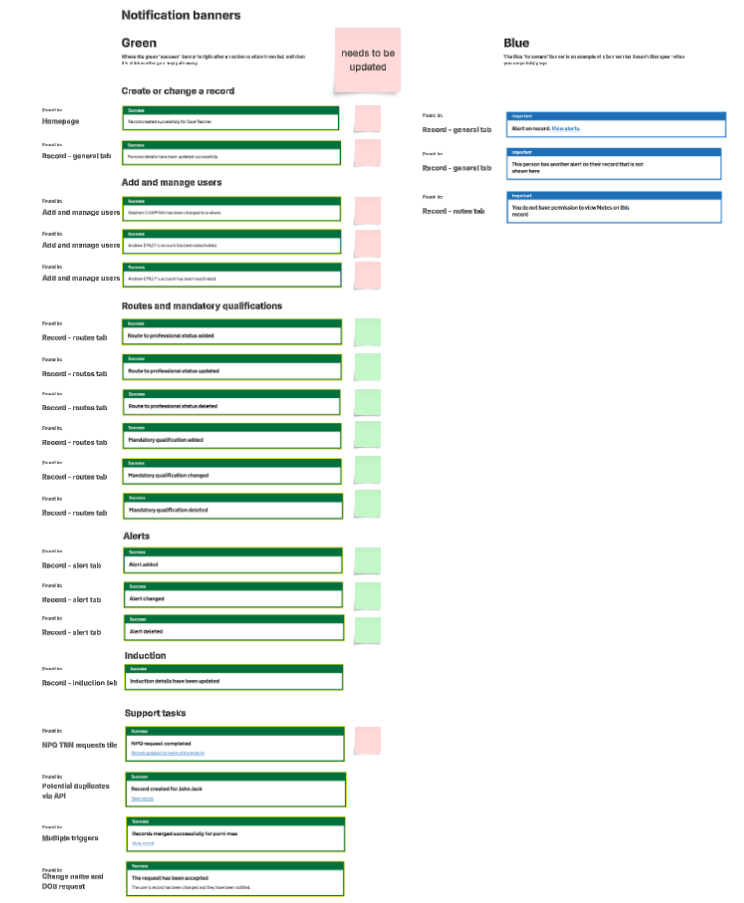
Notification banners
Notifications banners used a mix of body text, headings, link text and full stops.
We agreed that banners should:
- use headings as the primary text and body text for any secondary text
- have a link to the relevant teaching record (unless the user is already on the record page), and the link should open in a new tab
- not use full stops at the end of headings
Screenshot of Lucid board showing all banners in the service
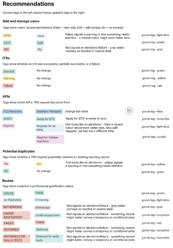
Tags
Tags in the service were a mix of upper and sentence case and used inconsistent colours, for example red tags (which denote an alert, error or failure) for neutral states.
We agreed tags should be written in sentence case and we updated colours where appropriate.
Add and manage users
We changed tag text from upper case to sentence case.
We also changed:
- ‘View’ from yellow (which is used elsewhere to denote a warning or that something needs attention) to light blue
- ‘No’ (which we use to mean someone does not have a certain permission) from red to grey, which better conveys an inactive or neutral state
APIs
We changed the ‘TCS Pensions’ tag to ‘Teacher’s Pensions’ as this was inaccurate.
We changed the tag telling users a request has come via the Apply for QTS API from ‘AfQTS’ to ‘Apply for QTS’ to make it more scannable.
We also split the ‘Register’ tag into ‘Register for an NPQ’ and ‘Register trainee teachers’ tags so users know exactly the API the request has come via. We used light blue and purple respectively for these tags.
Potential duplicates
We changed the ‘Yes’ tag telling users a TRN request potentially matches an existing record from pink (which looks close to the red tag, and hence an alert or error) to yellow, which denotes a warning or that something needs attention.
Routes statuses
We changed tag text from upper case to sentence case.
We also changed the following tag colours from red to:
- grey for ‘Withdrawn’
- turquoise for ‘Under assessment’, ‘Deferred’ and ‘Deferred for skills test’ to convey a temporary or conditional state
‘Failed’ is the only state that now uses a red tag.
Record status
We changed tag text from upper case to sentence case.
Screenshot of Lucid board showing old and updated tags
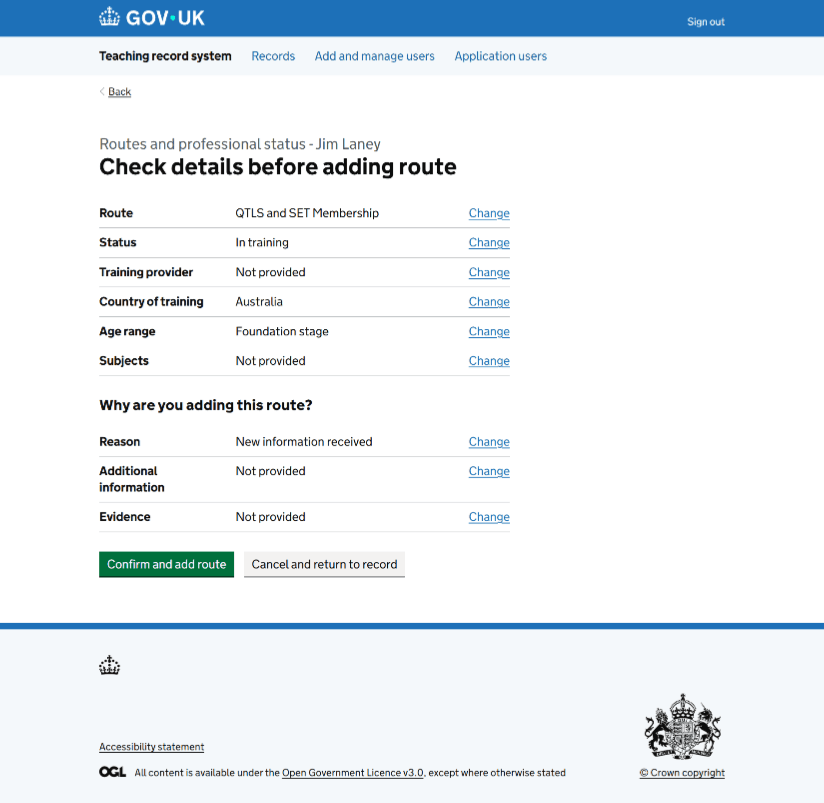
Check answers pages
We found several inconsistencies across check answers pages in both content and component use.
Summary lists vs summary cards
We were using a mix of summary lists and summary cards to display answers.
We agreed to:
- use the summary list component consistently for check answers pages
- use summary cards only when information is grouped or repeated, such as for multiple routes or alerts
Headings
Headings were inconsistent, with variations like ‘Check details’, ‘Check your answers’, and ‘Confirm you want to delete this’.
We agreed all check answers pages should use ‘Check details before [doing thing]’.
This aligns with the Design System example and clearly sets user expectation about the next step.
Change links
Some pages used ‘Change’ links inconsistently - some had one per field, others only one in the summary card header, and a few had both.
We agreed every value in a summary list should have its own ‘Change’ link to help users quickly navigate to the relevant field.
Buttons
Primary call-to-action buttons used inconsistent text such as ‘Confirm and [do thing]’ or simply ‘[Do thing]’, for example ‘Add alert’.
We agreed to standardise this as ‘Confirm and [do thing]’.
This makes the action explicit and consistent across the service.
Cancel buttons
Secondary buttons also varied between ‘Cancel’ and ‘Cancel and return to record’.
We agreed to:
- use ‘Cancel and return to record’ when cancelling returns the user to a record page
- use ‘Cancel’ alone when returning to a support task list or equivalent
This keeps language consistent while reflecting the user’s actual destination.
‘Reasons’ questions
We found inconsistency in how we displayed and labelled questions about why a user did something (including evidence and additional information).
We agreed these questions should appear as a separate section titled ‘Why are you [doing thing]?’, for example ‘Why are you adding this route?’.
Labels were also standardised to:
- ‘Reason’ for the main reason
- ‘Additional information’ for the follow-up question, ‘Do you want to provide more information?’
- ‘Evidence’ for any uploaded evidence
This creates a predictable pattern for all reason-based questions.
Example of updated check answers page
Next steps
These changes have been or will soon be built into the service.
We’ll continue to monitor for any remaining inconsistencies and ensure future designs follow the agreed guidelines.
As the service evolves, we’ll keep reviewing components like banners, tags and check answers pages to make sure they remain consistent, accessible and aligned with the Design System.