
Summary
We added a GOV.UK notification banner warning users that the content has been translated using AI. We added this to every translated page so the disclaimer appears where people need it, and in the translated language.
Why we did this
25–30% of care leavers aged 17–21 are former unaccompanied asylum-seeking children (UASC). Our assumption is that a significant proportion of these young people speak English as an additional language or speak no English at all, therefore there is a need for the information to be available in their language.
This is why our service includes a translate function. Users can read pages in their preferred language. This function uses AI so there is a risk that the generated content could be incorrect.
We found that users could miss the existing translation warning. The disclaimer only appeared on the languages page (which is written in English). This was a problem because the languages page is one of the few pages where AI translation is not enabled.
That meant users could land on a translated page and treat the content as fully accurate. We could not guarantee accuracy, so we needed a clear warning to reduce misunderstanding and overreliance on the information shown. Because this was an urgent priority, we needed a solution that was:
- quick to implement
- consistent with GOV.UK patterns
- easy to remove or change later
Understanding the Need
Comments from our feedback form submissions told us that this was something we needed to address. The information we deliver could have a real impact on user’s lives. Translation errors could affect someone’s understanding of this support and how they can access it and therefore could impact their ability to access support they need and are entitled to. That meant a visible disclaimer was proportionate, even if it added friction to an overall user journey.
Our design process
Working at pace
We needed to find a solution that could be achieved with the skill set of the team in place, and that could be delivered quickly, therefore we focused on a solution that was:
- proven (an existing pattern)
- implementable with minimal design and build effort
- easy to iterate based on evidence
Collaborating closely with development
We worked closely with a frontend developer to confirm what was technically possible quickly, including:
- where we could place a banner without breaking layouts
- how to ensure it displayed only on translated pages
- how to avoid disrupting the user journey
Collaborating with other teams
We made use of open and collaborative working, by asking other design professionals outside our immediate team to advise on final design. This gave us the opportunity to consider any design implications we may have missed.
We also reached out to designers who had worked on the project previously to give us context to the existing choices and advice on the new solution.
Understanding the existing choices helped us to quickly understand the context we were working in, enabling us to speed up ideation as we weren’t spending a long time trying to work on solutions that would not be feasible.
Options we explored (and why we did not use them)
We explored a variety of options as part of the design process. Some of the main options included:
- Sending users back to the languages page to see the warning before they then continued their journey
- We considered this because the existing warning was already there.
- This wouldn’t work because it was technically complex (we would need to translate the list of languages) and currently AI translation wasn’t set up for this.
- We thought it could disrupt the journey by taking users away from the page they wanted to read and they would have to renavigate to it.
- Building a new page that users are directed to after they select the language for translation
- We considered this because we felt it would be easier for users to take notice of the warning as it interrupts their journey
- We didn’t opt for this solution as it felt intrusive to the user. As an option this was more complex to build and maintain. We also didn’t feel as if there was enough content to the warning to warrant a single page.
Option we chose
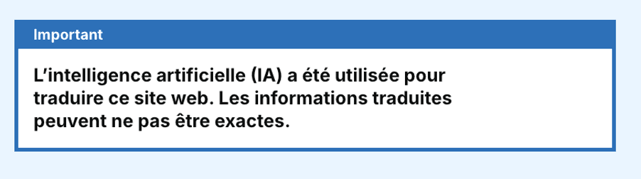
Add a banner to every translated page
- We chose this option as it’s consistently visible at the moment the user reads translated content. It goes before the title on the page so it covers everything underneath it.
- We identified some risks or shortcomings to this option. We felt that it could feel repetitive for a user, especially if they are consuming lots of pages. However, we judged that shortcoming as acceptable because the warning is important. There’s also evidence the warning banner can be missed, therefore repeating it on every page helps avoid that. The solution was not too technically complex and is easy to remove and change later if evidence shows it is too disruptive.
- We chose the GOV.UK Design System notification banner component to avoid inventing a new pattern.
The Outcome
Using an existing GOV.UK component
Why this option worked for us
- The disclaimer appears where the risk occurs (on translated content), not on a separate page
- The disclaimer now can be translated in the language the user is using
- The pattern is used widely in other services meaning it would be low risk when adopting it and has already been tested for accessibility and function
What we checked
We tested translation of the banner message in our top identified languages for UASC (unaccompanied asylum-seeking children). We did a quick accuracy sense check using Google Translate by translating the translated content with Google Translate. We got good results – the warning was clearly translated. This gave some confidence, but we are aware of the limitation that without being able to speak these languages, we’re relying on further translation tools to understand accuracy.
We’re also aware of the fact that using translation services twice can result in less effective translations. We also don’t use Google Translate on our service, so it does not guarantee the same output as our service translation. We’ll continue to work on how we can test the accuracy of using AI translation.
Next Steps
We want to assess translation quality more systematically across priority languages and high-risk content.
We also want to measure impact of the banner use in analytics, including:
- changes in Translate usage
- bounce/exit rates on translated pages
- repeated language switching (possible sign of confusion)
We also want to explore longer term solutions in opportunities to promote understanding, such as:
- improving the accuracy of AI translation
- exploring available modification of AI tools
- finding out more about the needs of our users who speak limited or no English and how we can best meet them