
Post-alpha changes
Following the alpha phase, several changes have been made to the prototype designs for secondary schools. Some were necessary to align with best practices, GDS style guidelines, and ensure consistency across the service. Other changes aimed to improve the overall usefulness of the design for users. These designs have been tested in a further round of research before deciding what is ready for MVP in the build.
General changes
To ensure consistency with other services and GDS guidelines, we have updated the page header and footer to the latest style and changed the phase banner to beta.
Onboarding journey
The onboarding journey has now been created so school users can see their own individual school as well as search for other schools. This allows those working across multiple schools to have access to all of the information they need. As people can now view multiple schools, it was necessary to change all mentions of 'My school' to 'This school' to avoid confusion.
Compare section
This section allows users to compare their school's academic performance with local, national, and similar schools.
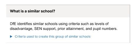
Similar schools panel
A new panel has been added to the 'What is a similar school?'. This was introduced because users were missing this content. During testing, users would ask on what basis their school was being compared later down the page. Highlighting this section helped users to understand the basis of comparison, increasing their confidence in the results.
GCSEs by subject graphs
Previously, only combined English and maths results were shown, as this is the current headline measure. We've now added a tab called 'GCSEs by subject' that breaks down performance in:
- English literature
- English language
- maths
- combined science (double award)
- biology
- chemistry
- physics
This provides a more detailed view and supports consistent comparisons across schools. This tested well as users wanted as much detail as possible about how their school is performing.
Key opportunities for growth
During testing we created an area called 'Key opportunities for growth' which provides a snapshot of key areas where schools can improve compared to similar schools. The area is useful for inexperienced users as it highlights the biggest areas of improvement that can be made by the school and which similar schools they could reach out to who are performing better in these areas. It also allows for high-performing schools to find further areas of improvement as the comparison can become very granular it will always show some area to improve on.
After testing it was decided that this component needs further research and iterations. This is to ensure that users understand the purpose of the key opportunities and how the data is generated. We also need to consult with a data analyst about how the functionality will work before building.

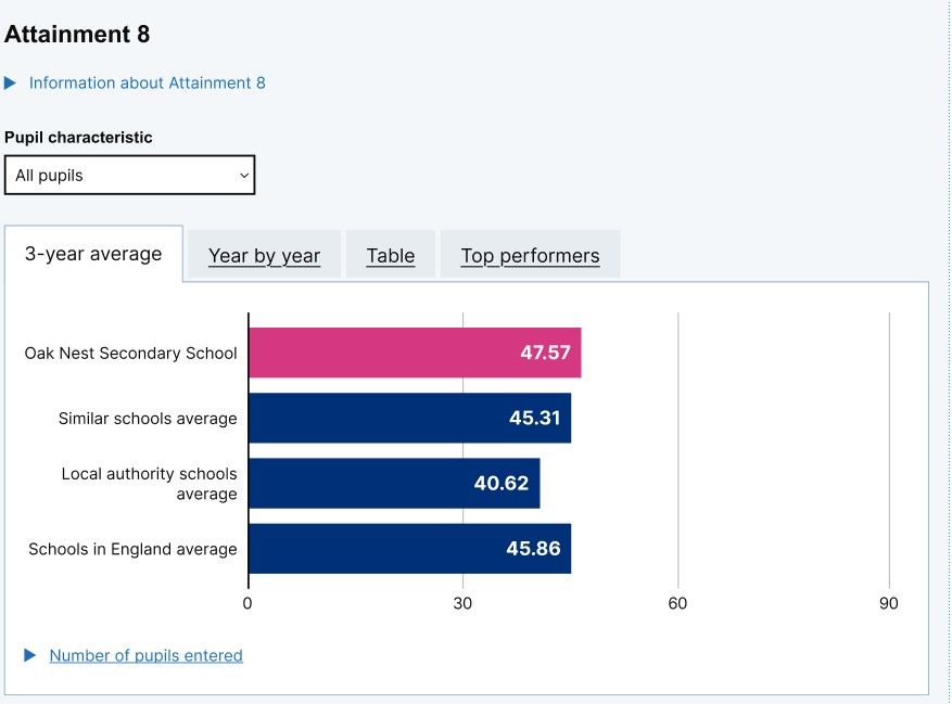
Graph changes
All of the graphs used have been simplified. This included simplifying the headings of the graphs to make them more readable and reducing the unnecessary filters.
Top performers tab
A new tab shows the top-performing similar schools for each measure. This helps users identify high-performing peers and links clearly to the Connect pages, encouraging them to reach out to other schools. In testing, users found this a helpful way to identify schools to learn from.
Progress 8 graph
The Progress 8 graph and table have been updated, and the 'progress over time' charts have been removed. The previous charts were misleading, as they could not accurately represent confidence intervals over time. The new visualisation was well received as users found it clear, easy to interpret, and helpful for explaining to governors. Currently these will not be able to be displayed as there is not enough data to visualise due to the disruption of the pandemic.
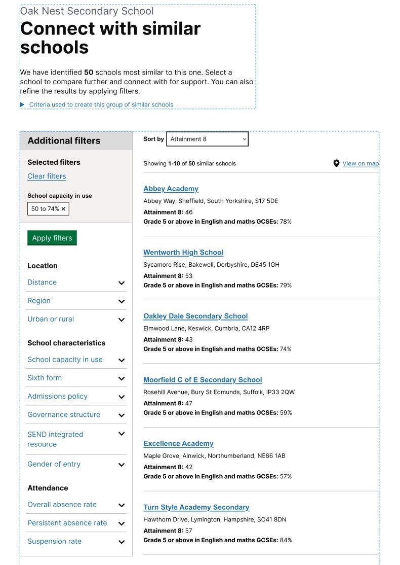
Connect section
This section helps users filter and find similar schools using the same algorithm as the Compare page. Users cannot change the initial comparison but can refine results further. This and the number of filters has been reduced to simplify the journey. During testing, users were satisfied with the number of results they were being shown and did not expect to further customise the algorithm.
Layout changes
The section was previously called 'Find' and has been renamed 'Connect' to better reflect the intended action which is reaching out to similar schools.
The results format has been changed from a table to cards. This was intended to encourage users to click into individual school profiles. However, users still perceived this as a comparison tool and didn’t explore further. More design work is needed to clarify that profiles are clickable.
A map was added to help users understand the geographical distance between their school and similar ones. This tested well with users who told us that distance and location was an important metric when considering connecting with other schools.
Find out about section
This section shows more information about a similar school including its similarity, its results and information about the school.
During testing users wanted to compare similarity before exploring school details. Therefore, this section was given its own tab and has been put first in the order of tabs to reflect what users expected to see.
Graphs were added for headline measures and core GCSEs to give better visualisations of the comparisons between schools.
The local authority was also added to the school details to align with GIAS and CSCP data.
Contact details were moved higher on the page to reflect their importance and to encourage users to contact other schools. This change tested well. Users said they would contact schools after reviewing similarity. However, further iterations are needed to make the contact information more visible in the journey.
Next steps
The features that performed well in testing will now move into the build phase for the MVP. Since this build focuses on the secondary school version of our designs, the next step will be to develop and test a primary school version in preparation for future testing.