
Primary post alpha MVP designs
After completing the secondary school MVP designs for private beta, we shifted our focus to creating designs for primary schools. These designs have undergone a round of user testing and are now ready for development. The initial format closely followed the existing secondary designs. However, testing revealed the need for several changes to page layouts and navigation to improve the overall user journey.
Vertical side navigation
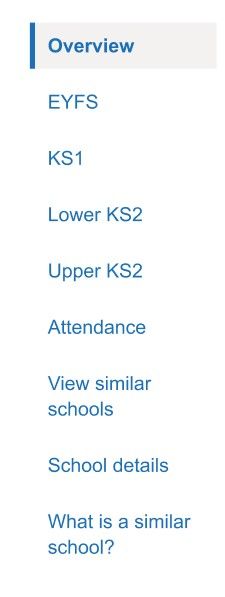
Users were getting stuck when moving from comparing school performance to viewing individual schools to connect with. To address this, we changed the navigation from a horizontal layout to a vertical one. This creates a more natural, step-by-step journey, and during testing it helped users understand what action to take next. It also aligns our design with the public-facing service, ensuring consistency.
Phase tabs
During testing, it became clear that users struggled to find some of the comparison data they wanted to view due to the navigation tab names and how we had organised the data. Initially, we grouped all measures that primary schools are judged on under a tab called headline measures. This included metrics such as:
- Pupils meeting the expected standard in reading, writing, and maths
- Pupils achieving a higher standard in reading, writing, and maths
- Average score in reading
Then any other measures, such as early learning goals, phonics screening and the multiplication tables check were put under a tab called additional measures.
This created confusion as at-a-glance users felt we were missing data that they wanted to view which were not headline measures. This information was available but sat under a tab they either did not see or understand as an additional measure.
To resolve this, we reorganised the tabs to follow a phase-based structure showing all of the measures under their phase of education, which better aligned with users’ mental models. The new order is:
- Early Years
- Key stage 1
- Lower key stage 2
- Upper key stage 2
- Attendance
This structure proved more intuitive for users, as they felt they knew where all of the measures would sit and could find everything they were looking for. It also encourages school leaders to look for school improvement insights at all levels of the school.
Find school
The ‘Change school’ link, which allows users to switch the school they are viewing data for, has been renamed to ‘Find a school’. This change was made because users landing on the website for the first time did not understand the term ‘Change school’, as they had not yet selected a school. ‘Find a school’ is clearer and better reflects the action users need to take.

What is a similar school?
Users were confused about how their school was defined as similar. While we initially placed the definitions at the top of each page in an expanding element, users were missing the information. To have expanded this information would have taken up significant space on every page. To solve this, we created a separate page dedicated to explaining the criteria for similarity. This page is accessible via a link in the navigation, allowing users to explore the information in as much depth as they need. This change tested well as users were able to explore how similar was defined whilst not creating a distraction at the start of each page.
Overview page
Due to the navigation change we have introduced a new overview page to replace the old homepage. This page helps users orient themselves and understand what information they can access. Additionally, we removed the icons from the journey, as users mistakenly thought they were clickable links.
Next steps
The features that performed well during testing will now move into the build phase for the primary MVP. The next round of design testing will focus on all-through schools, combining elements from both primary and secondary designs. This approach will allow us to evaluate how the two sets of designs work together and ensure a consistent user experience across the service.