
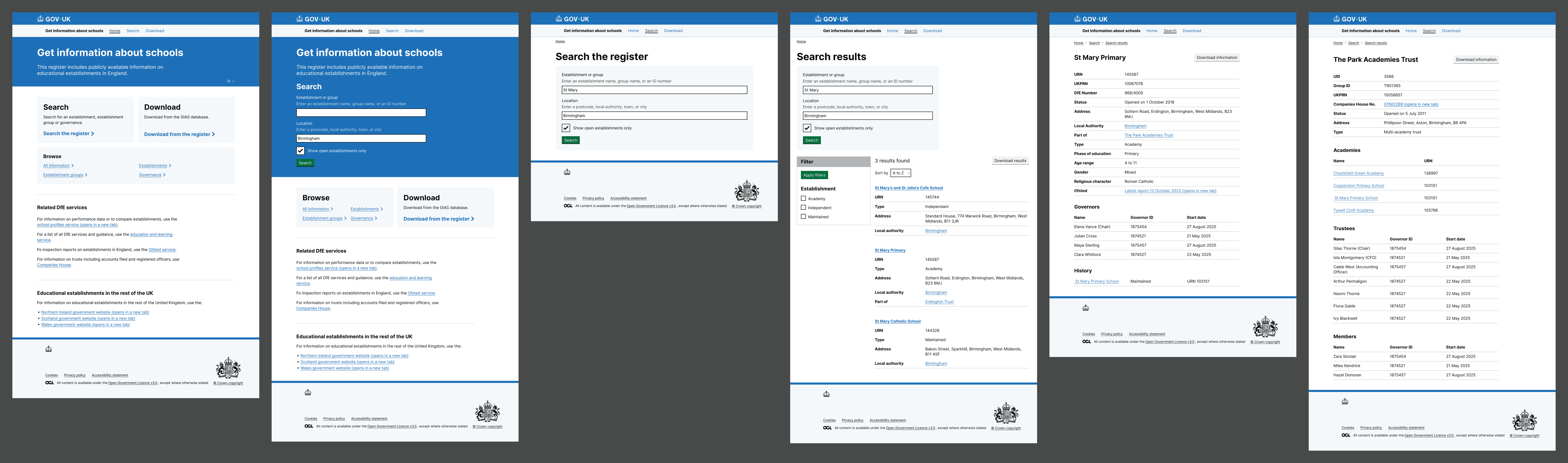
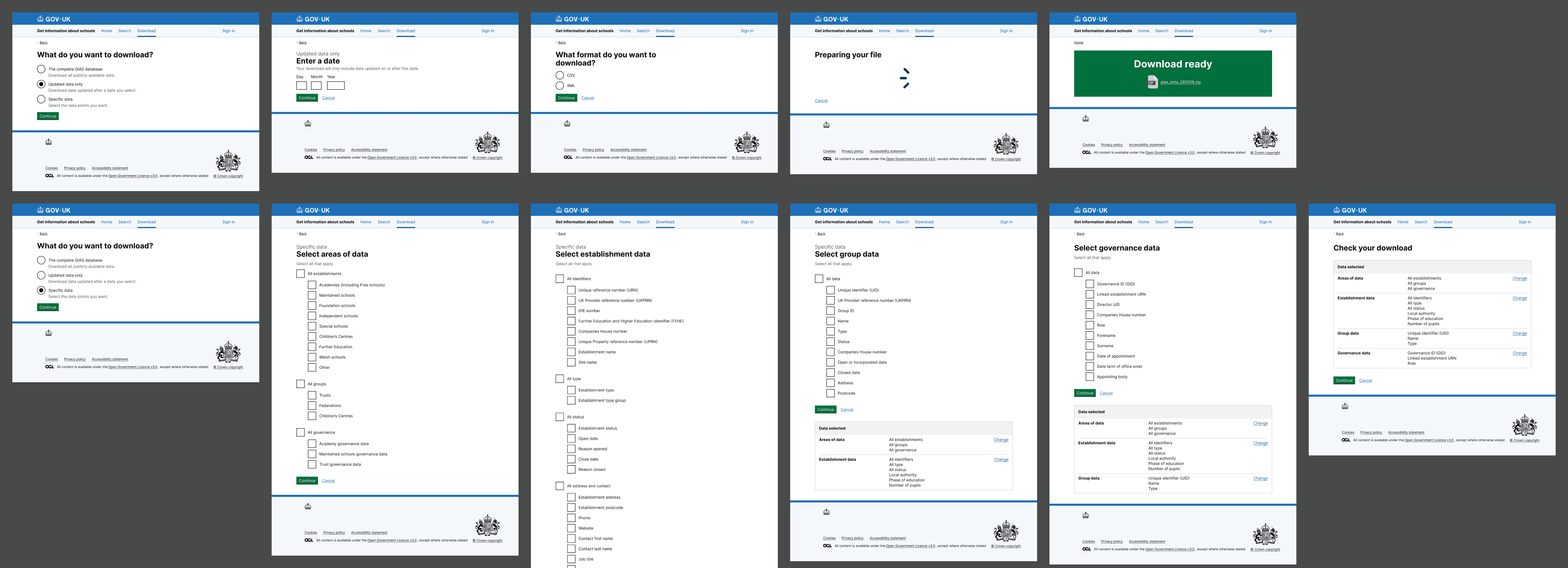
This prototype was a significant step change. Working in Figma for the first time this project, we moved away from focusing on only the search flow and this time included a revised download flow too.
The home page was redesigned to explain what GIAS is and how it relates to other services. Two variants were built for testing: one search-led, one giving equal prominence to search and download.
The search field was split into two: one for names and ID numbers, one for location.
Establishment and group pages were expanded to include all legally required and operationally required data, along with governors, trustees and members.
The revised download flow was designed from scratch for the first time. We introduced the option to download updates since a specific date, and the option to select specific data fields. These were a direct response to the widespread behaviour of downloading everything and manually editing it down.
What we found
The most significant finding was not about any single design decision. It was about who uses GIAS and what they actually need from it.
Round 4 confirmed that GIAS serves two fundamentally different audiences.
- Heavy data users such as analysts, policy teams, and data engineers who treat the service primarily as a data source. They download large datasets, manipulate them locally, and use the interface mainly to check or investigate individual records.
- Occasional lookup users visit GIAS to find information about a specific school or trust.
Both groups want speed, but they mean very different things by it.
The clearest message from the research was that users want fewer steps, not more capability.
Homepage and search
The dual-field search worked well and aligned with existing user behaviour.
The card-based home page created a tension: users who wanted to search immediately disliked the extra click, while users focused on downloading preferred the layout. A genuine split between the two audience types.
Terminology caused friction throughout. establishment and group were regularly questioned. Users were unsure whether establishment meant school or whether group meant trust. Open establishments was also ambiguous. Open today? Currently active? What's a closed trust?
Downloads
The custom field selection approach was not so popular with users. Even those we thought most likely to use it still preferred to download everything and filter locally. They found field-by-field selection more of an effort than the routines they already had in place. A couple of users did say that they might be interested if they could save their selections as a download profile, but this would require them to be signed in.
What participants consistently asked for instead were presets. Named download packages for common use cases such as all establishments, trusts, governance, contacts or phase-based files. This looks likely to serve both technical and non-technical users more effectively than granular selection.
There was strong demand for an API among analyst users. Many existing workflows are already automated.
Historical snapshots are seen as important, particularly for policy and audit work where some users want to download data as of a specific point in time.
Establishment pages
These were generally well-received. The hierarchy was considered logical and most key information was present.
The most common additions requested were
- headteacher
- nursery provision
- SEN provision
- PRU information.
School history was considered essential by some users but was frequently missed in its current position. It needs to sit closer to the status information.
Data quality
Among analyst users, concerns about data integrity overshadowed feedback on navigation and design.
Duplicated URN records, successor/predecessor inconsistencies, incorrect trust relationships and missing leadership information all generate manual cleanup and workarounds.
One participant had built their own tool to clean GIAS data before use. This is a significant issue that sits outside the scope of the prototype but can't be ignored in the broader service strategy.
What comes next
- Keep search and download equally visible
- Replace field-by-field download selection with named presets
- Add phase filtering and address the broader terminology issues throughout
- Surface school history more prominently on establishment pages
- Begin scoping API access as a longer-term priority for analyst users