
In the Find user insights (FUI) service we had a page called 'Guidance' but users either missed it or expected something different when they clicked it.
The word 'guidance' set an expectation of advice but FUI is an AI service for finding research, not providing advice.
This gap between expectation and reality created confusion before users even started:
“The guidance page is different to what I expected.”
“It feels like a help or trouble-shooting list than guidance - not really guiding anything.”
The original guidance page:
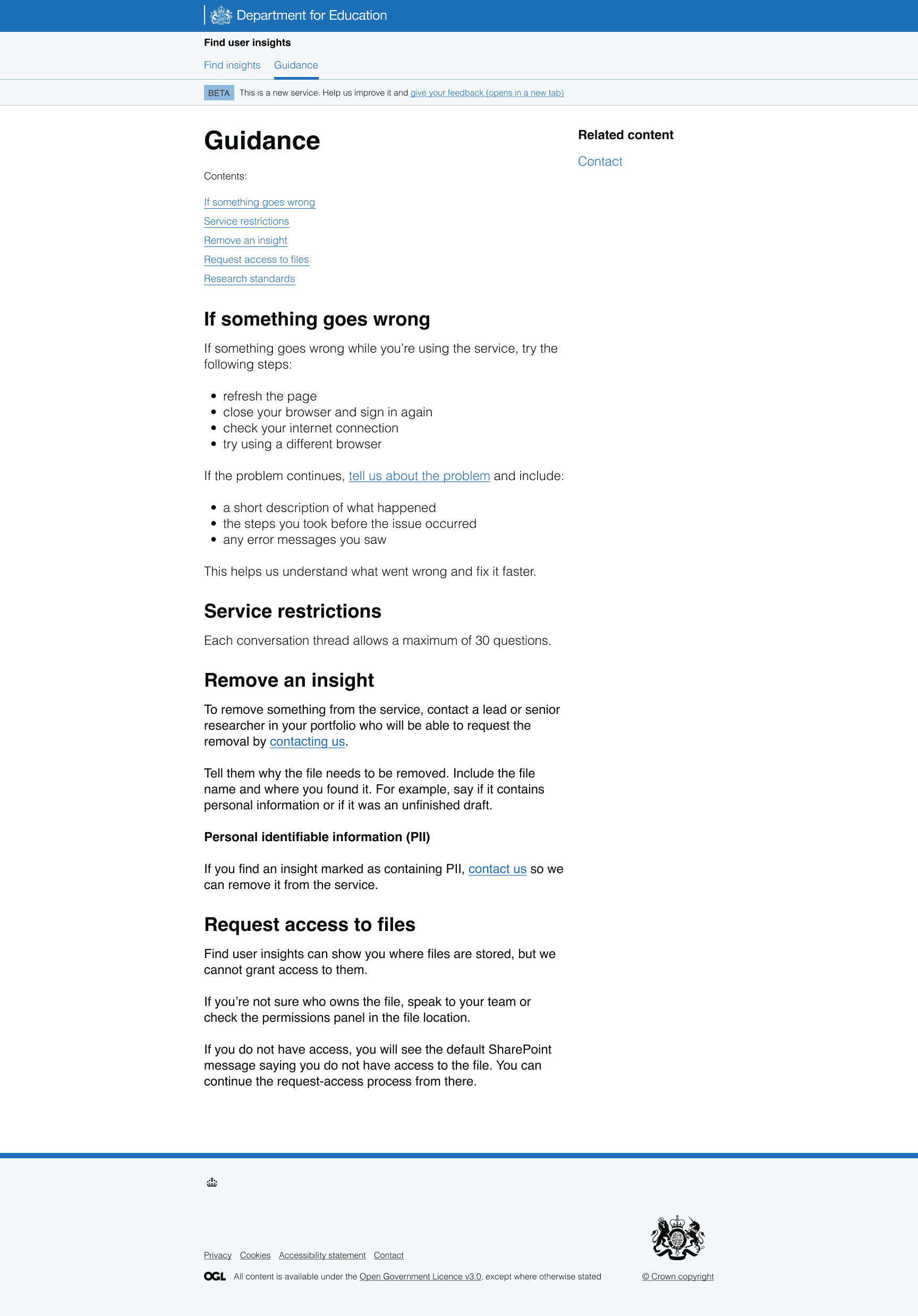
When guidance does not match the moment
The page combined several types of content: how to use the service, what to do if something went wrong and other operational instructions.
In research users told us some of this did not belong upfront.
For example, the page showed error-related content and solutions such as refreshing the page or checking an internet connection. Users questioned why they needed this at that stage:
“This content feels more relevant later, when it actually happens.”
At the same time, users responded better to task-focused guidance, such as how to remove an insight, because it felt more appropriate in this context.
The problem was not the content itself, but when we showed it.
A deeper problem: trust in the research
Alongside usability issues, we saw a bigger concern: users needed more confidence in the research itself.
In early research, users were unsure what they could do with the research:
“Can I use it or not?”
To address this, we explored adding more reassurance about reuse and limitations. In an intermediate version of the page, we added content such as:
'All research in the service has been approved for reuse. However, check the context, evidence and limitations before using it.'
We reviewed this version in a design critique. While the changes helped clarify expectations, they also raised a new question: what did 'approved research' actually mean?
“Approved research... from who?”
This showed us that simply labelling research as 'approved' was not enough. Users needed to understand how research was selected, checked and validated.
We changed the framing
We moved away from the idea of a general guidance page and reframed the page around helping users understand the research behind the service.
We explored an intermediate version called 'About the research' during a design critique.
The intermediate version of the Guidance page with the new title 'About the research':
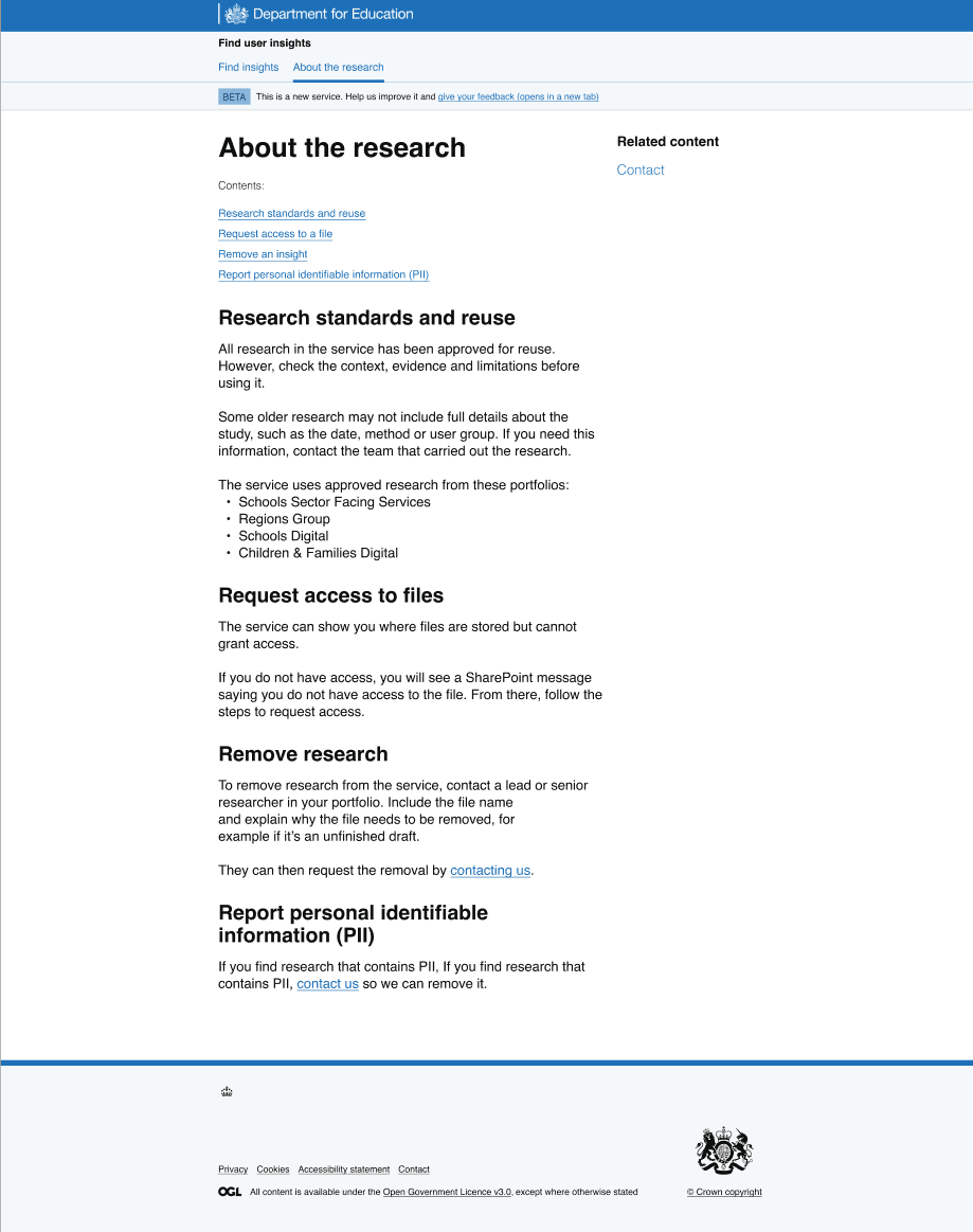
This was clearer than 'Guidance', but the design critique showed that the title was still ambiguous. Some participants were unsure whether it referred to research conducted about the service or something else:
"The current title is a bit misleading, I wasn't sure whether it was about research conducted on the service or something else."
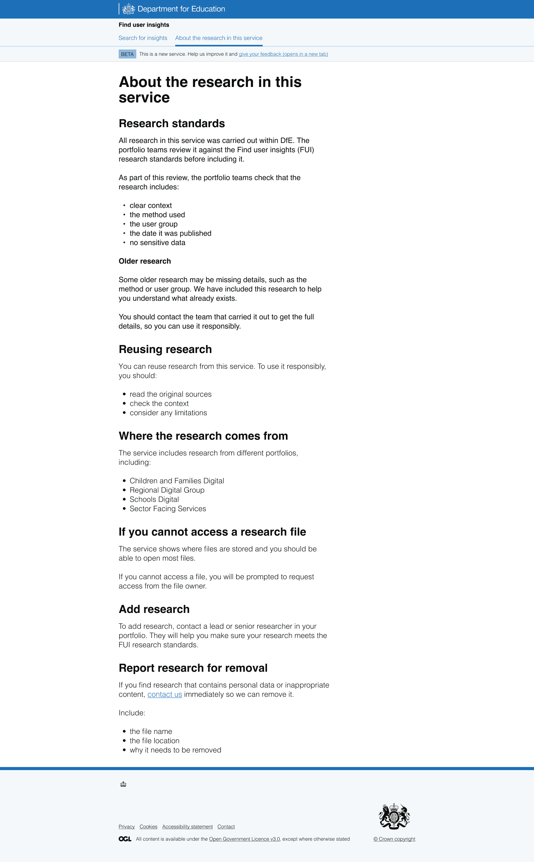
This led us to refine the title further to 'About the research in this service', making it clearer that the page explained where the research came from and how it was used.
The new version also focused more on where the research comes from and the standards it meets.
This changed the role of the page in the experience.
We then:
- linked to the page from the homepage so it was easier to find
- added clear information about research processes and quality standards
- explained how we check research before adding it to the service
This helped users build confidence in the research itself, not just the interface around it.
As one pilot user said:
“Nice. OK this is good as it's telling you where the research is coming from. This is good as I wanted some clarity on that.”
The redesigned 'About the research in this service' page:
Moving from upfront guidance to in-the-moment support
We also changed how we handled 'what could go wrong' content.
Previously we showed this upfront but we saw it added unnecessary weight for users at the start of the journey.
Instead, we provided guidance at the point users experienced an issue.
To do this, we:
- reviewed error scenarios with developers (system, user input, and AI behaviour)
- focused on user impact rather than technical causes
- moved from upfront explanations to contextual guidance shown when needed
- applied existing GOV.UK design patterns where possible
- designed new patterns for AI-specific scenarios where no pattern existed
Now, instead of preparing users for possible issues in advance, the service responds when something actually happens and tells them clearly:
- what has happened
- what they should do next
What we learned
This work reinforced two things.
First, we saw that too much upfront guidance added unnecessary weight to the experience. Users engaged better when we reduced early complexity and showed support when it was relevant.
Second, trust does not come from labels like 'approved.' It comes from understanding. When users understand how research is selected, checked, and validated, they are far more likely to trust the research and the service overall.