
We faced a balancing act on the Find user insights (FUI) homepage. The challenge was finding the right amount of information to help users understand the service without creating unnecessary friction.
We started with a simple interaction model
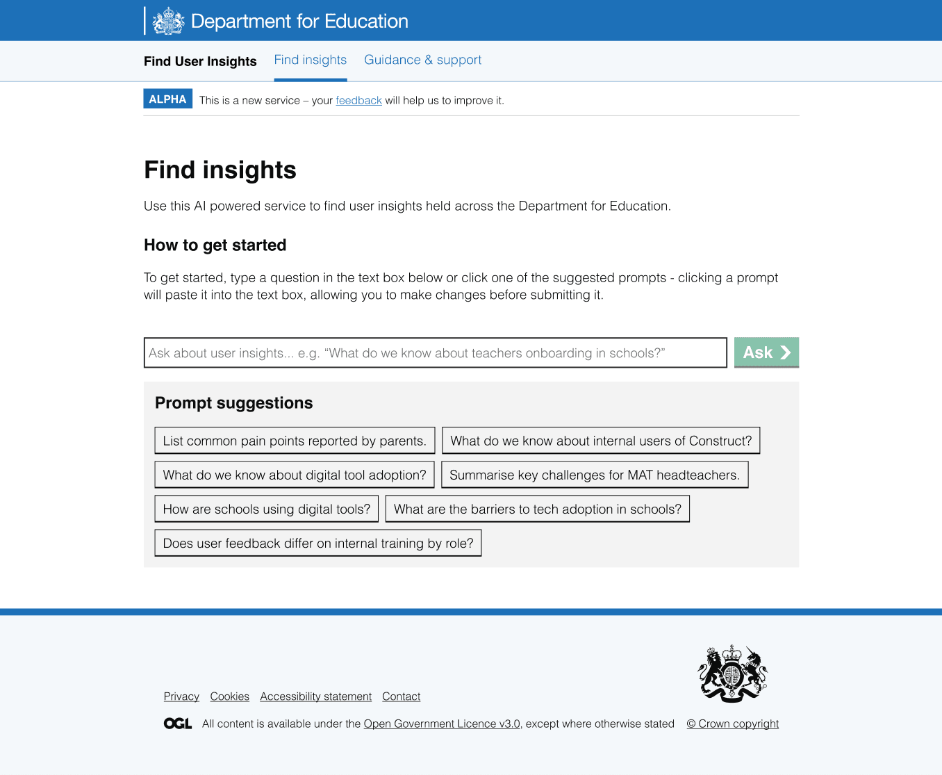
At the end of alpha, we had a very simple setup: users could go straight into the service.
This reduced friction, but user research showed that some people still wanted more context before starting:
“I expected it to go into more detail on what it does before you can jump into the chat”
The model we had at the end of alpha:
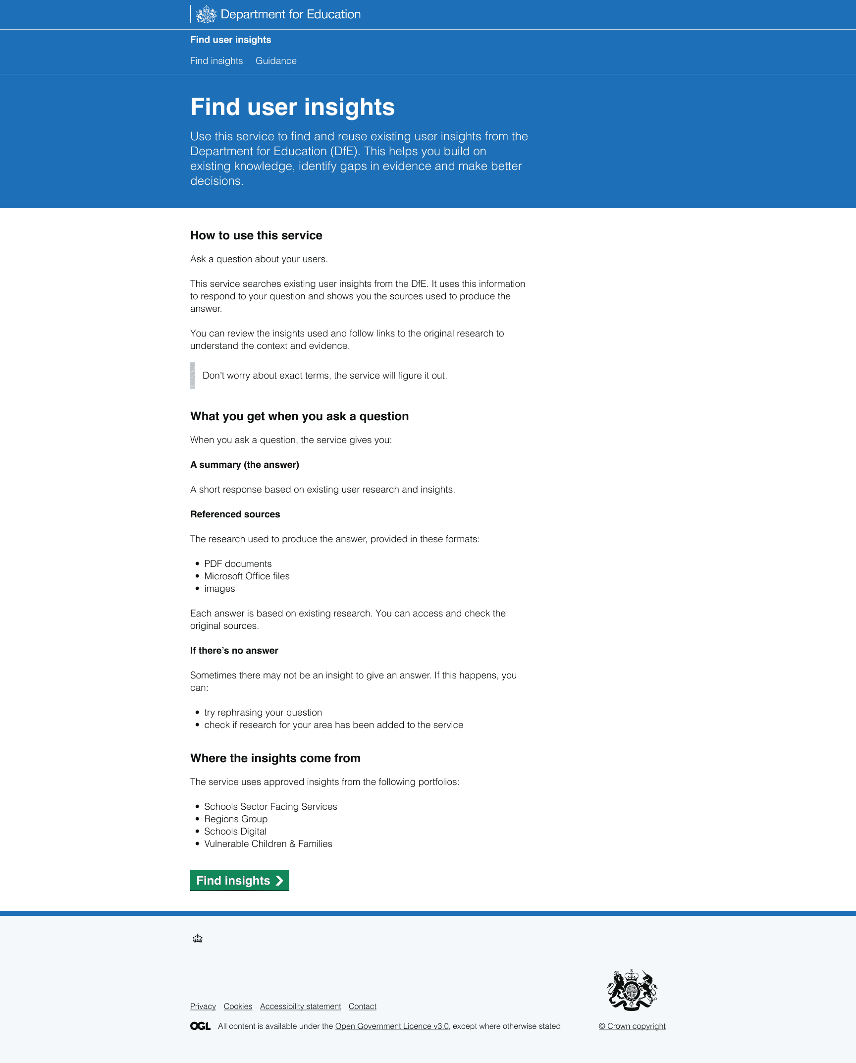
In response, we added a homepage that explained the service and set expectations upfront:
When more information became overwhelming
Users appreciated having additional context, but research showed that the homepage had become overwhelming:
"It's a long, long page of text with lots of information."
Users said they had too much to read before getting started and colleagues at the design critique questioned whether all the content was needed at this stage in the journey:
"Are users really bothered about the format [of research files] at this stage?"
Testing with neurodivergent users also showed that heavy scrolling caused fatigue and made it harder to engage. Many preferred to start immediately and learn through use:
"I like to 'do' first, I want to learn as I do it."
We explored how much we could shorten the homepage
User research showed that the homepage contained too much information before people could get started. To understand how much content was really needed, we explored a more radical simplification of the page.
We created a much shorter version of the homepage and reviewed it alongside the existing version in a design critique.
The critique showed that neither version was quite right. The original homepage provided useful context, but contained too much information for users who wanted to get started quickly. The shortened version reduced cognitive load, but removed too much context for people who wanted to understand the service before starting.
As one design critique participant said:
"I agree with the direction to simplify and keep the content minimal, but perhaps this is less content now than is needed to succeed."
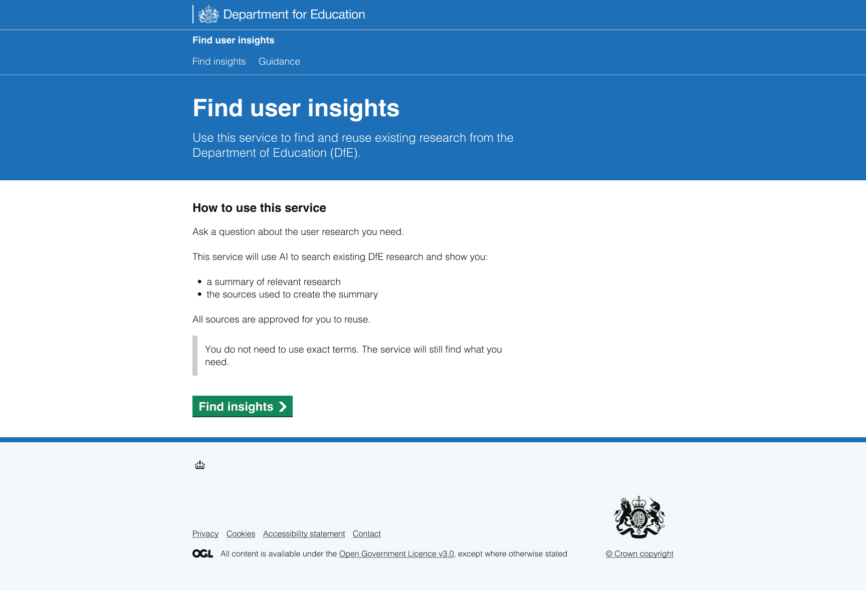
This helped us find the right balance. Rather than simply removing content, we reviewed every section of the homepage and asked a simple question: do users need this right now?
As a result, we:
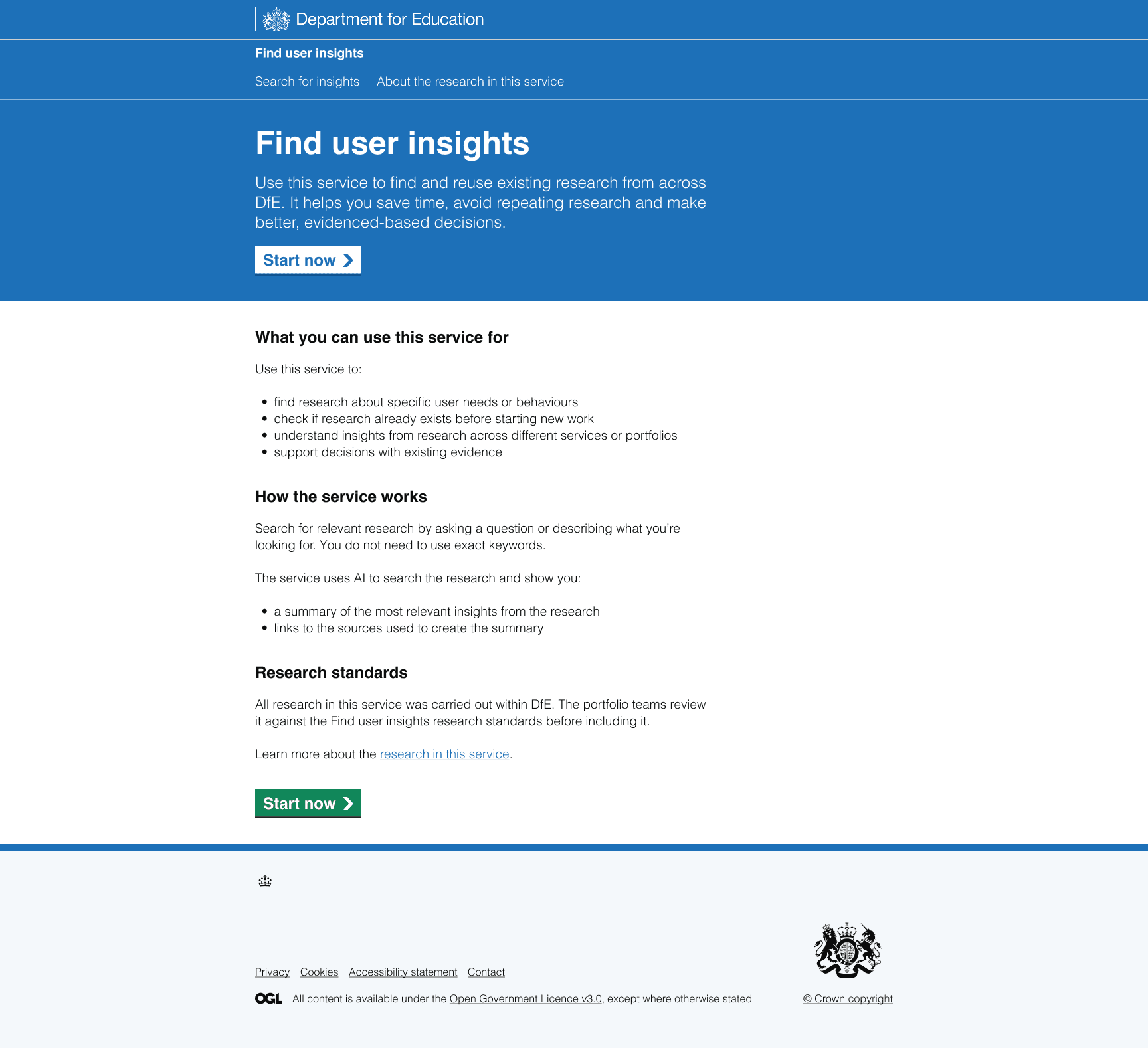
- removed or relocated non-essential content, including file format details and scenarios about what happens when no insights are found
- added a 'What you can use this service for' section with practical examples
- added a prominent call to action at the top of the page for users who wanted to start immediately, including returning users
- changed the primary button label from 'Find insights' to 'Start now' to align with familiar GOV.UK patterns
The revised homepage:
The result: more users entered the service
User testing showed a clear improvement:
"This seems a lot more succinct. It looks great."
Analytics supported this change.
Homepage-to-service conversion increased from 55% to 70%, a 15 percentage point uplift.
(Source: pilot Google Analytics, weeks 1–4 vs. week 5)
Users needed more trust in the service
Finding the right balance of information improved entry into the service. However, research also highlighted questions about trust and transparency.
Users were unsure:
- if they could rely on the research and summary
- what responsibility they had for checking and reusing information
- how AI was being used in the service
For example:
"Can I use the research or not?"
"I'm not sure what 'approved research' means exactly. I do know though that I need to check things, but the message confuses me."
"I'm surprised that we're not declaring use of AI."
We improved clarity around how the service works
To address this, we improved transparency across the homepage and supporting content.
We:
- explained research standards more clearly on the homepage
- added a dedicated ‘About the research in this service’ page covering standards, processes and how research is checked
- explicitly described how AI is used
- introduced a 'How the service works' section
The result: confidence in the service increased
These changes helped users understand the service better and set clearer expectations from the start:
"The language used feels much more like approved government standard content, which makes it feel like a more trustworthy service."
What we learned
This work reinforced that providing the right amount of information is more important than simply providing more or less information. Neither extreme worked: the original page overwhelmed people, but a stripped-back version removed too much confidence-building information. The final design came from finding the balance.