
The AI response page is shown after users ask a question in the Find User Insights (FUI) service. It presents an AI-generated summary of relevant research alongside the source documents, helping users quickly understand the findings and explore the underlying evidence.
The page has 3 main elements:
- a disclaimer that introduces and frames an AI-generated summary
- an AI-generated summary
- the source documents and metadata
The challenge
Research highlighted 3 related issues with the AI response page.
First, users found AI-generated summaries difficult to work through. Long summaries created effort, particularly in longer conversations. This was especially true for neurodivergent users.
Second, the response page itself created unnecessary cognitive load. In addition to long AI-generated summaries, long metadata sections made it harder for users to scan information and reach the original research.
Third, users were unsure how to interpret and use AI-generated responses. They had questions about the role of AI, the limits of the summaries and their own responsibility when using the research.
Together, these findings showed the whole response experience needed improvement.
We explored improvements to the AI-generated summaries
Users described some summaries as overwhelming, particularly when conversations became longer:
"The wall of text feels long and overwhelming."
We explored how we could make AI-generated summaries easier for users to understand and more aligned with the GOV.UK writing style. We reviewed the existing AI prompts and added new writing-style instructions.
We focused the prompts on the areas where we thought AI-generated summaries needed the most improvement.
View the writing-style prompts we added
- Use plain English
- Avoid jargon, technical terms and acronyms where possible
- If you need to use a technical term, explain it clearly
- When using an acronym for the first time, write it out in full followed by the acronym in brackets
- Use lower case for job titles unless referring to a specific formal title or office
- Use the active voice instead of the passive voice
- Be informative, not persuasive
- Remove unnecessary words
- Avoid contractions*
- Avoid unnecessary repetition
- Keep sentences short
- Keep paragraphs short, ideally maximum of 3 unless there is a need to add more
- Leave a blank line between paragraphs
- Use bullet points where they make content easier to understand, especially for lists with more than 3 items
- If using a colon to introduce bullet points, add a line break before the bullets start
- If using a colon to introduce bullet points, start each bullet point with a lower-case letter
*GOV.UK style is more nuanced than this when it comes to contractions, but we simplified the prompt to make it easier for the AI to follow consistently.
We first trialled the revised prompts in ChatGPT by applying them to existing FUI-generated summaries. We evaluated the results using both the Hemingway readability score and our own content design review to judge whether the summaries were clear and aligned with GOV.UK content principles. For GOV.UK content, a Hemingway score of around 7 to 8 is a useful guide for clear, accessible content.
We tested the revised prompts against 4 different user questions and summaries. The revised prompts improved the Hemingway score across all 4 examples we tested.
The comparison below shows one example of how the revised prompts affected a summary:
| Version | Hemingway readability score |
|---|---|
| Original FUI summary | 14 |
| Revised prompts applied in ChatGPT | 8 |
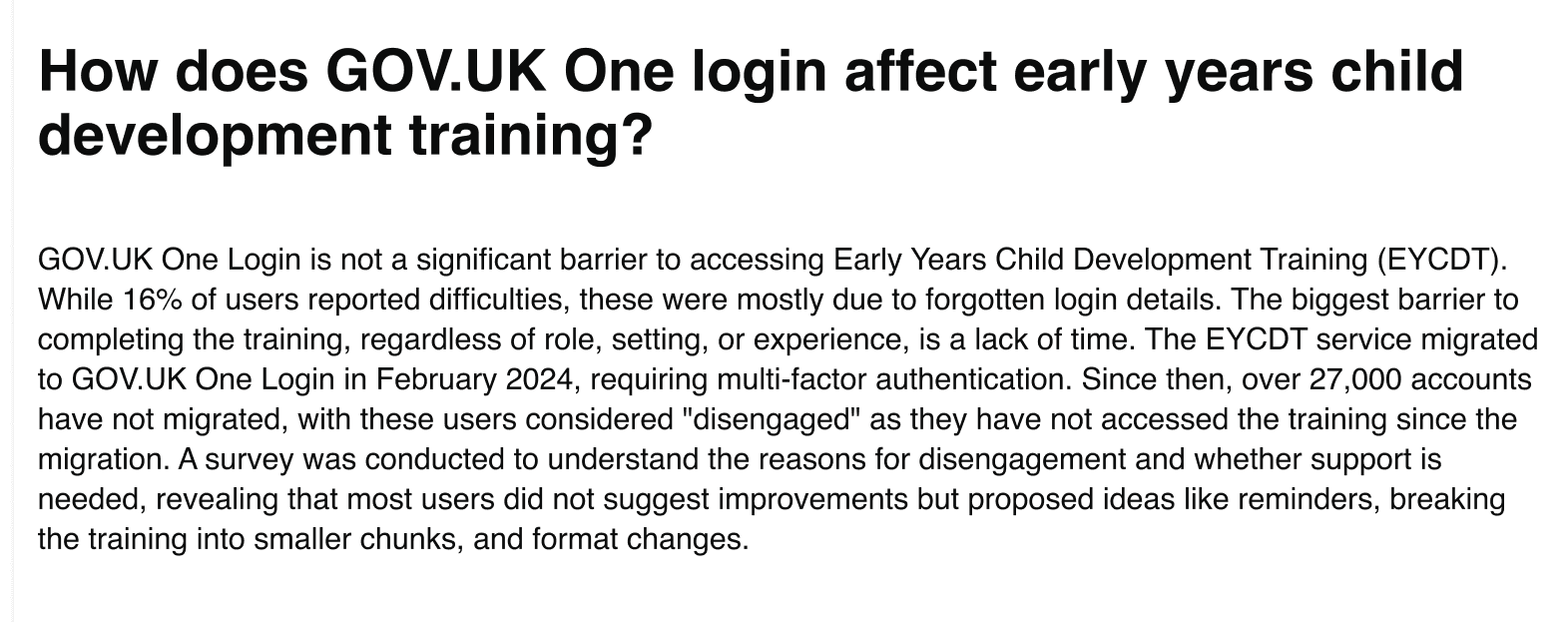
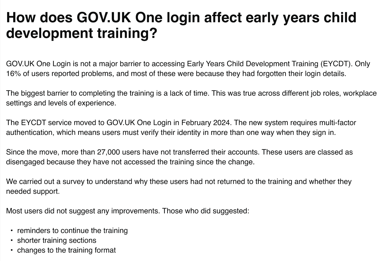
The version with the revised prompts applied in ChatGPT was easier to read, reducing the score from 14 to 8 and bringing it closer to the GOV.UK target range. The examples below show the difference in the summaries.
The original summary from FUI scored 14 in Hemingway:
The same summary with the revised prompts applied in ChatGPT scored 8:
We then applied the revised prompts within the live FUI service against 5 different user questions. We used the same user questions so we could compare the impact of the prompt changes directly. The prompts improved the Hemingway score in 4 of the 5 examples tested, while 1 remained unchanged.
The comparison below shows the impact of applying the revised prompts to the same user question in the live FUI service:
| Version | Hemingway readability score |
|---|---|
| Original FUI summary | 14 |
| Revised prompts applied in FUI | 11 |
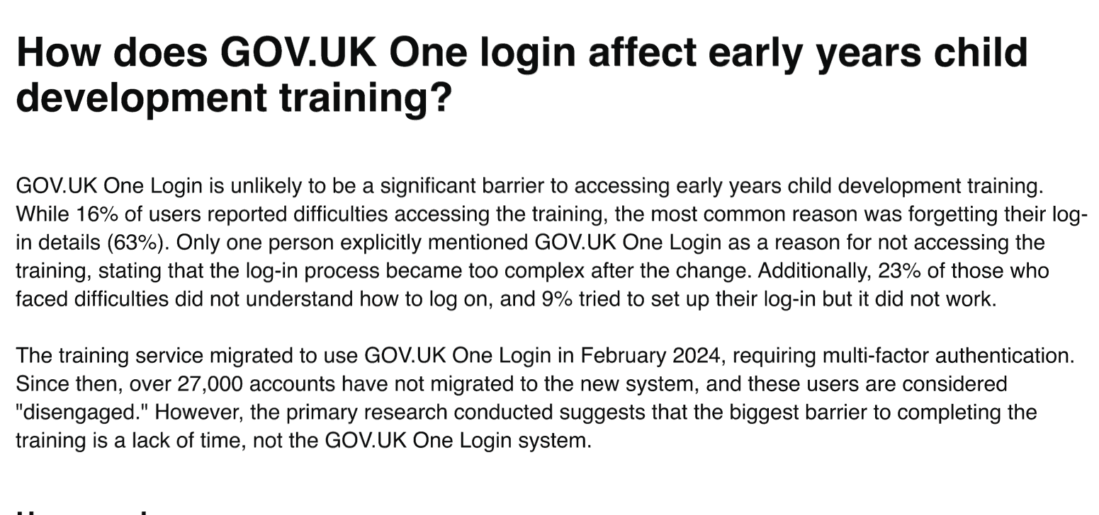
The score of 11 was an improvement on the original FUI summary score of 14, but the change was smaller than we saw in ChatGPT.
This example shows the AI-generated summary in the live FUI service after the prompt updates, which scored 11:
This led us to investigate why the improvements were smaller in FUI than in ChatGPT.
The ChatGPT trial only involved applying writing-style instructions to existing summaries. In the live FUI service, the AI must also find relevant research before it can generate a summary. It therefore has to balance several tasks at once, including retrieving relevant information, following instructions and linking the summary back to the source documents. This reduced the influence of the writing-style prompts on the final summary.
This reinforced that prompt design is only one part of the solution.
We are continuing to refine the prompts used by FUI to improve the readability and consistency of AI-generated summaries. This includes exploring how to help the AI apply writing guidance more consistently while balancing other requirements.
We redesigned the metadata section
Improving the AI-generated summaries was only part of the solution. Research also showed that users became fatigued when scrolling through long conversations containing multiple AI responses. The metadata section contributed to this by adding further content below every summary.
We redesigned it to reduce cognitive load by:
- turning document names into clickable links
- removing the separate “Open document” button
- simplifying the layout to use less space
These changes created a cleaner page and helped users reach source material faster.
We redesigned the disclaimer
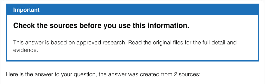
Research also showed that users were unsure how to interpret AI-generated responses. This was largely due to the disclaimer banner that introduced them.
One user queried:
"Can I use the research or not?"
They also questioned why the service did not clearly explain the use of AI:
"I'm surprised that we're not declaring use of AI."
A subject matter expert also highlighted that the summaries could appear more definitive than they really were:
"The information is presented as if it's the whole truth, when in fact a lot is missing."
These findings showed that users needed more transparency about what the summaries represented and how they should use them.
The original disclaimer:
We explored different approaches to the AI disclaimer in a design critique, testing 3 versions with different wording and emphasis.
There was a slight preference for the version that made the use of AI explicit in the title of the banner. This helped users understand immediately what the summary was and why they should interpret it differently from traditional content.
The 3 versions we shared in the design critique:
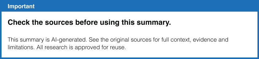
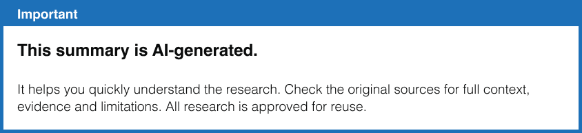

We made it clear that:
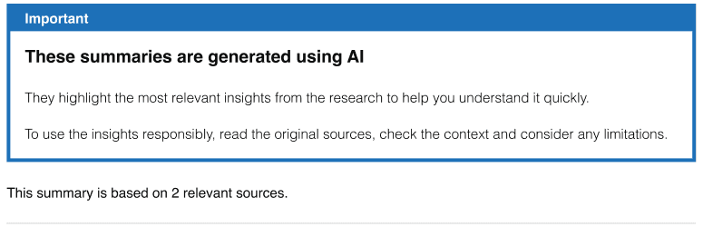
- summaries are generated using AI
- summaries are a starting point for exploration, not a final answer
- summaries come from underlying research
- source documents include important context and limitations
- users should check original research before making decisions
We also strengthened supporting content across the service by:
- making research standards clearer and more visible on the homepage
- creating a dedicated “About the research in this service” page explaining standards, processes and checks
- adding explanations about the use of AI
The revised disclaimer:
What we learned
Improving the AI response page involved more than adjusting a single element.
Research showed that users experienced the page as a whole. Long summaries, lengthy metadata sections, uncertainty about AI use and questions about how to use the research all affected how people felt about the experience.
We therefore made changes across the response page, focusing on clearer summaries, simpler supporting information and a more transparent explanation of the AI.
Together, these changes made the response page easier to use and helped users understand how to interpret and use AI-generated summaries appropriately. More importantly, they showed that the quality of an AI experience depends on both the underlying AI system and the surrounding user experience. Both contribute to making responses useful and trustworthy.