
Why we started with natural language search
In alpha, the team identified AI as the biggest delivery risk. To reduce that risk early, we tested a natural language chat approach, as it was the feature most dependent on AI performing well. We worked with user researchers to understand how well this interaction model supported their needs.
Building on those findings, private beta gave us the opportunity to explore additional search approaches and test with a broader range of users beyond the user research community.
Our alpha assessment also supported continuing in this direction.
We tested different ways to search
At the start of private beta we used Maze to test different search approaches with participants completing the test in their own time.
We wanted to understand:
- which search experience user researchers preferred
- whether product analysts, managers and other users had similar preferences
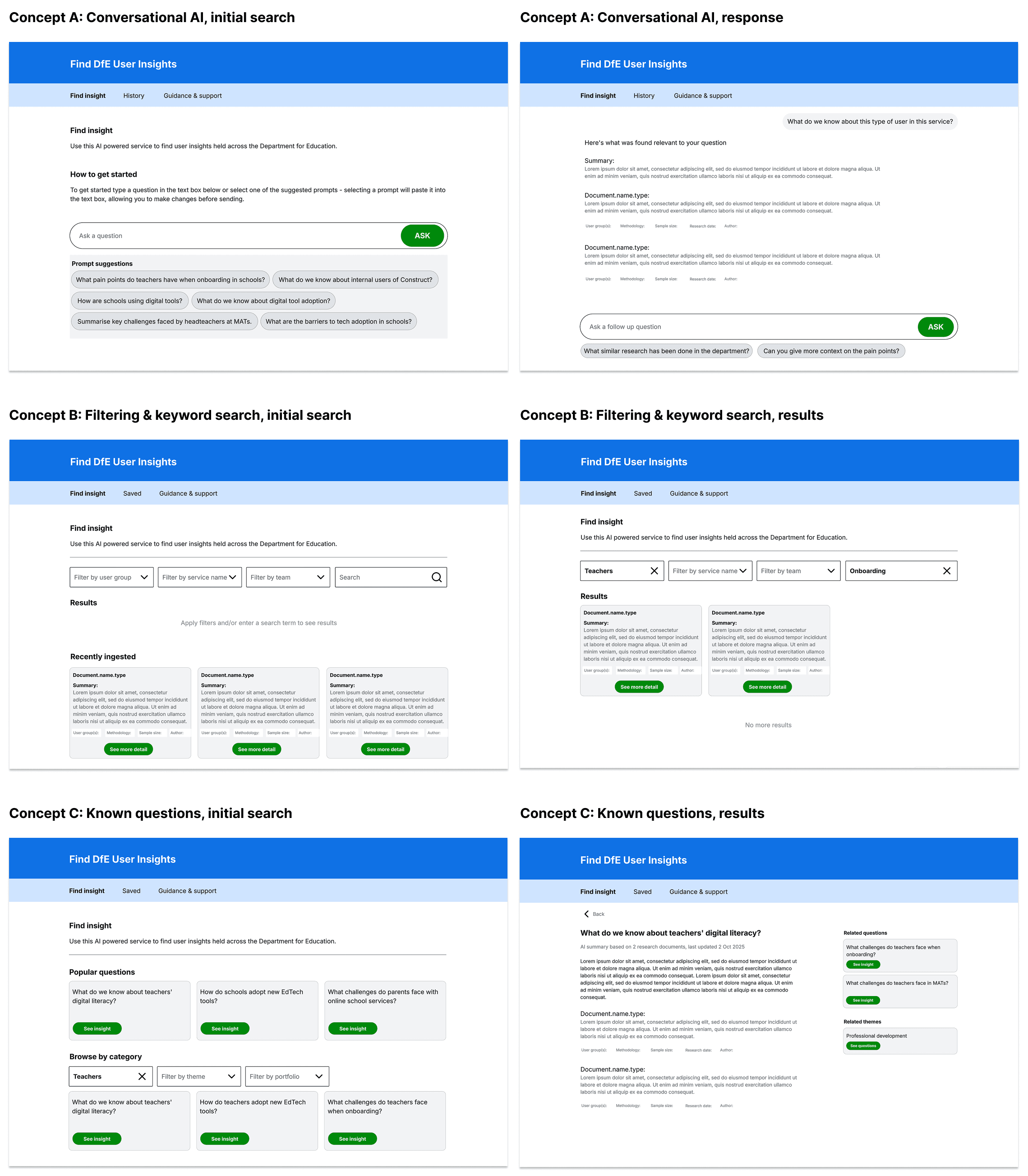
We tested 3 ways for users to find research:
A. Ask in your own words ('natural language search')
This is the chat model we tested in alpha, where users typed a question in their own words. The AI then searched the research and generated an answer.
B. Search and filter documents ('semantic search and filtering')
Users searched for relevant research and narrowed the results using filters such as user group, research date and portfolio. The AI summarised each document when it was uploaded, rather than at query time
C. Browse common research questions ('curated question search')
Instead of typing their own question, users chose from a list of common research questions. The AI then combined findings from multiple research documents into a single summary.
The 3 search approaches we tested:
Both groups preferred approach A, giving us confidence to continue developing this direction.
UCD professionals valued being able to ask specific questions, ask follow-up questions and explore related insights.. They liked having a single summary with links to the supporting sources, with some comparing the experience to speaking with a user researcher on Teams.
Non-UCD users valued speed and wanted quick, direct answers, which approach A supported well. They also wanted filtering options to help narrow results and raised concerns about how accurate AI-generated answers would be.
What requests for filters really meant
During prototype testing, many non-UCD users and less confident users asked for filters.
However, we found that the underlying need was not necessarily for filters. Many users were unsure where to start, felt overwhelmed by the amount of information available or needed help writing effective prompts. What they were looking for was more guidance to help them find the right information.
People wanted guidance, not filters.
Helping users ask better questions
In the next iteration we aligned the interface more closely with DfE and GOV.UK styles, made usability improvements and introduced a guided question flow.
This approach addressed the need for users to narrow their search without adding filter fields.
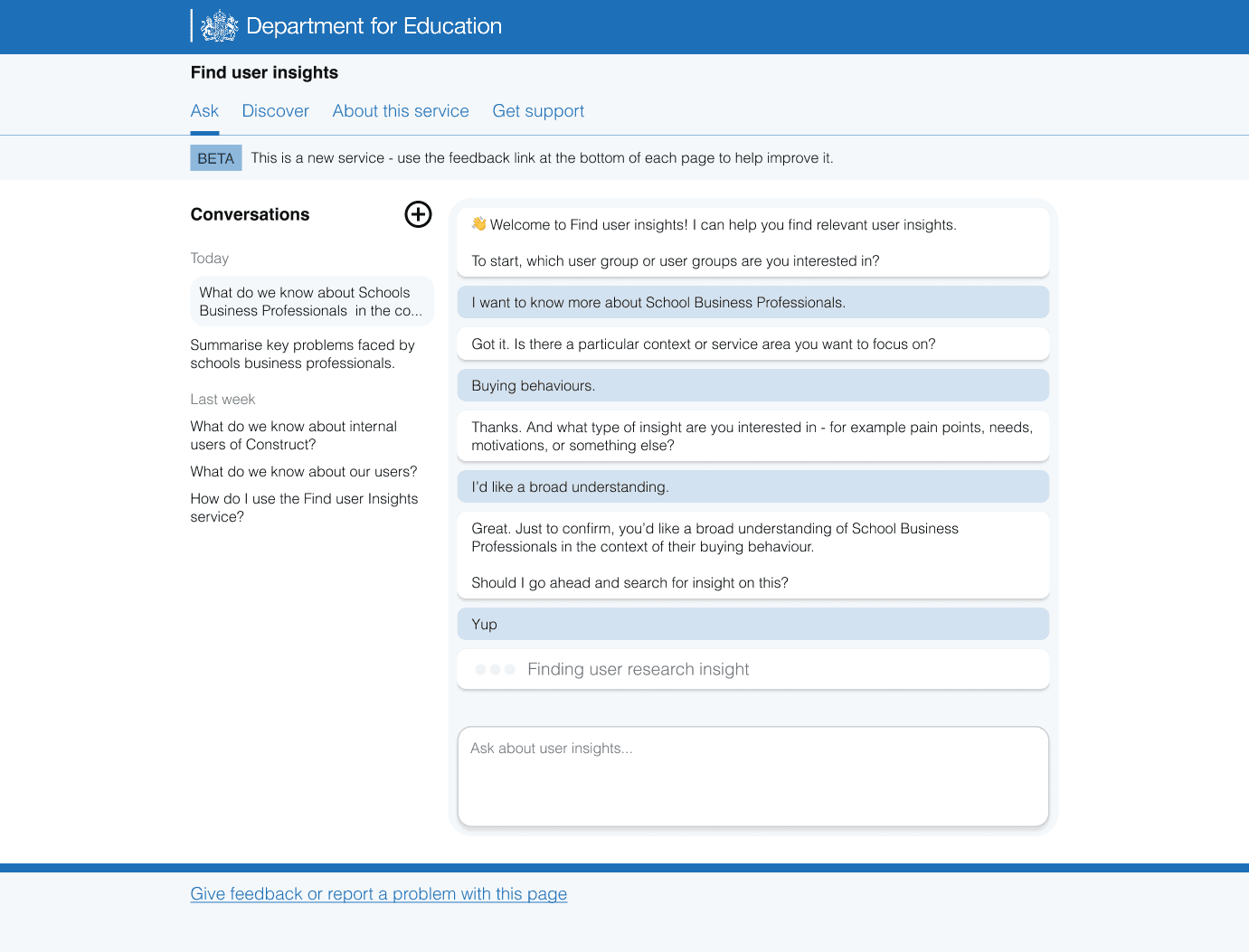
Instead of typing a question from scratch, users could select 'Help me ask a question'. The AI then guided them through a series of questions, asking one at a time. For example: 'What user group do you want to know more about?'
Each answer acted as a filter. Once the AI had enough information, it ran a search using the details gathered from the conversation, as if the user had written a complete question themselves.
The prompt suggestions:
Research identified further usability improvements
Usability testing highlighted several opportunities to improve the experience.
The landing page and chat experience needed to be separated. Starting the chat immediately meant some users saw the chat input before they understood what the service did, which created uncertainty. We explore this in more detail in our separate post about the landing page.
The history panel also affected the chat experience. Keeping it open by default made the chat window feel crowded and made messages harder to read and scroll.
We also simplified the AI processing messages. The system originally showed three stages: finding, collating, and summarising research insights. Testing showed that users did not need this level of detail and only needed to know that the system was finding relevant user research insights.
The guided question flow tested well. People described it as a form of filtering and found it helped them develop better questions. They also saw it as a useful structured alternative to open search.
A note for other teams designing guidance into AI services
The guided question flow helped reduce the 'blank page' problem by supporting people who were unsure what to ask. Although we did not build this feature during private beta, the approach tested well and is worth considering for other teams designing AI services.
Separating search from the landing page
The next iteration addressed this feedback by making the chat experience more focused and easier to use.
We made 2 main changes:
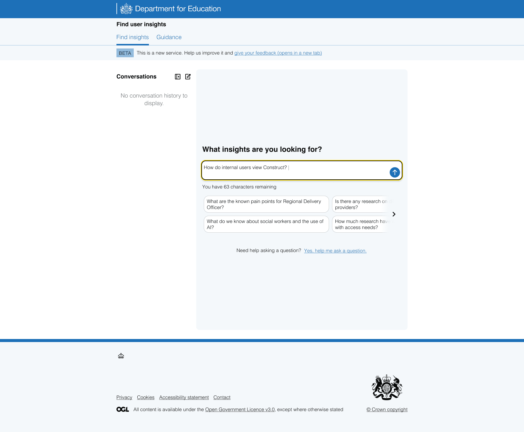
- we moved chat off the landing page and into its own page in the navigation
- we made the history panel collapsible to give more space to the chat
We also improved guidance within the experience by:
- updating placeholder text and adding prompt suggestions to help people write a query and explore possible questions
- replacing the 3x2 grid of suggestions with a carousel
- allowing people to select a prompt suggestion and edit it to fit their needs
- changing the input label to 'What insights are you looking for?'
The chat interface with the collapsible history panel and carousel of prompt suggestions:
Improving accessibility and usability
Although the revised interface tested better overall, accessibility testing identified several areas for improvement. We refined the existing design rather than redesigning the interface again.
We:
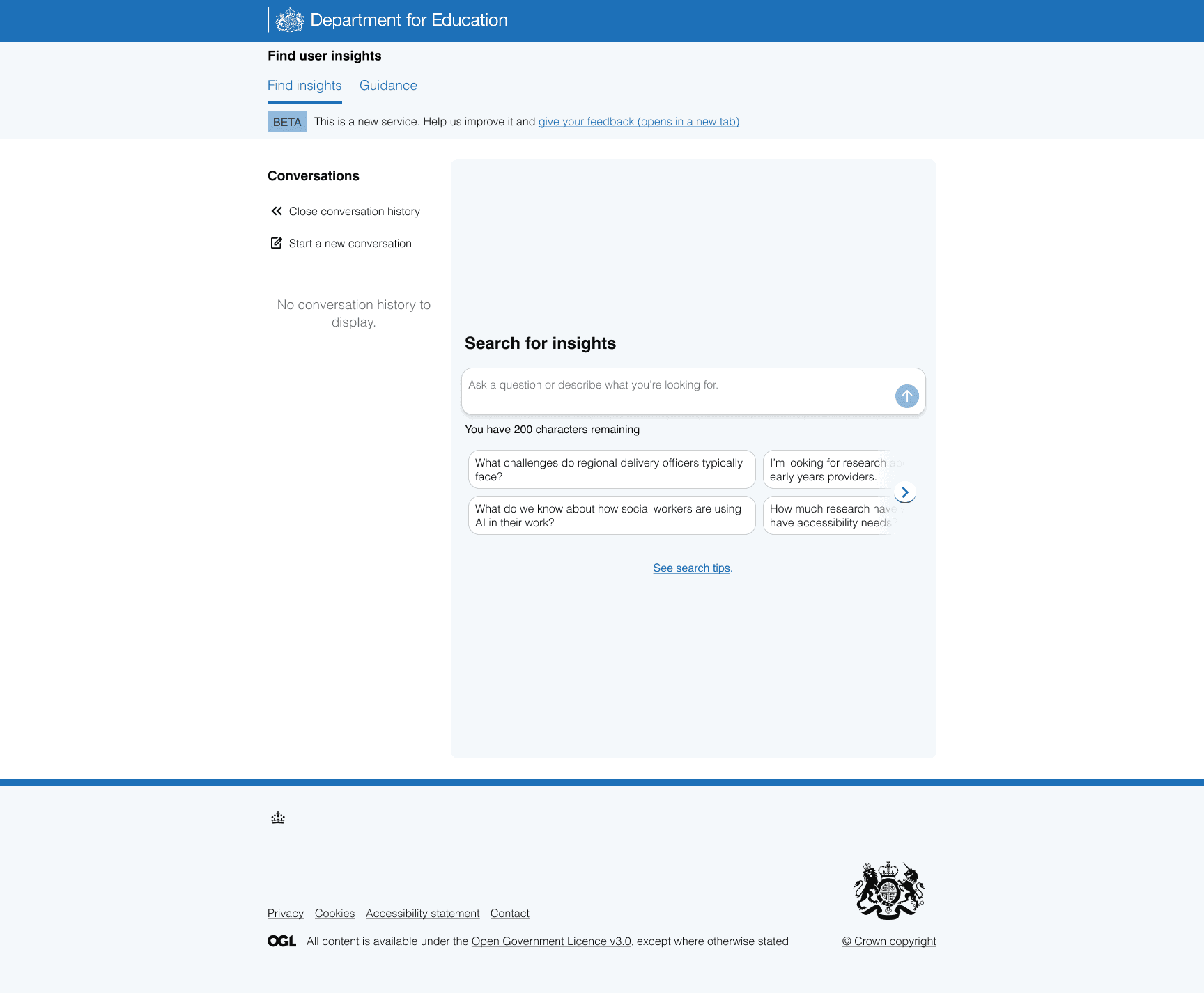
- opened the history panel by default and added labels to icons after finding some users did not discover chat history when the panel was collapsed and icons were unlabelled
- changed the input label to “Search for insights” because “What insights are you looking for?” assumed people already knew what they wanted
- updated the placeholder text to “Ask a question or describe what you are looking for” to make it clear that users could enter either a question or a statement
- broadened the prompt suggestions to better support different ways of searching
- made the carousel arrows easier to notice
- aligned focus and hover states with the GOV.UK Design System
These changes made the chat interface easier to understand and navigate.
The final private beta chat interface:
Future improvements
Private beta gave us confidence that natural language search was the right interaction model, while also showing that people sometimes need guidance to ask effective questions. Future iterations will continue exploring ways to make AI search more intuitive for users.
There are several areas we'd like to explore in future iterations of the service, including:
- time-stamped history
- pinning chats in the history panel
- sharing chats
- follow-up prompt suggestions
These ideas will help shape the service as it continues to develop.