
We conducted research with 7 users from a range of DDT professions and portfolios, to understand how users navigate the service via the filters and categories.
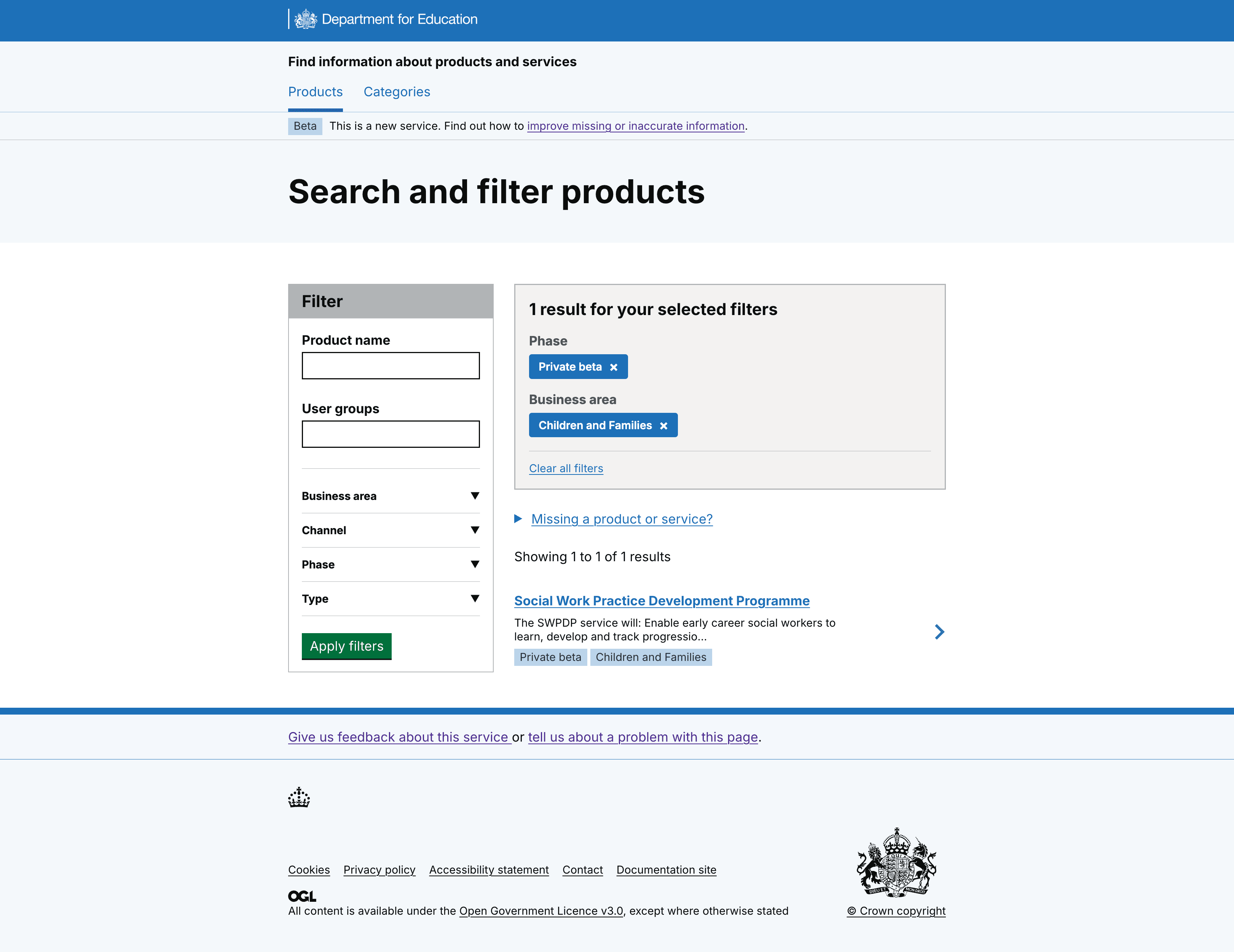
We saw users were confused with search results using OR functionality
When users applied the filter, results did not follow their mental model and caused confusion. For example, if a user searched ‘Children and Families’ and ‘Private beta’ they would expect to see services that are in the Children and Families portfolio and are in Private beta. Instead, results showed all services in Children and Families, as well as all services in Private beta across all portfolios.
We also heard:
In addition, we saw that users became further confused by the search results due to the tags displayed within each service chevron. The version of the service being tested showed static tags for ‘FIPS ID’ and ‘Phase’. Combined with the OR‑logic in the search, this meant that the results did not match users’ expected mental model and they could not easily find relevant services for their search.
So we applied AND functionality to the filter to reflect mental models and make search results clearer
For clarity we also:
- displayed filter choices at the top of results list, to validate search
- agreed that phase and business area would be the 2 tags we use
- added tags for business area, to confirm results and allow users to scan list of services
- removed FIPS id tag, as we confirmed there is no user need to show this
- kept phase tag, research validated this is useful top level information
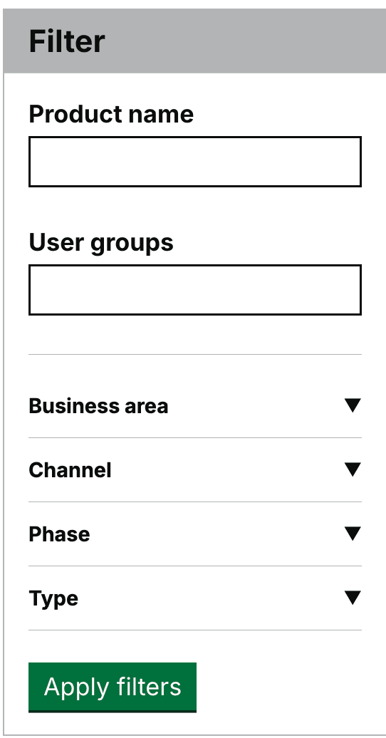
We saw some users miss the apply filter button
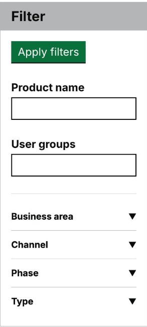
Some users struggled with the visibility of the Apply filters button, due to its positioning at the top of the component.
So we moved the Apply filter button to the bottom of the filter component
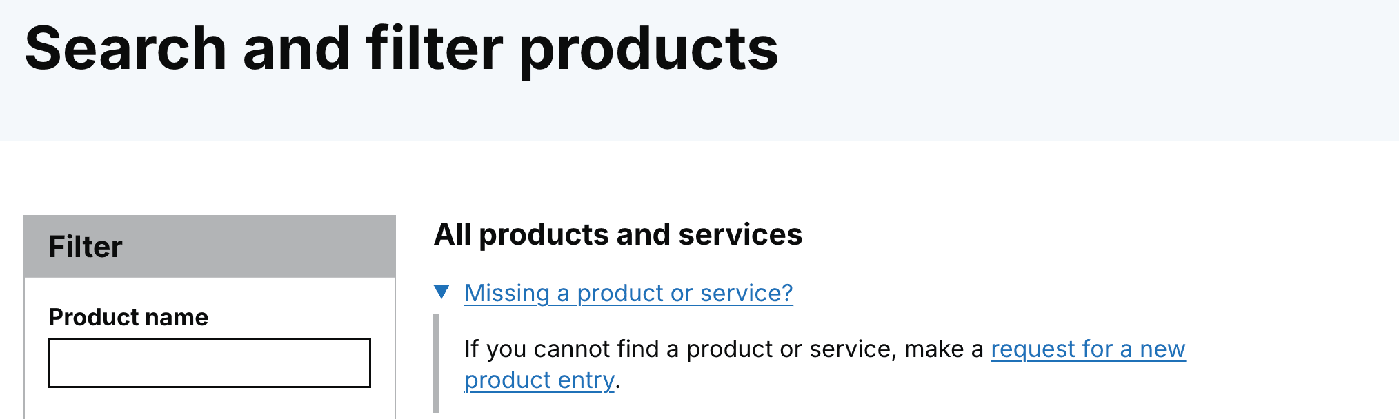
We saw some users confused about the functionality of adding a missing product or service form
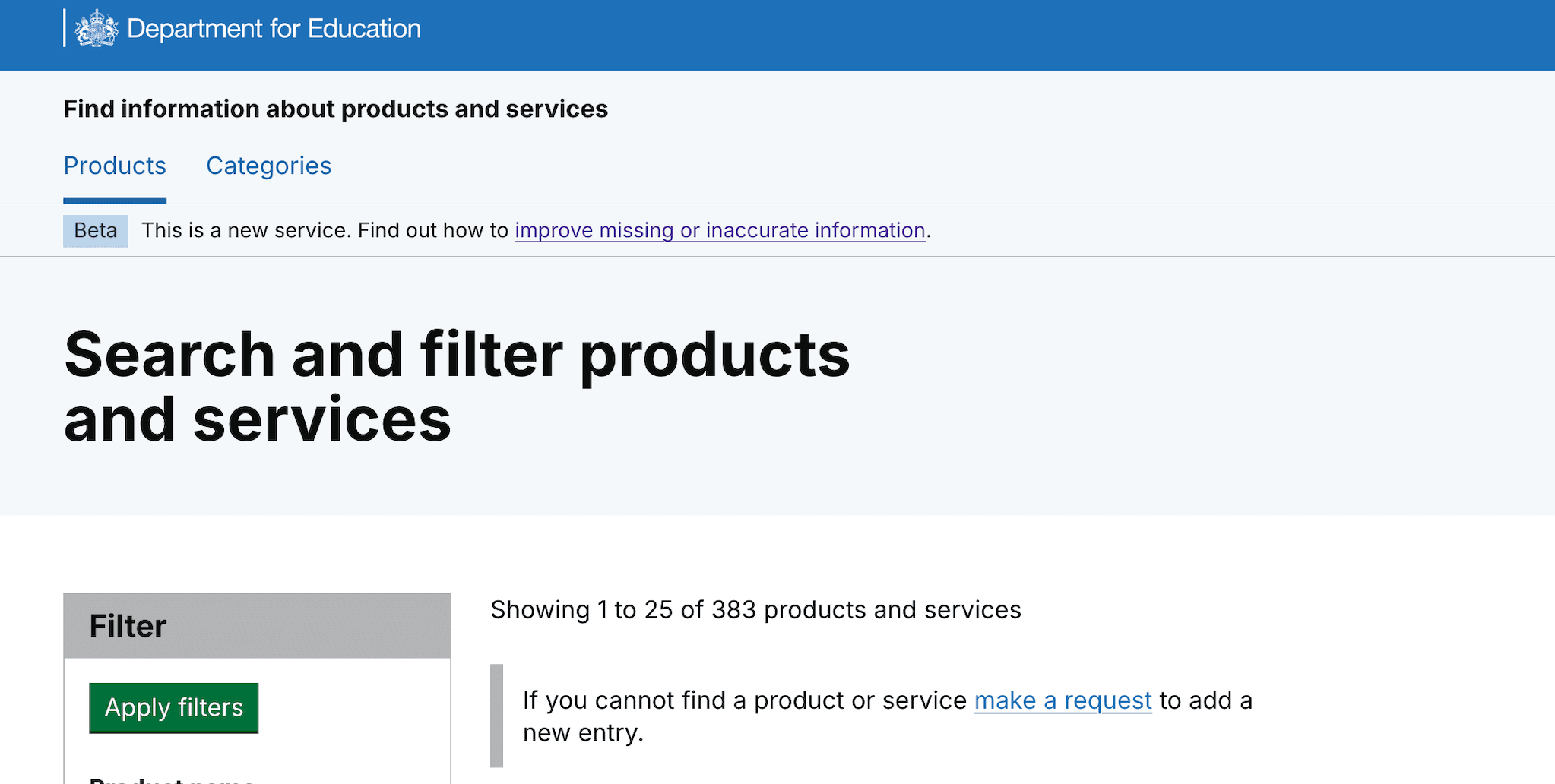
Some users interpreted the form to add a product or service as a way to get support to find products, as the wording wasn’t clear.
So we iterated the form link to make it clearer, this is how to add a new product or service
We iterated the link content, from, 'make a request', to 'make a request for a new product entry'.
We also added a details component to make it clearer that the form is for users to add a missing product.
What's next
We have issues to look at how to improve:
- the product name and user group search fields within the filter component
- tagging of services with the user group taxonomy to improve searching for user groups
We’re currently working to solve these 2 design challenges, based on what we’ve learned in our latest round of research.