
The problem with the homepage navigation
User research showed that people were struggling to navigate the Cyber Security Hub and find the information they needed.
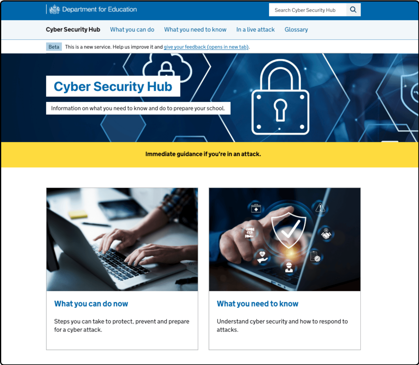
The homepage and header navigation used labels “What you can do now” and “What you need to know”, which reflected our distinction between protecting against cyber attacks and responding to them. However, these distinctions were not clear to users and did not match how they expected to find cyber security guidance.
During usability testing, users were often unsure which section to choose and had to rely on guesswork. They could not confidently predict what content sat behind each label, leading them to explore multiple sections or miss relevant information.
This made it harder for users to quickly find the guidance they needed, highlighting the need to improve navigation labels and restructure the information architecture.
Image of the original home page
What we learned from user research
We carried out scenario-based usability testing to understand how users navigated the Cyber Security Hub and whether they could find key information.
We tested the navigation with 7 participants, including senior technology leads in trusts, an assistant head teacher, and third-party advisors. All participants had a high awareness of cyber security.
The research showed that users consistently struggled to find content across a range of scenarios. In many cases, users were unable to complete tasks without support.
For example, none of the users were able to find the cyber response plan template on their first attempt, and all users failed to locate the ransomware playbook. Users often believed they had found the right information when they had not.
We found that:
- users did not clearly understand the difference between “protect” and “respond” journeys
- users interpreted “respond” as actions during a live incident, and “protect” as preparation, leading them down the wrong paths
- users expected related content, such as cyber response plans, to be grouped together in one place
- some labels, such as “playbooks”, were not understood
- users often had to rely on guesswork to decide where to go
- many users turned to the search function when navigation was unclear
These findings showed that users were frequently navigating in the wrong direction or missing important content altogether. This highlighted the need to simplify the structure and use clearer, more intuitive labels.
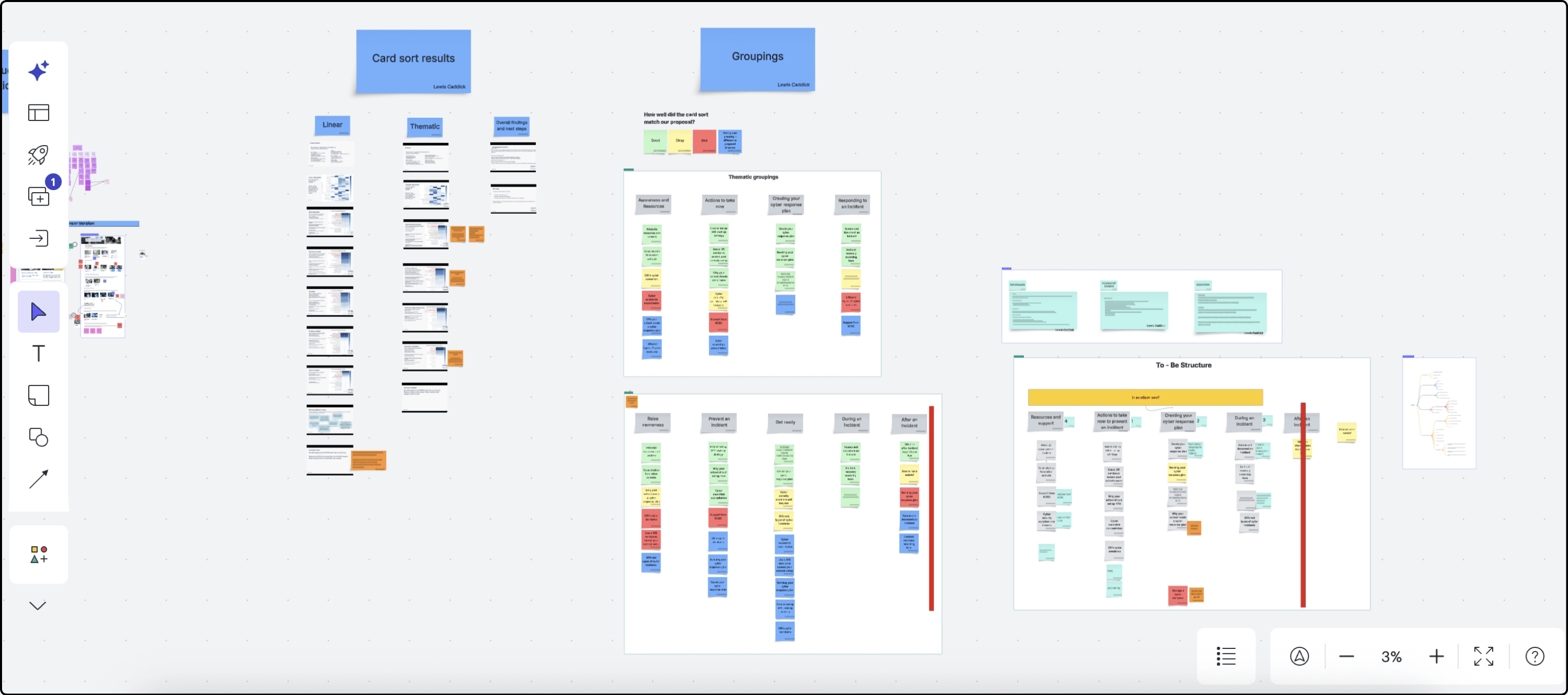
Using card sorting to improve the information architecture
Based on our usability testing, we explored new ways to structure the site that better matched how users think about cyber security.
We developed two different approaches to grouping content:
- a thematic structure, grouping content by topic
- a linear structure, grouping content based on user journeys or stages
We tested both approaches using card sorting exercises, where participants were asked to group content into categories that made sense to them.
The results showed a much higher level of agreement between users compared to our existing structure. Participants consistently grouped content in the same way, giving us confidence that the new approaches were more intuitive.
We found that:
- users were able to group content more confidently and with less hesitation
- there was stronger alignment between participants on where content should live
- clearer, more descriptive category names improved understanding
- some areas still showed lower agreement, highlighting where further refinement was needed
Using these results, we were able to identify the strongest-performing groupings and combine elements of both approaches to create a revised information architecture.
Lucid whiteboard for revising the site structure
Iterated design and impact
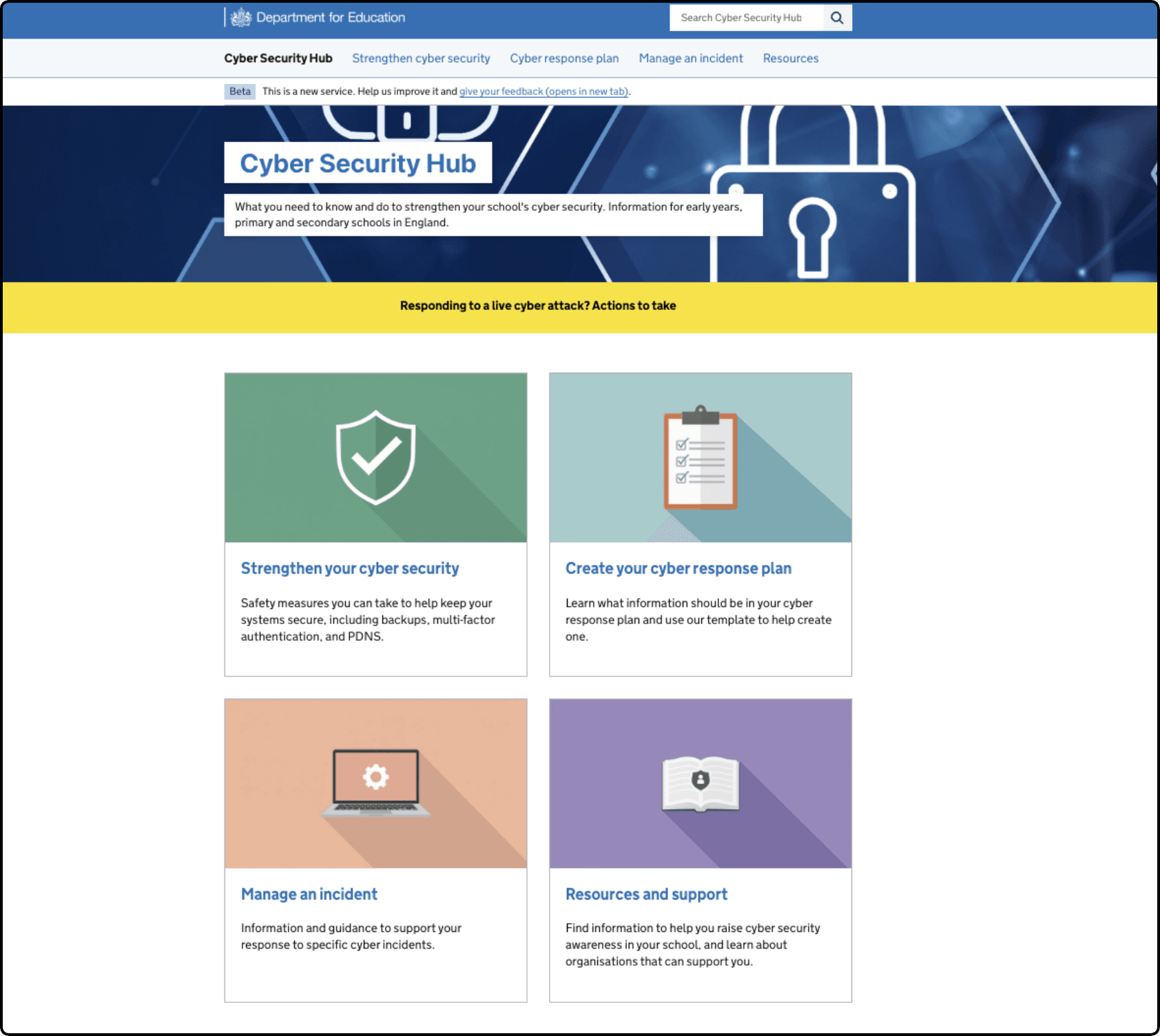
The final design introduces a clearer and more intuitive navigation structure, aligned to how users think about cyber security tasks in their setting.
We replaced the previous high-level labels, such as “What you can do now” and “What you need to know”, with four clear, task-based sections:
- Strengthen your cyber security
- Create your cyber response plan
- Manage an incident
- Resources and support
These headings reflect distinct user needs and remove the ambiguity identified in earlier research.
Updated home page
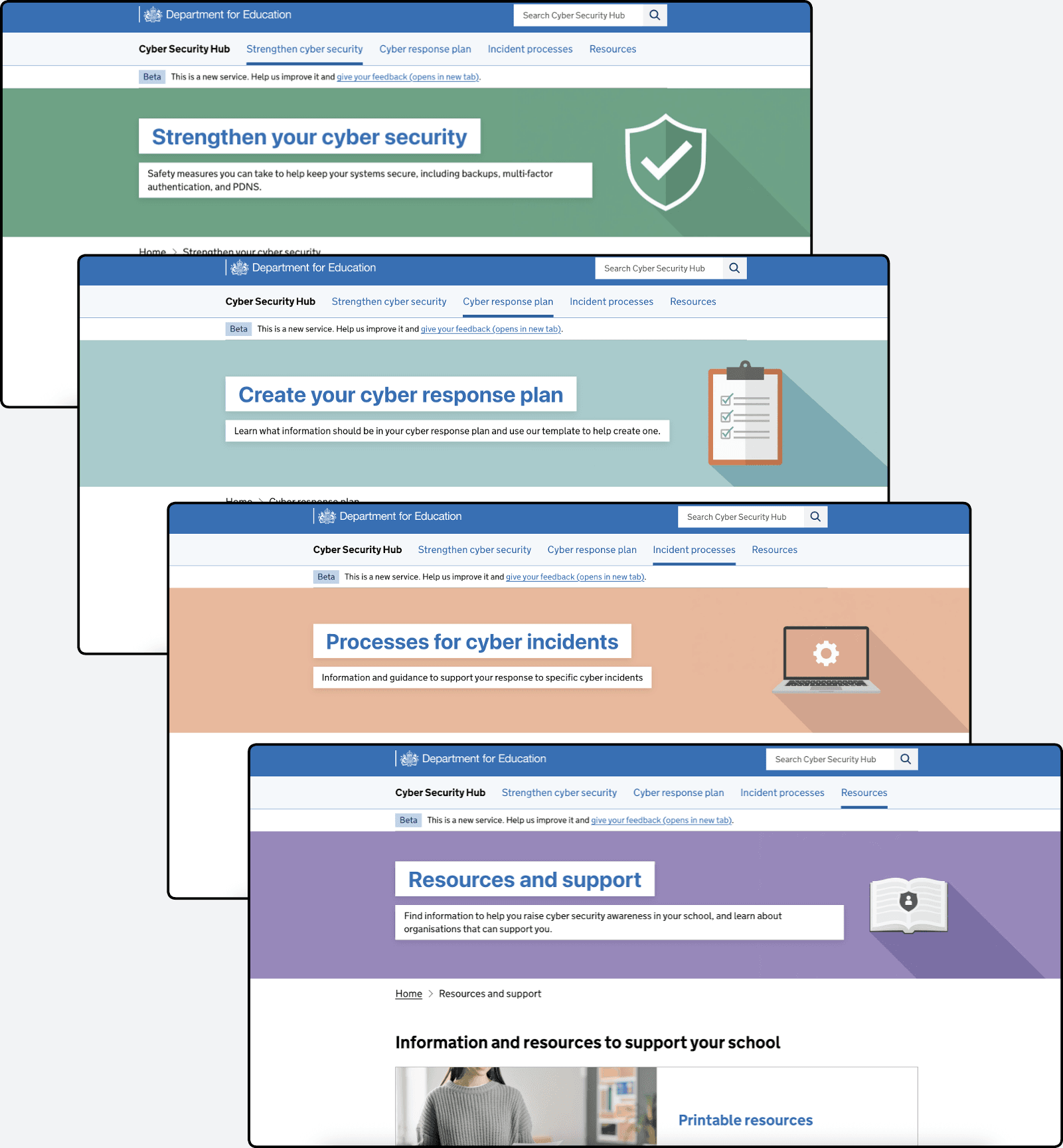
Our card sorting exercise helped us understand where users expected content to sit. We used these results to group articles and guidance into categories that felt more natural and predictable. This means related content now sits together, making it easier for users to find what they need without navigating across multiple sections.
We also improved the use of imagery across the homepage and landing pages. Previously, images did not clearly relate to section headings and added limited value in helping users understand where they were in the site.
In the updated design:
- each section is supported by a clear visual style, including consistent use of colour and simple icons
- homepage card images are directly linked to their section headings
- these visuals are carried through to the header banners on landing pages
This creates a more cohesive experience and helps users orient themselves as they move through the site.
Updated sub-landing pages and consistent imagery
As a result:
- navigation is clearer and more predictable
- content is grouped in a way that matches user expectations
- users can more easily understand where they are within the site
- visual cues support faster recognition and decision-making
Together, these changes create a more structured and user-focused experience, reducing reliance on guesswork and helping users find relevant cyber security guidance more efficiently.
Next steps
We will continue to test and refine the Cyber Security Hub as we gather further user feedback.