
The information box component is used to emphasise information or an action the user must or should do.
We identified that we were not using information boxes consistently or effectively across the Support for social worker’s (SfSW) service.
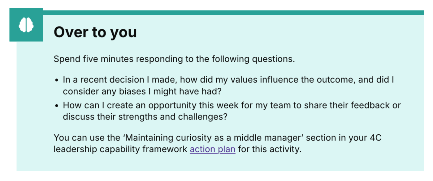
We had two versions of the standard information box and a specific ‘Over to you’ information box which is used in the Pathways social work leadership modules.
Issues identified
We completed an audit of information boxes across our service. This raised several issues around our use of information boxes across the service.
These included:
- using the component correctly
- having the right content in the box to emphasise to users
- the use of headings
- the use of multiple information boxes on a single page
- the inconsistent use of icons associated with the information box
- the use of different coloured information boxes
Researching and exploring our options
We reviewed and investigated these issues by bringing them together on a Lucid board.
As a team we considered:
- risks, issues and assumptions (current and future)
- other service examples of using information boxes
- information and links to design systems using information and call out boxes
- questions we wanted to ask other professions (for example, designers, researchers and developers)
We took our initial thoughts, questions and ideas to the Patterns and components working group and our portfolio UCD crew call. These sessions answered some of our questions and confirmed clear guidelines for us to apply to our use of information boxes.
These included:
- using one information icon for our information boxes
- using two different icons causes confusion for users as they are not used consistently and this fails consistent identification accessibility standards
- having two different colours for information boxes fails consistent identification
- there is no colour preference for information boxes (blue or green), if it is used consistently and is right for your service
- taking content out of information boxes where they are not needed
- having multiple information boxes on one page as this can cause notification blindness
We used this feedback to inform our next steps. We talked through the different issues and decided on tasks for each profession within the SfSW team to do.
User research
We reviewed previous rounds of research for relevant findings on the use of the ‘Over to you’ information boxes in Pathways specifically.
We found that users:
- understood the ‘Over to you’ information boxes and their purpose on the pathways journey
- clearly interpret the use of the brain icon on these information boxes
- understood their tasks based on the content boxes
A next step could be to carry out further research, which could be beneficial to validate or improve the information boxes. This is currently a low priority however, as most of the information boxes on our site are being used in the Pathways leadership modules, which is legacy content.
Interaction design
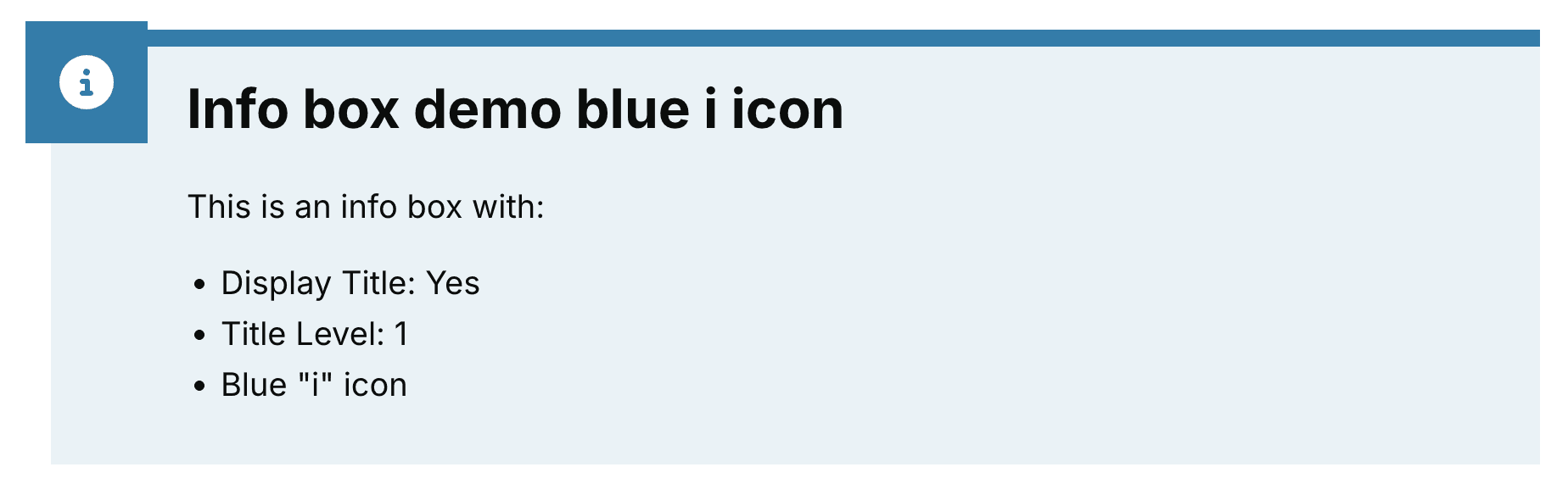
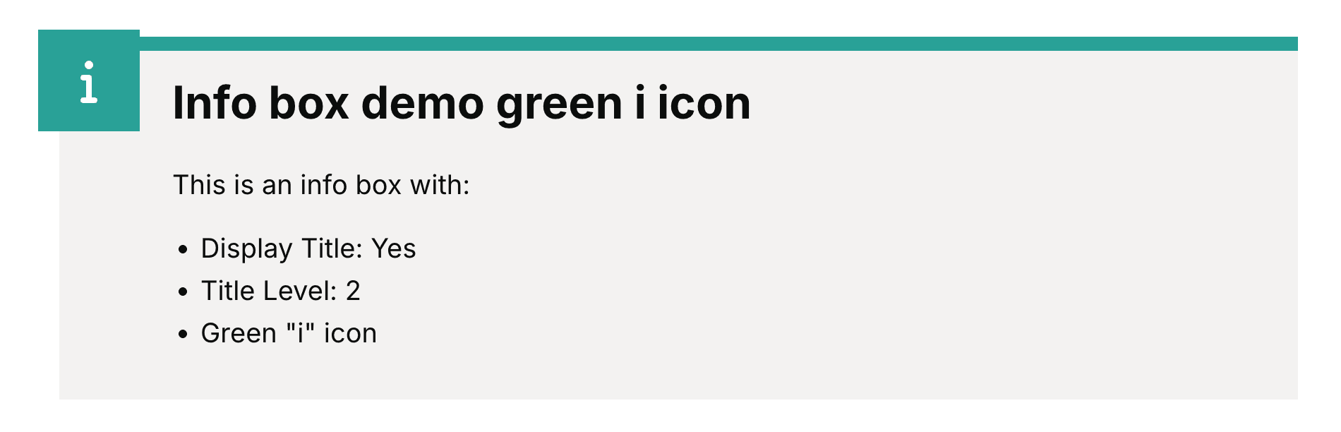
The task for interaction design was to decide on which of the two ‘i’ icons should be used, and which colour scheme should be used.
For the ‘i’ icon we decided on which one was best to get the point of the information box across. We decided to use the ‘i’ icon with the circle surrounding it as it appeared more like the standardised information icon you can find in different services.
We also decided to use the ‘i’ icon with a circle because we took the information box from the Early years children training development service. This service used the 'i' box to indicate an 'in your setting' box rather than an 'information' box, This meant we were using this box in the wrong way.
For the colour of the info boxes, we did more research into the source material and did not find a reasoning behind the use of the different colours. Because of this, we decided to continue to use:
- blue for standard information boxes, as per other services
- green for the specific 'Over to you' information boxes in Pathways
We felt the green 'Over to you' information boxes was the best use of colour because:
- it stands out from the blue theme of our service
- most of the variations of the information boxes are green so it means that fewer changes are required
- it worked well against the new Department for Education header design
Once these decisions had been made, we were able to build the finalised components in the design system file for our service.
We then passed this onto the developers after a ‘Three amigos call’, creating tickets and refining them.
Content design
We audited the service for all instances of the various information boxes currently being used. Working closely with the wider UCD team, we agreed content guidelines for the use of information boxes in our service. These were to address the issues identified at the start of the process.
Content principles for information boxes
The content in any information box needs to have impact and should always:
- be concise
- use the active voice
- be written in plain English
‘Over to you’ information box guidelines
The ‘Over to you’ information boxes should:
- only be used in Pathways leadership module content
- provide specific actions for social workers to take away and complete
- always have the heading 2 ‘Over to you’
- be limited to one information box per web page
- consistently use the brain icon
- use the agreed accessible colour palette
Standard information box guidelines
The standard information box should:
- highlight a specific action users need to complete
- highlight important information or guidance users need to follow
- include a link to guidance or the task to complete
- consider using a heading 2 to support navigation and users of assistive technologies
- be at the top of your page for visibility
- be limited to one information box per web page
- use the standard component formatting
It should not:
- include a heading 2 if this disrupts the reading order of the content
- be used for formatting chunks of text (For example, case studies)
- exceed 200 words or two paragraphs
- be used multiple times on one web page
What next
We would like to do a site-wide audit of the content to understand the purpose of each page and whether there is a call to action (information box) needed. This would make actions we need users to take clearer and more accessible.
These changes also need to be evidence-based. We aim to analyse the data in more detail to identify stages where users drop out and how this relates to any unmet or partially met user needs. This will help us make informed decisions on if and where call to action boxes can enable users engagement with the content and meet user needs.