
Context
Initial design
From the start, managers highlighted the need to keep evidence of qualification check results, as they usually store these in a physical or digital employee/candidate folder.
This evidence is critical during an Ofsted inspection, where managers must demonstrate that they have suitable professionals working in their setting.
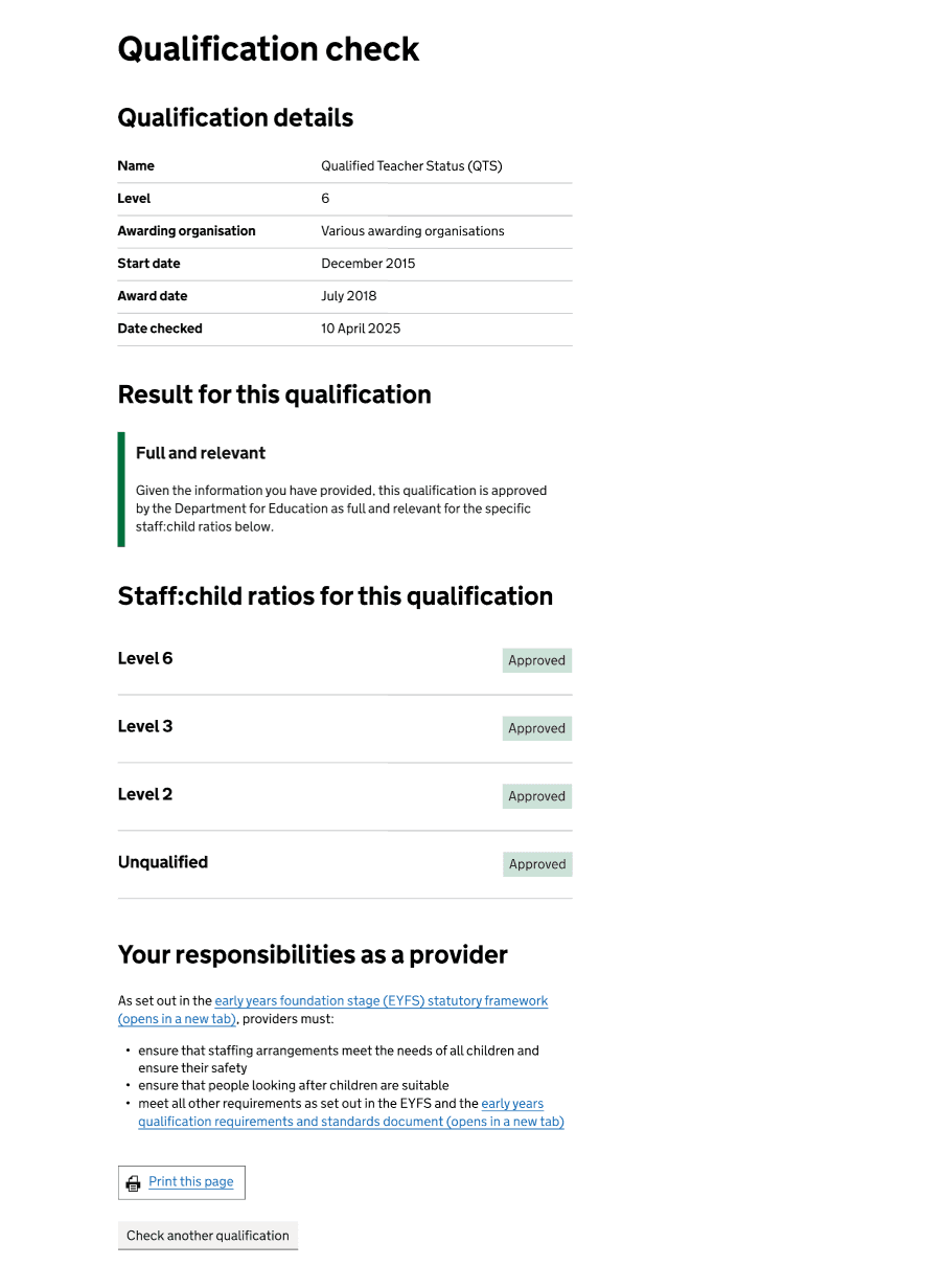
To meet this need, we added a ‘Print this page’ button at the bottom of the result page. This placement followed the natural reading flow, as we expected users to typically print after reading the content.
Evidence from research and data
Analytics showed the button was not being used as much as expected. In the first two months after going live in Public beta, Clarity heatmaps revealed that only 39% of users who reached the result page scrolled far enough to see the print button, and Google Analytics showed that only 15% of users who reached the page selected it. Because the page can become quite lengthy depending on the qualification being checked and the result, the button was often pushed too far down, making it easy to miss.
In user research, we also heard that some users took screenshots or relied on their browser’s built-in print functionality, showing they had alternative ways of recording the qualification check result.
Design iteration
The main issue was the low visibility of the print button, which likely explains the small number of users interacting with it. While we did not receive feedback suggesting users were unable to print or asking for another button, research showed most people rely on their browser’s built-in print function, which already meets their needs.
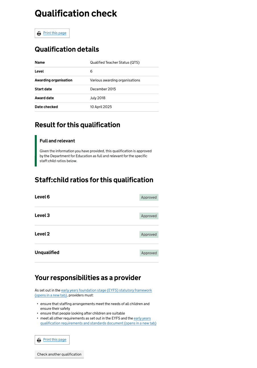
To improve usability and make the option more discoverable, we aligned with patterns used on other GOV.UK guidance pages where users are first shown a ‘View a printable version of this page’ link, followed by ‘Print this page’ buttons placed at both the top and bottom. This approach maintains consistency and supports user expectations without changing established behaviour.
To address this, we added another ‘Print this page’ button at the top of the result page. This ensures the option is always visible, regardless of how far users scroll.
Emerging problem
Although alternatives existed, recent research showed more users asking for a way to download the result or save it as a PDF. They said this would help them save time and money, reduce environmental impact, keep links clickable to guidance pages, and allow them to email the result to themselves or their employer. It would also make it easier to store evidence in a digital folder without having to print and scan or resort to taking screenshots. Some users also mentioned that they do not have access to a printer, which makes the current print-first process less useful for them.
This indicated that many users did not realise they could already save the page as a PDF through the print function. When users click the ‘Print this page’ button, if their computer is connected to a printer, the print preview defaults to that printer. Users then need to notice and change the destination to ‘Save as PDF’, which may not be obvious.
Additionally, Google Analytics showed that in July, only around 22% of users who reached the result page selected the print button.
Dev spike to explore
To address this, developers carried out a technical spike to explore whether a dedicated download option could be added and what the downloadable version of the page would look like. This would allow us to support both users who prefer downloading and those who prefer printing.
The spike identified three possible approaches:
- Client-side generation – creating the PDF directly in the browser.
- Server-side generation – producing the file on the server and letting users download it.
- Use built-in print preview – creating a nicer print version and allowing users to use the built-in print browser functionality to save as PDF.
We chose the third approach because it was the only one guaranteed to work consistently across all devices and configurations, and it did not rely on users having JavaScript or other features enabled.
Design work
Given the outcome of the spike — that generating a downloadable version of the result page was not entirely viable due to technical constraints — we focused our design efforts on helping users understand how to save the result as a PDF through the print function.
We explored different options, such as adding a dedicated print/save section between the page heading and the main content or using inset text to highlight the option. However, these approaches did not completely align with the GOV.UK Design System and would have pushed the main content further down the page.
Instead, we added a details component explaining how to save the page as a PDF. We chose a details component because this information is only relevant to users who are not aware of the option, and most people would only need to read the instructions once. Keeping the information collapsible avoids taking up unnecessary space.
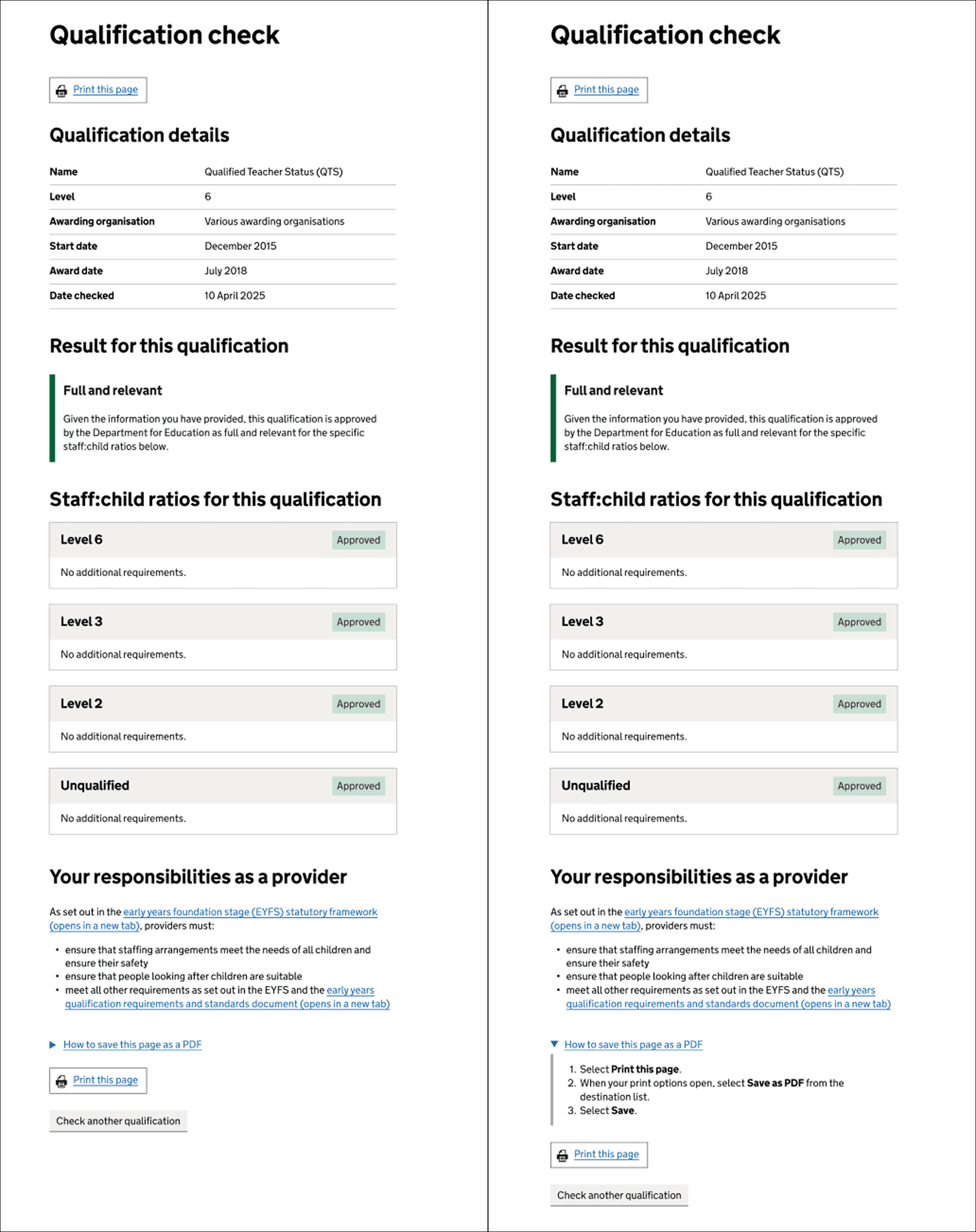
We placed the details component above the print button at the bottom of the page. Adding one at the top would have pushed the content down further, while positioning it at the bottom aligns with the point at which users are most likely to decide to print or save. We also want to encourage users to read through the result before saving it.
Next steps
We will track overall print usage over time and compare numbers before and after introducing the details component. This includes measuring how often users select each type of print option (top button, bottom button, or browser print). The findings will help us decide whether to revisit the design decision in the future.