
Context
Before we looked at how to increase engagement with the feedback form, users only had 2 ways to provide feedback on the Check an early years qualification service:
- a link in the phase banner
- after answering ‘No’ to the question “Did you get everything you needed today?” that appears on the qualification result page and other endpoint pages, where the feedback link was then revealed
This setup meant users had to either notice the phase banner or reach the very end of their journey to be able to give feedback. This may have limited the amount of feedback we received.
Problem
According to data collected through Google Analytics, in the first 3 months after going live in Public beta in March 2025, around 8,600 users have visited the Check an early years qualification service.
Of those, only 15 users clicked on the feedback form link, and just 10 completed it.
This low level of engagement meant we couldn’t understand whether the service is useful and easy to use, whether the information is helpful and clear, or to gather insights about what could be improved.
Additionally, the lack of user feedback meant we couldn't calculate the System Usability Scale (SUS) score, which was one of our Key Performance Indicators (KPIs).
What we did
We knew we needed to increase engagement with the feedback form, so we looked at how over 20 other government services ask for feedback (see research board). We found that most services place a feedback link or component in one or more of the following areas:
- in the phase banner
- in the footer (either as a simple link or a dedicated feedback section)
- just above the footer
- on the confirmation page, at the end of a module, or at the end of the journey
- in a section on the right-hand side
- within a details component at the bottom of content pages
Based on these findings and established GOV.UK patterns, we introduced several changes to make it easier and more natural for users to leave feedback.
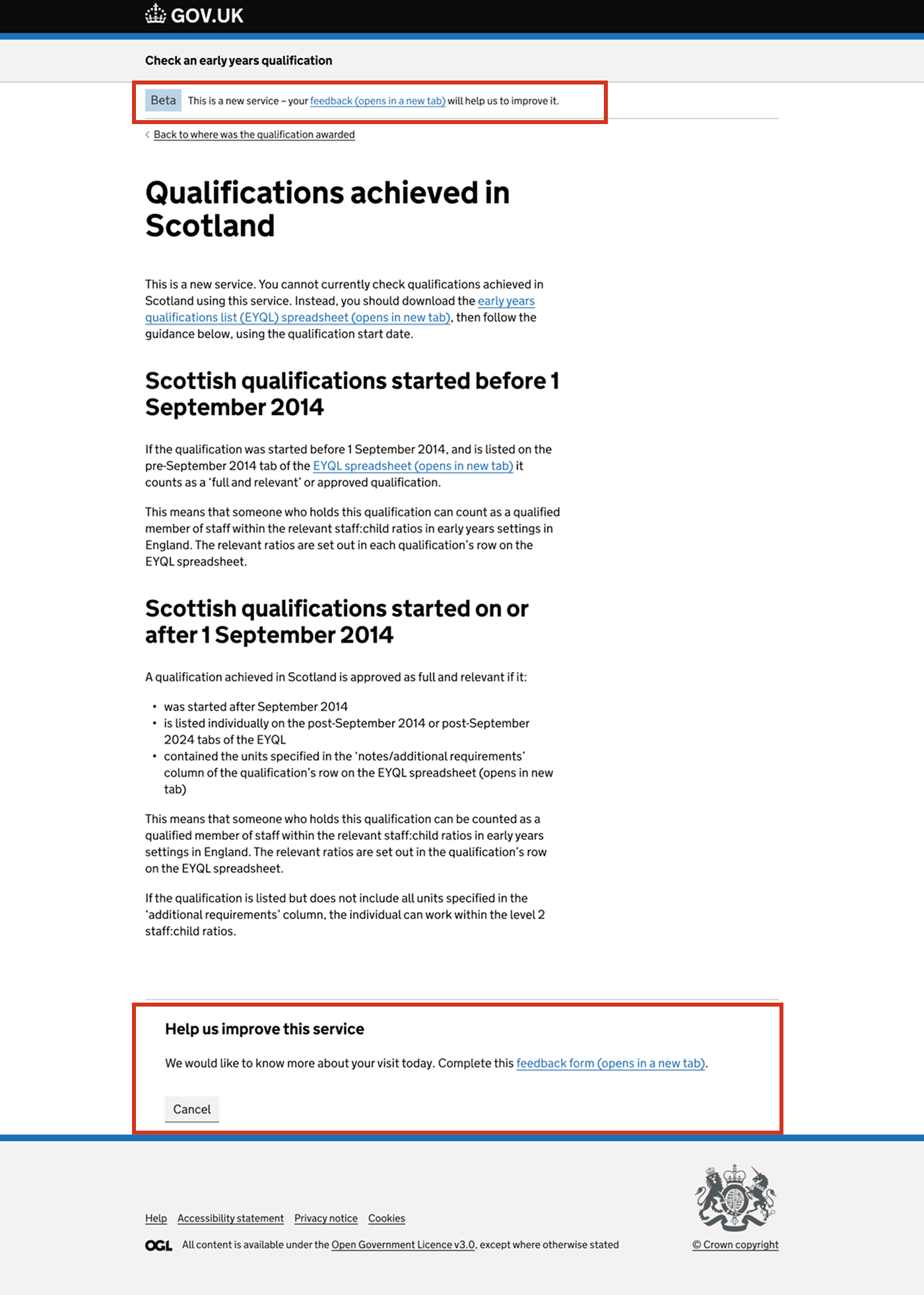
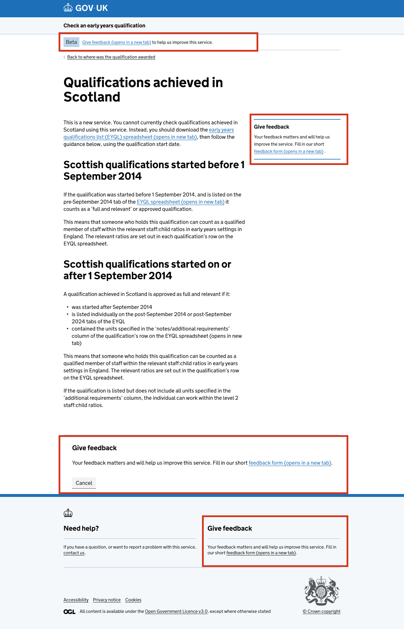
Link in the phase banner and dedicated feedback section in the footer
We improved the feedback call to action in the phase banner and added a dedicated feedback section in the footer.
We made these changes because both the phase banner and the footer are visible across all pages. Many users naturally look for help or feedback links in the footer, so including it there provides a useful fallback in case they miss the one in the phase banner. This approach also aligns with established UX patterns and reflects what other government services commonly do.
Feedback section on endpoint pages
We added a dedicated feedback section to endpoint pages, placed on the right-hand side for desktop and in a visible spot above the main content on mobile.
This placement provides high visibility without interrupting the main task. Positioning it outside the content flow avoids confusion about what users need to do while still making the option clear and accessible.
Because more than half of our users access the service on mobile, we ensured the section remains prominent without being pushed too far down the page.
Link after responding to the question on endpoint pages
Previously, the feedback form was only shown when users answered ‘No’ to the question “Did you get everything you needed today?”. Now, users also see the feedback link after answering ‘Yes’.
This change increases visibility and allows us to collect positive as well as negative feedback. In the first 3 months, for example, 57 users answered ‘Yes’ — a group we were previously missing.
By capturing input from satisfied users as well, we reduce bias towards negative feedback and reinforce that we want to hear from everyone, not just those who had problems.
Example of an endpoint page with all the changes mentioned above:
Feedback section on the Help Confirmation page
We also introduced a feedback section on the Confirmation page, which appears after users send a message asking for help.
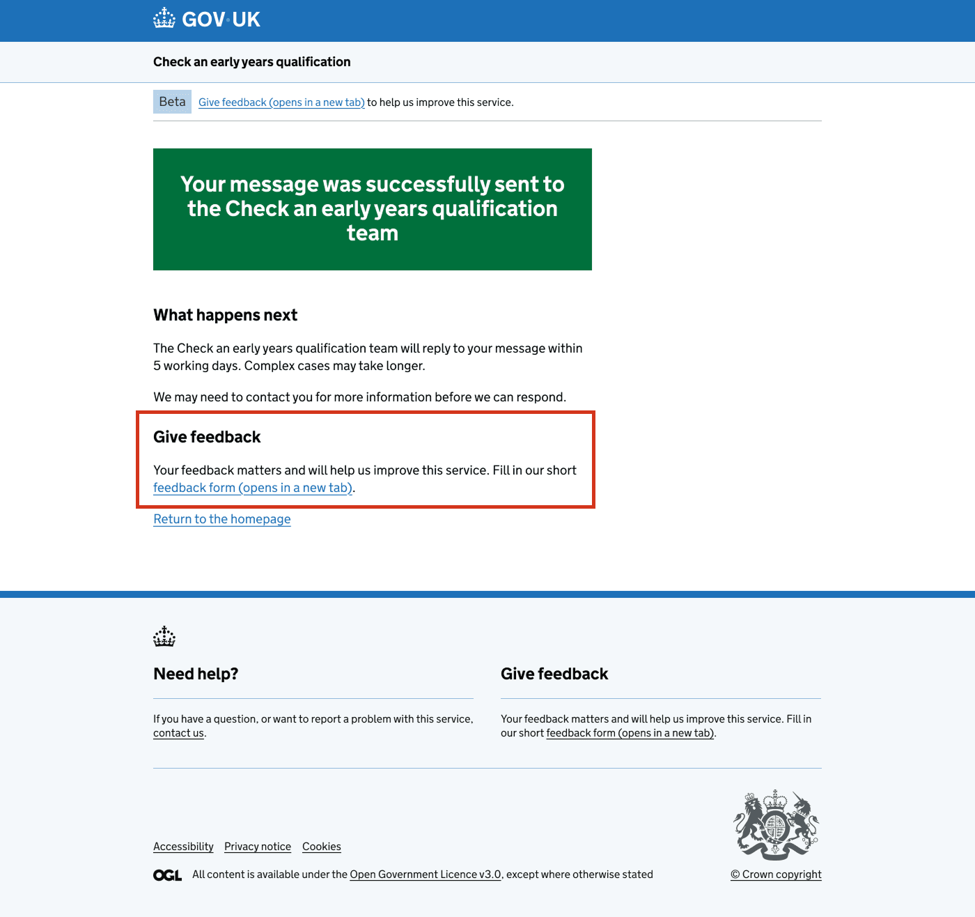
This is a natural pause point — users have completed a task and are in a wrap-up mindset. Asking for feedback here doesn’t interrupt their flow and highlights that we value their overall experience, not just the outcome of their query. This placement also reflects common GOV.UK patterns.
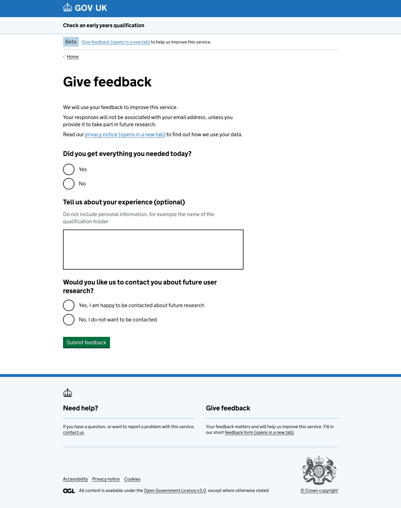
Embedded the feedback form
Previously, users were sent to a Qualtrics survey with 13 questions spread across multiple pages, taking around 5 minutes to complete. This length and complexity likely discouraged responses, as feedback forms should be quick and simple.
To address this, we embedded the form in the service, reduced it to 3 questions, and placed them on a single page. This makes it easier for users to see the effort involved and encourages more completions.
The form now includes:
- ‘Did you get everything you needed today?’ (kept from endpoint pages)
- An optional free-text question about the user’s experience
- A final question asking if the user would like to take part in future research. If they select Yes, a text field appears where they can enter their email address
Next steps
We will continue monitoring how many users access the service, how many click the feedback form from different locations, and how many go on to complete it. This will help us understand which placements are most effective and whether the changes are increasing both the volume of feedback.
If the embedded feedback form performs well, we may explore adding additional questions — carefully balancing the need for richer insights with the importance of keeping the form quick and easy to complete.