
Context
During the private beta pilot, users could contact us directly at our project’s email address, which was manageable given the small number of users involved.
For public beta, we had to provide them with a way to contact us from the service without needing to find our email address. This also provided a more structured get help process.
We initially considered using the Department for Education (DfE) Customer Help Portal, but we decided against this option for user submissions and used it only to manage queries internally.
Initial design work
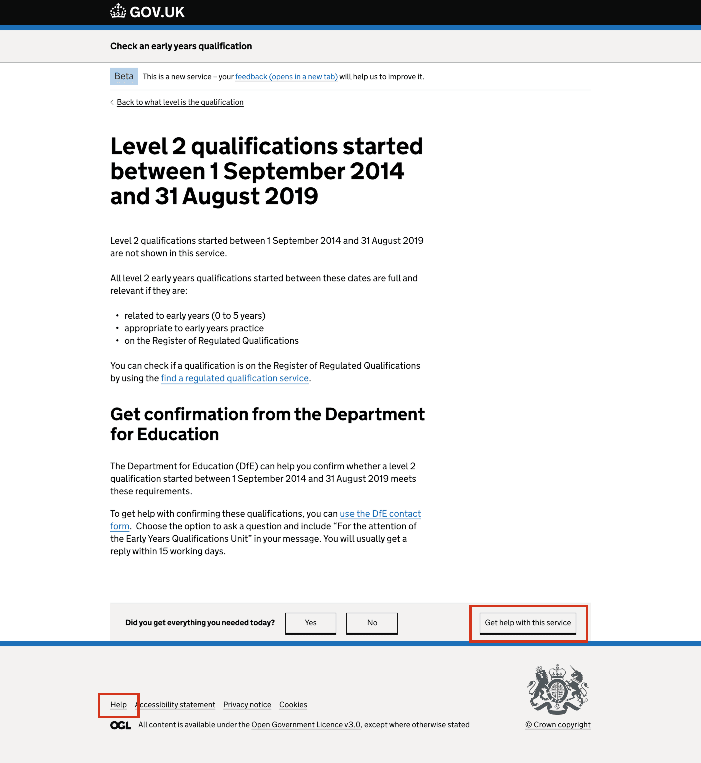
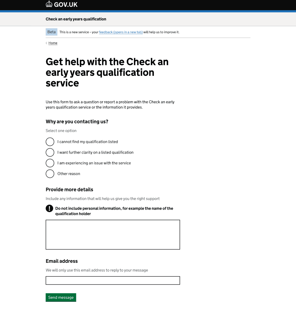
We added a ‘Help’ link in the footer. This took users to a help page in the service where they could submit their query by providing some basic information so we could reply.
Users could also reach the help page by selecting the ‘Get help with this service’ button in the feedback component at the bottom of the qualification result page and other endpoint pages, or the ‘contact us’ link on the first page of the feedback survey.
We kept the help form as short as possible and included only 3 questions:
- reason for contacting us - to help us triage the queries (these reasons were taken from the DfE Customer Help Portal)
- more details - so we could understand the issue and provide the right support
- email address - so that we could reply to their message
Design iteration
Users could access help through the ‘Get help with this service’ button in the feedback component. However, that button relied on JavaScript and cookies. If those were disabled, the only fallback was the small ‘Help’ link in the footer, which was easy to miss.
In research, some users asked for a contact number or support, which suggested that the existing help options were not visible enough.
To address this, we looked at how over 10 other government services present help. Most included more prominent options, either in the footer, within the content, or as a dedicated help section.
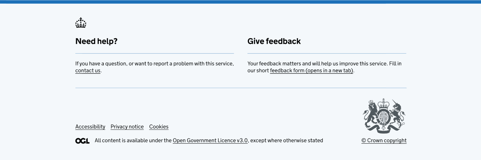
Based on this, we replaced the old footer link with a clearly labelled ‘Need help?’ section that appears on every page. This is more prominent than the previous ‘Help’ link, follows established design patterns, and ensures help is consistently visible and accessible, even if users have different browser or cookie settings.
Emerging problem
As the service grew, the number of user queries increased. Most questions were about whether a qualification was full and relevant, which meant our policy colleague had to respond to them all.
Even though users were prompted to provide more details about their query, they often did not include enough information in the text area provided. As a result, the policy colleague could not quickly verify whether the qualification was full and relevant, and had to request further details. This slowed down response times and made the process unsustainable at scale.
Working closely with policy colleagues
We spoke with the policy colleague responsible for responding to qualification-related queries to understand what minimum information they needed to reply within the service legal agreement (SLA) of 5 working days. They identified:
- user’s name – to check if they had sent previous queries about the same qualification
- qualification title
- awarding organisation
- course start date (month and year)
- course end date (month and year)
Most of the information was sensible, since we already ask users for it within the service to reach an outcome. However, because we already collect users’ email addresses, policy colleagues can use that to search for previous queries. This meant we did not need to collect users’ names as well.
Temporary design solution
Improving the help journey became a high priority, because otherwise the policy colleague would have had to keep sending follow-up emails to users, which kept response times well above our SLA.
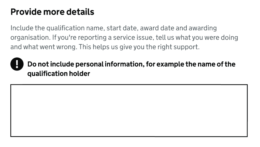
To address this quickly, we implemented a temporary solution to encourage users to provide more details about their query. We updated the hint text in the text area to include the specific details we wanted them to add, such as the qualification name, awarding organisation, and start and award dates.
We chose this approach because it did not require any development work and could be deployed immediately.
New design iteration
We then agreed to update the form itself to collect the qualification name, awarding organisation and start and award dates. This would improve the overall help journey for both users and the team.
We decided to replace the single-page form with a multi-page pattern, and made the following changes:
- reduced the reasons provided for contacting us
- added new fields where needed
- adjusted content to fit the new multi-page pattern
- updated the confirmation page message
Changed the reasons for contacting us
The original reasons had been copied from the DfE Customer Help Portal, which users were initially expected to use. However, we found no evidence that they were still useful. In fact, some users selected ‘Other reason' for qualification-related queries that actually belonged under the existing reasons (such as ‘I cannot find my qualification listed’ or ‘I want further clarity on a listed qualification’).
As a result, we simplified the list of reasons to just 2:
- Queries related to a qualification
- Queries related to an issue with the service
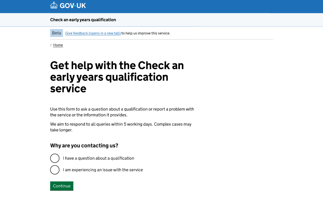
On this page, we also set expectations around the response time, since this information had previously only made available to users after sending their query.
Branched the journey
Since the information required for these two types of queries differs, we branched the journey, so questions are tailored to the reason selected. For example, qualification-related queries require qualification details, while service issues do not.
If users have a qualification-related query, they will need to:
- Provide the qualification details.
- Answer the question about how we can help them.
- Enter their email address.
If users have a service-related query, they will need to:
- Answer the question about how we can help them.
- Enter their email address.
What worked for a single-page help form did not work for a multi-page form. We made changes to ensure the journey was clear and did not overwhelm users, even though they now had to provide more information than before.
‘What are the qualification details?’ page
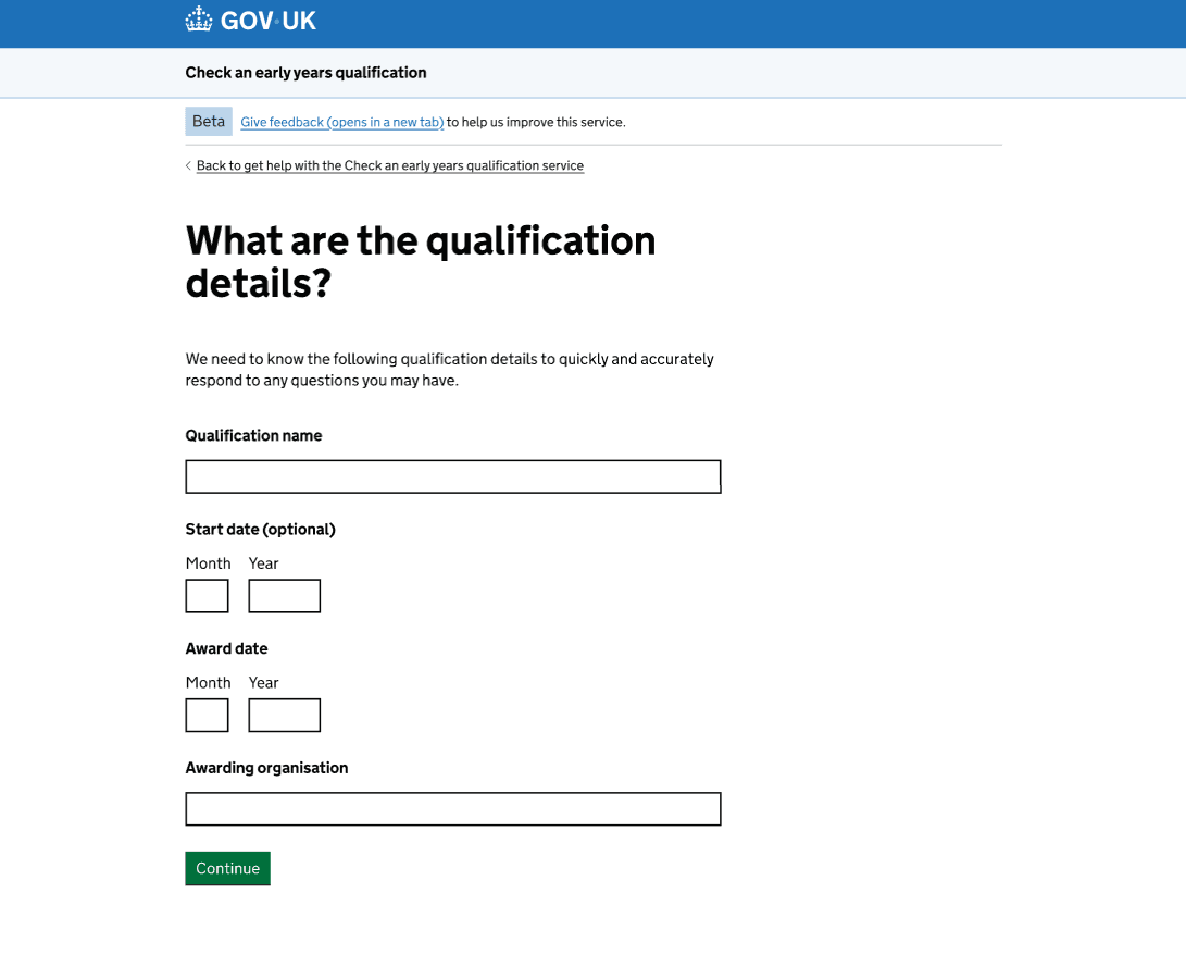
Users can access the help form at any point within the service. This means that they might have already provided some or all the qualification details. If so, those fields are pre-populated on the qualification details page. This is because we should not ask users to re-enter information we already have.
We decided to make the start date optional, as we are aware it can be difficult for users to provide. We did not want that to become a barrier to contacting us for help.
The rest of the qualification details can be easily found on the qualification certificate, which is a document we recommend having at hand when starting the check.
We also explained why providing the qualification details is important, so we can respond quickly and accurately.
‘How can we help you?’ page
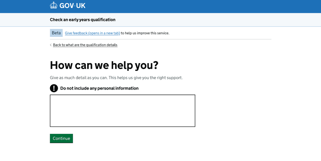
We updated the ‘Provide more details’ field label to ‘How can we help?’, making it clearer that users should give as much detail as possible about their query.
‘What is your email address?’ page
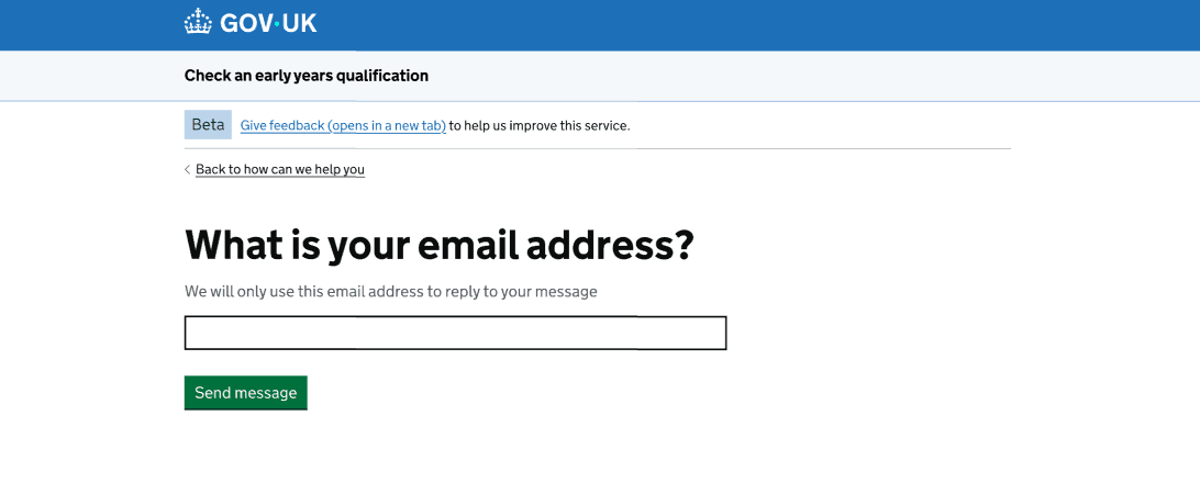
We turned all the headings into questions. For consistency, we updated the field label from ‘Email address’ to ‘What is your email address?’. Aside from that, the rest remained unchanged compared to the single-page help form.
Help Confirmation page
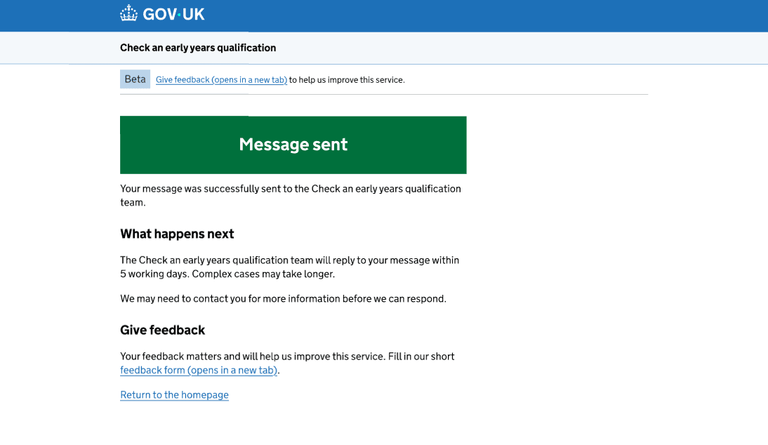
Since we were already making changes to the help journey, we also revisited the confirmation page.
We shortened the message in the green panel, since it was quite lengthy and should be short and straight to the point. The remaining content in the green panel was moved outside it and placed below it.
Next steps
We need to monitor whether the new help form makes it easier for policy colleagues to answer users’ queries. To do this, we will:
- track the number of follow-up emails policy colleagues need to send
- measure whether response times stay within the SLA of 5 working days
- review whether the qualification fields reduce back-and-forth with users
We will also monitor whether users mention the help journey in their feedback, to check that the additional questions are not creating unnecessary barriers to contacting us.