
The alpha team formed, with a mixture of Heads of Profession across digital, data, technology, plus, user research, service, and interaction design, product, delivery, business analysts, and development skills.
Agreeing project scope and checking engagement
Data source for the service
Before starting to prototype, we had to decide on the data source for product information in the service. We looked at service eco systems across DfE – we agreed that the CMDB (Configuration Management Database) is the most complete data set of services and products. It’s added to and maintained on a regular basis, so we used this data as our starting point for the service. It’s important that we chose something that feeds into and updates the service on an ongoing basis.
Category scope for MVP
We worked with subject-matter experts to agree the scope of categories for our MVP. With business area, type, channel, and user group being our starting point. We know that patterns and components and tech platforms are important, but it will take more work to get these categories into the service.
Ran a pulse check across DDT
The team ran a pulse check across DDT to check for engagement with the concept of having an accessible, consolidated list of DfE products and services. 90% colleagues responded positively.
Prioritising search on the homepage
It was quickly identified that search and filter functionality are an integral part of the design. We had learnings from the DDT 2022 mission 3 design sprint, which resulted in a prototype being created and tested in 5 days, which demonstrated this need.

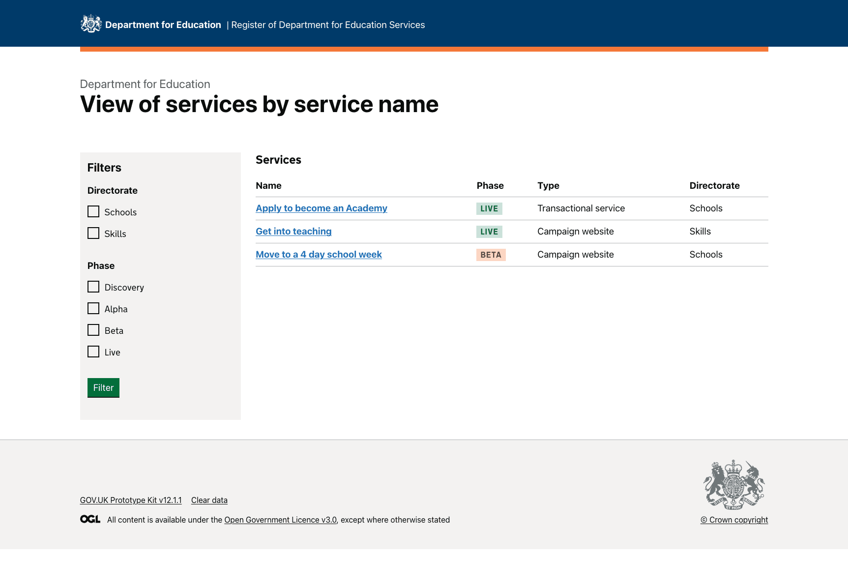
We used a mixture of the GOV.UK design system and xgov components, for example, the MOJ filter component, to build version 1 of the prototype.
We designed a simple start page to test and learn.
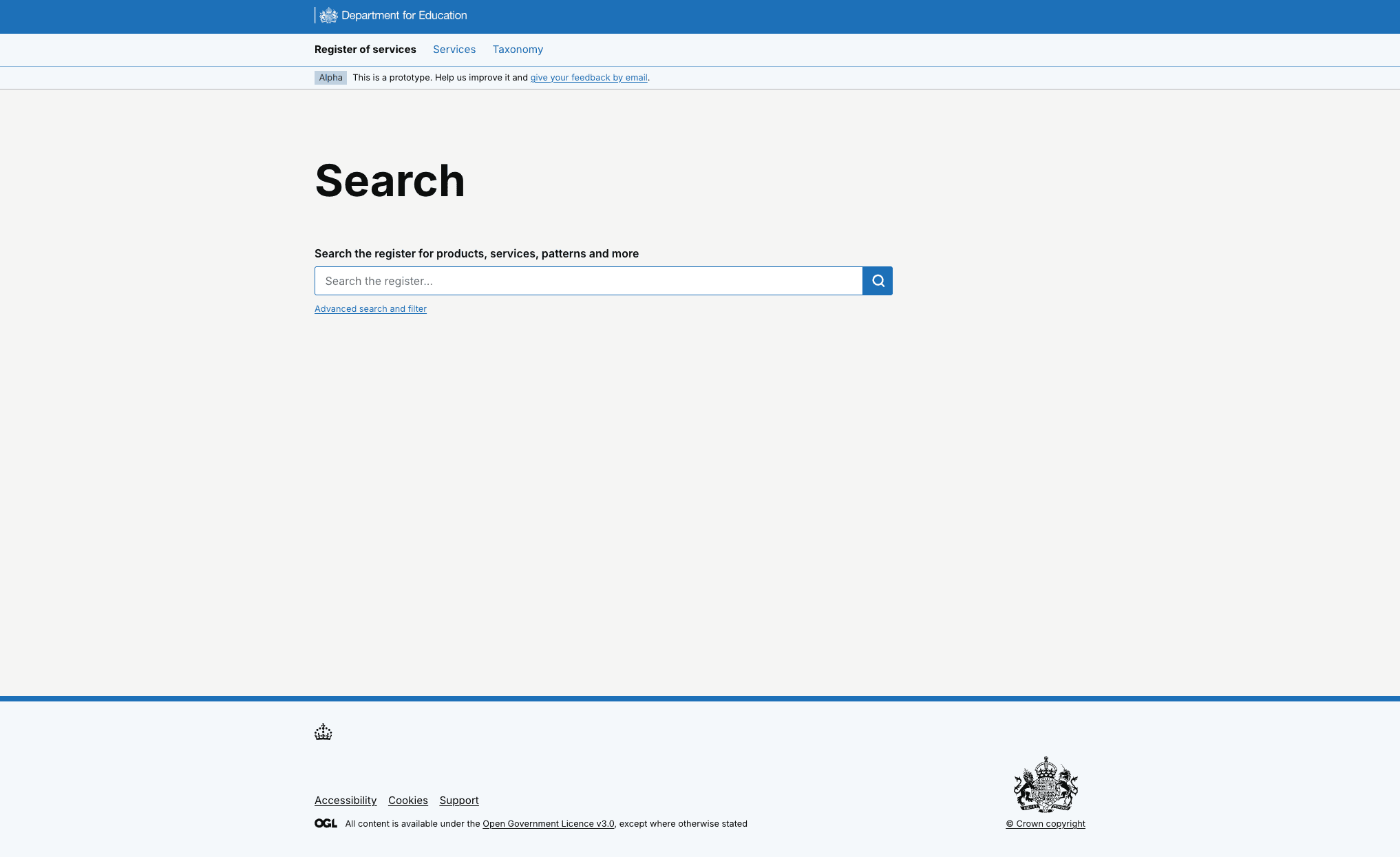
Users understood what the service would provide but the homepage lacked clarity
We saw that users understood that the service would provide a view of all DfE products and services. However, they felt the landing page lacked clarity on the type of information and level of detail they could expect to find for each service.
This was reinforced when users were looking for service information and knowing what terminology to use as they were unsure what existed in the service and how it was grouped.
Added content to service and options to search and browse products
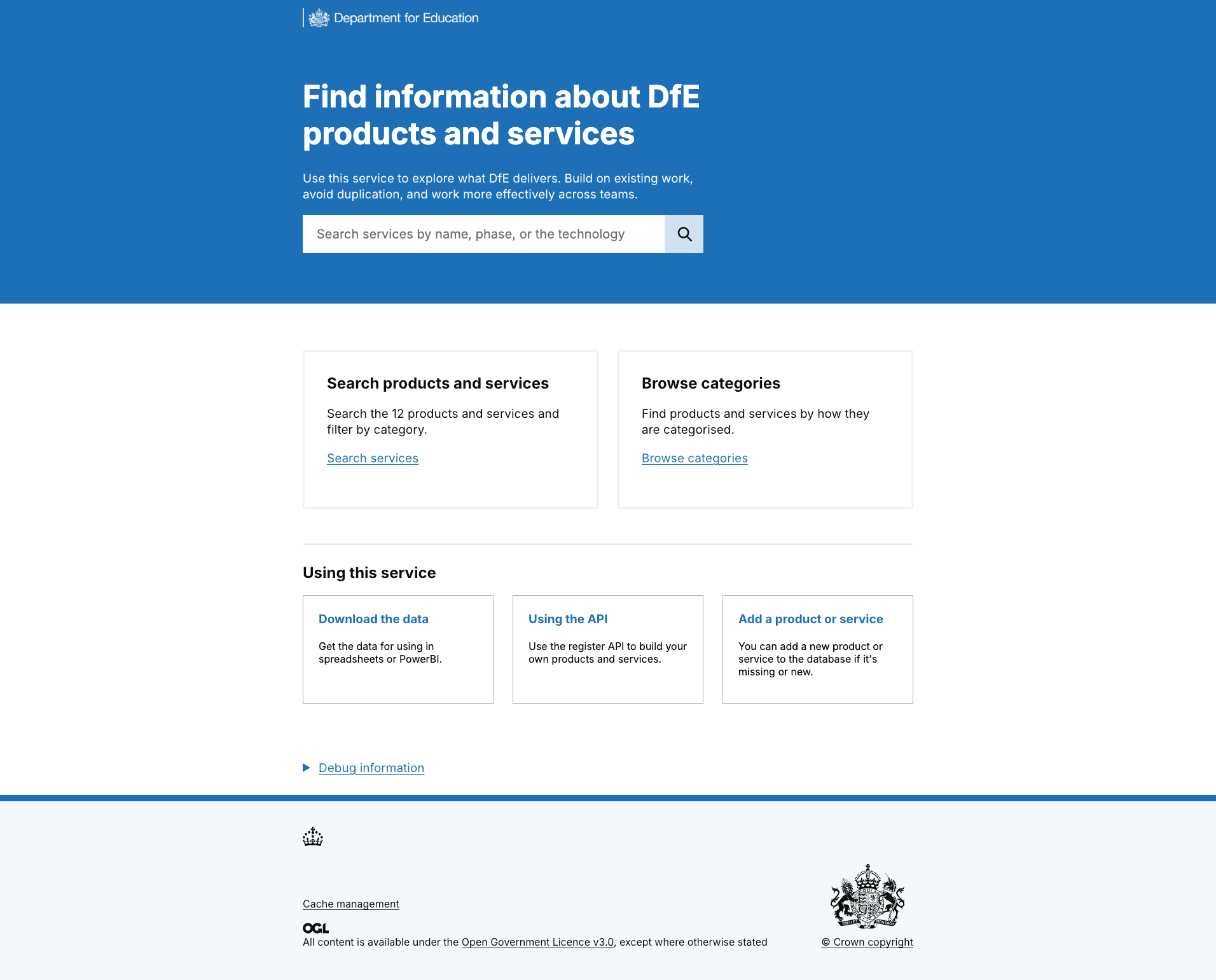
Users were clearer on the different ways they could search for products and services, and what the service was for.
There was often a lack of confidence in the search result data that returned to users – but cleaning and updating the data in the service is also a part of the project. Sometimes, no search results came back, and users assumed it was due to the terminology they used.
This testing confirmed that user have a low tolerance for inaccurate or incomplete data, therefore a significant proportion of our alpha and beta phases have been focused on inputting the correct data and ensuring data quality in the future (hence importance of using CMDB data as it is a maintained data source).
Filter options terminology not always understood
In our first round of research, we saw that people didn’t always understand the different types of filter options. We used the MOJ filter component, so felt confident that it was functionally accessible, but could look at the language. To do this, we plan to work on the terminology through working with the departmental taxonomist, so that we are using the established language.
Users told us:
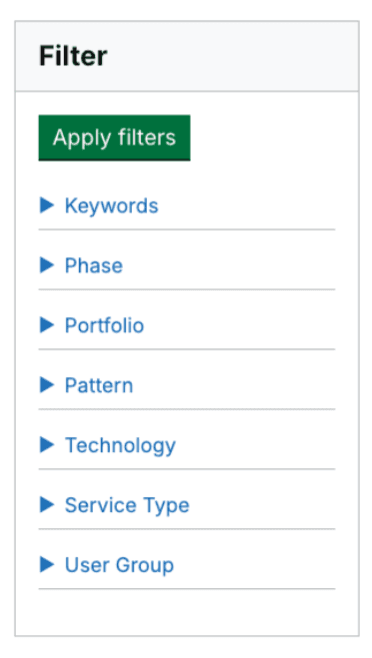
We simplified the filter component and made language clearer
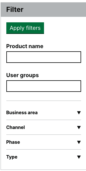
We iterated the filter component to give users the option to filter by a product name or user group description. We reduced the number of filter options from 7 to 4 for our MVP - changing ‘portfolio’ to ‘business area’ (because this is more recognisable across the department) and having ‘channel’, ‘phase’ and ‘type’ as initial options.
We also included taxonomy descriptions against each of the categories to give a high-level overview.
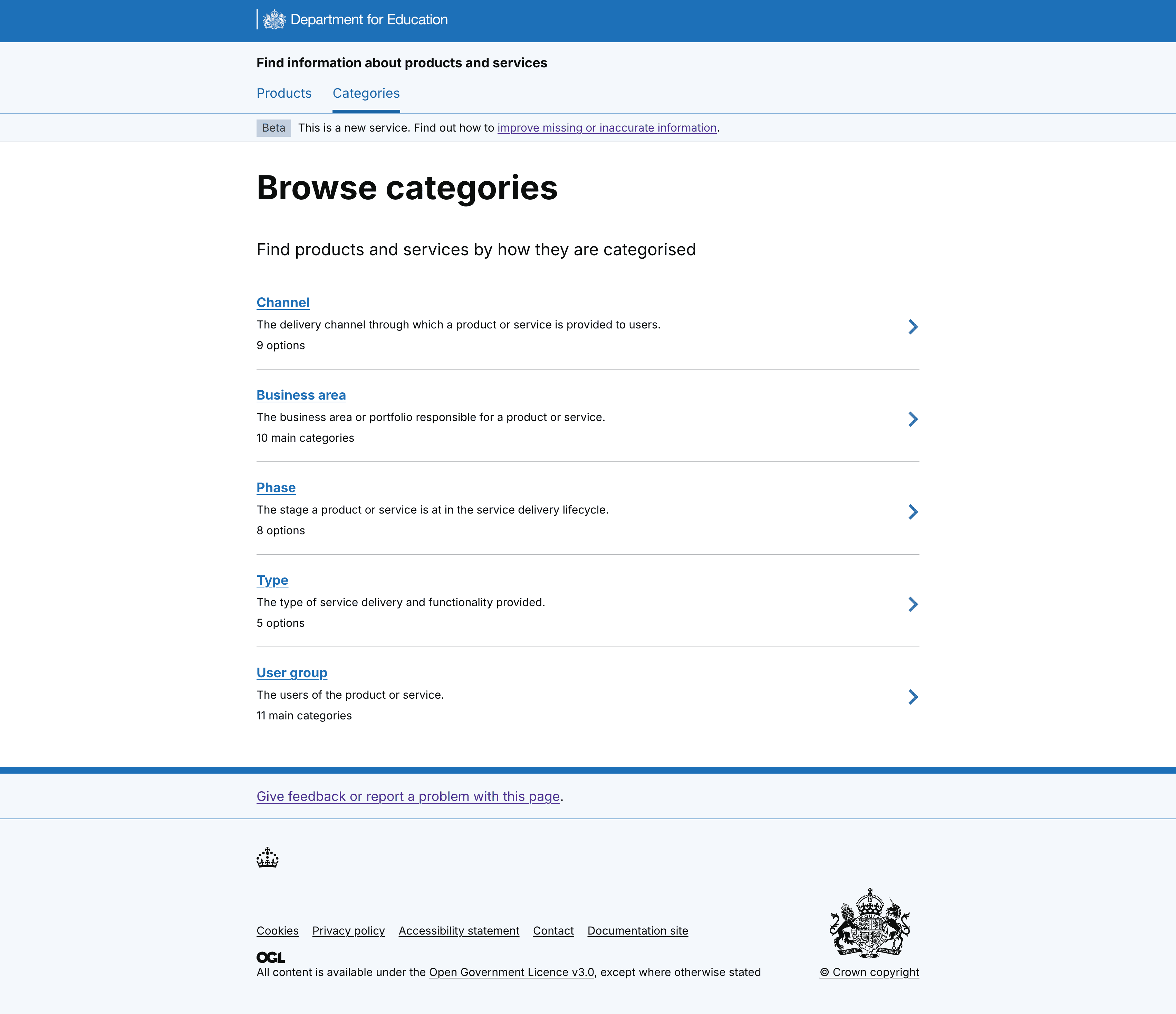
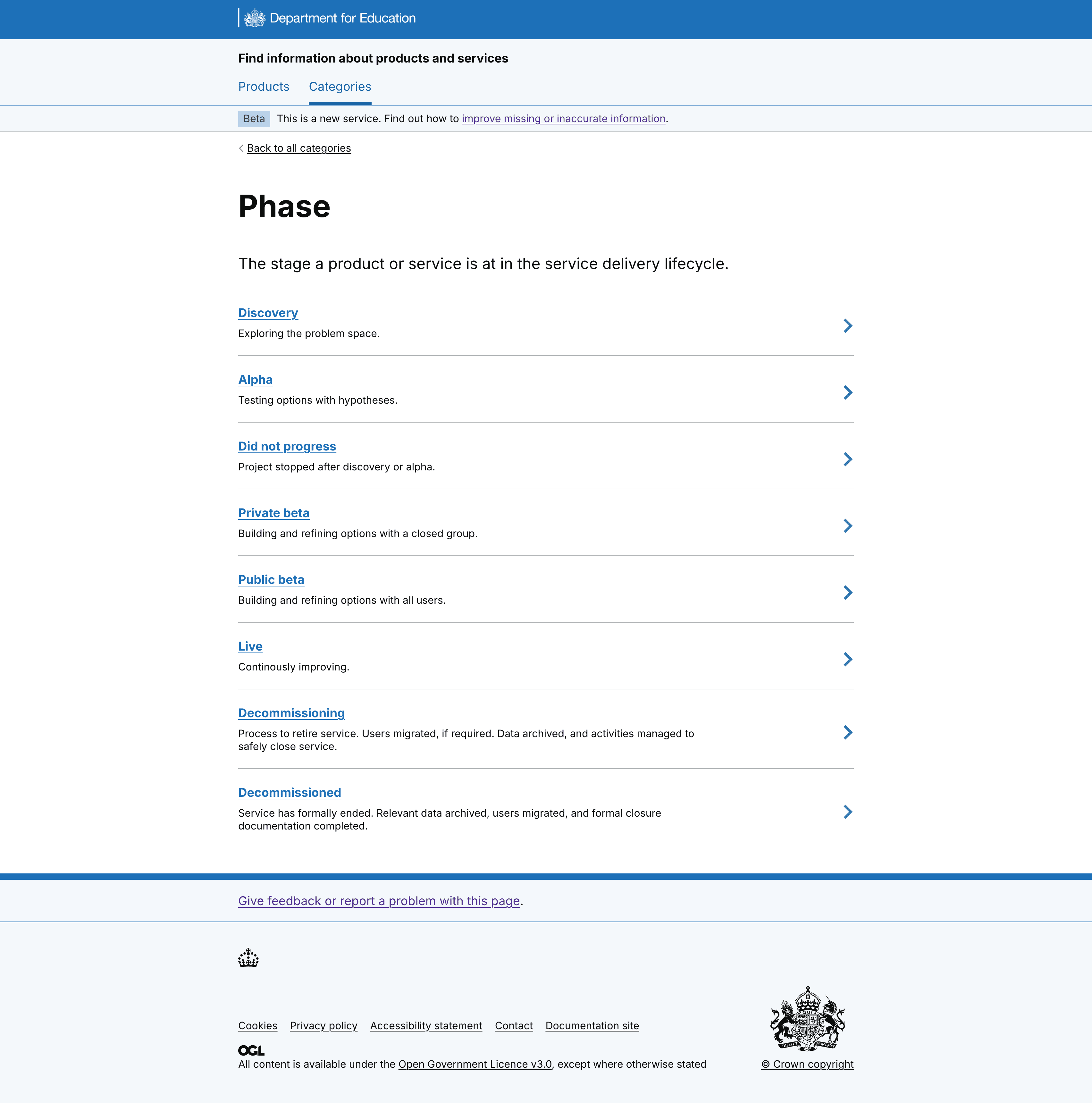
And detail at a lower level, for each category type. For example, on the Phase category page.
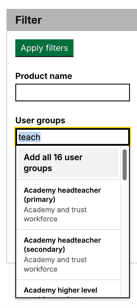
Iterated searching for user groups
We used the newly finalised departmental user group taxonomy (developed by user research colleagues) to tag services with relevant user groups. This addresses a key need identified in early research. The taxonomy’s complexity initially led to a long, multi-layered filter list that confused users during testing. To improve usability, we replaced the list with a search autocomplete component, allowing users to find relevant groups more intuitively.
We haven't tested this yet, but we are also hoping it will be better for screen-reader users as previously the screen-reader read out a very long and quite repetitive list of options which was confusing.
Testing the service pages
Users indicated they would be looking to contact service team members to find more information out about the service, however the 'contacts tab' on the side navigation wasn't seen by all users.
As Senior Responsible Officer and Service Owner information was more visible, some users identified that they would contact them to find out more about a service.
However, some users were cautious to contact senior leaders for low level service information and expected to contact those at the working level. We therefore removed the named contacts from the top nav and created a section for 'Responsibilities and contacts' within the main body of the content on the page.
We added service team contact details to service pages
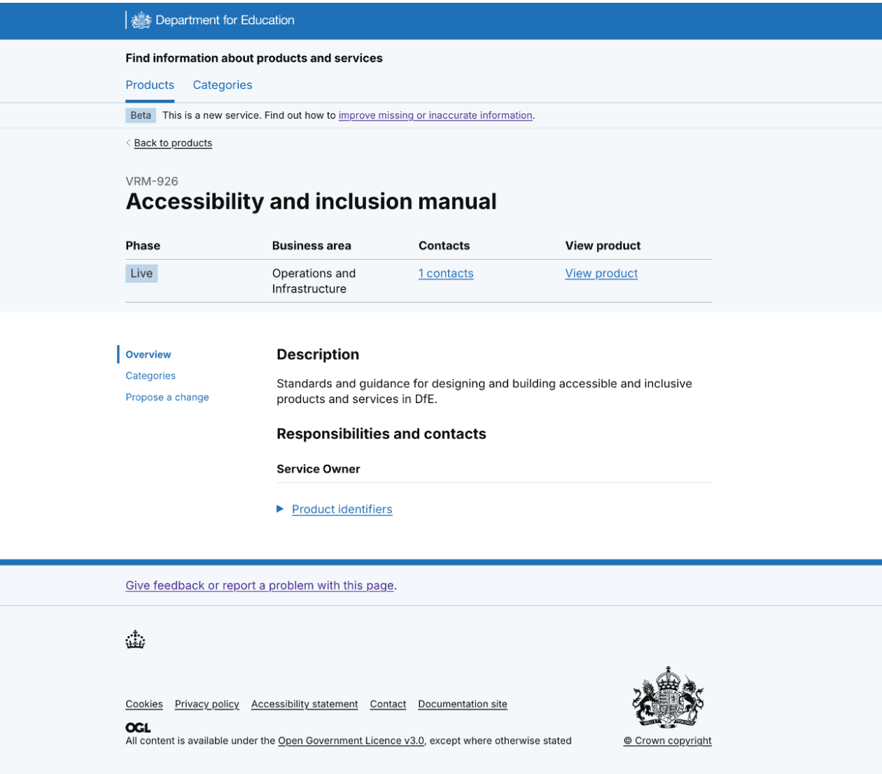
We added Responsibilities and contacts to the Overview page, and included other service team roles, so that users can contact the delivery and product managers. These service team roles have operational knowledge and lessons learned when developing the service - this will help users to get to the information they need - and quicker.
Reviewed name of service
Register of services was our first draft of the service name. In alpha, we tested this name and we learned that people understood what the service was about.
Participant 1: 'A simple register in one place is always useful but GOV does have some of this.'
We knew that people understood the context of what they were looking at but we also wanted to apply GOV.UK guidance for naming a service and starting it with a verb.
Users had told us:
We iterated the name to, ‘Find information about products and services’ to follow GOV.UK guidance and in line with what users told us they expected the service to do. We will test this name in beta.
What’s next
We’ll share the prototype across gov with departments working on similar projects, for example, with NHS and DEFRA; then post end-of-alpha assessment, we’ll continue to test and iterate.
We'll also consider the user journey for people to update service information and add new services.