
What we've done so far
We launched the DfE Accessibility and inclusive design manual in September 2024. We documented how we designed content based on user needs in a previous design history post.
The information architecture was based on findings from a card sorting exercise across communities. This initial architecture gave us something to test with users, to understand if it works in a way that people expect.
What we wanted to explore
We wanted to test the design and navigation of the knowledge hub section. To understand users' mental models around where they expect to find content and also, how they are using it.
Can people navigate the knowledge hub
The knowledge hub contains a range of accessibility-related content.
We wanted to understand:
can people find what they need, specifically in the knowledge hub
do people understand content in the knowledge hub
what does the name ‘knowledge hub’ means to people
We ran 10 research sessions, with:
5 user-centred design colleagues
5 product and delivery managers
What we learned
Content in the knowledge hub is not easy to find
 Knowledge Hub landing page
Although content within the knowledge hub was seen as valuable, users are wary of opening it due to the volume of content on the landing page. They found it challenging to find what they need.
Participant 4, product and delivery
‘Knowledge hub is a box of really interesting useful stuff - but maybe no where for it to go....'
Participant 2, user-centred design
'Knowledge hub is a term that should be consigned to a bin’.
Participant 2, user-centered design
We iterated the position of all content in the knowledge hub
Reflecting on users’ mental models and their journey to find content, we redesigned the information architecture. This included removing the knowledge hub and repositioning all content that previously lived in this section. We added the content to the places that users expected to find it.
These are some examples of the changes made.
Created a new guidance section
 New guidance section
Leading with WCAG, this section also includes cognitive accessibility guidelines (COGA) and the inclusive design guidelines. Users had previously found it difficult to navigate to WCAG content when scrolling down the knowledge hub landing page.
Users had also struggled to find the conformance guidance for WCAG, so we condensed it onto 1 intro page, which contains the principles and declaring conformance.
 WCAG overview and conformance page
Changed audits and statements section to audits, issues, statements
 Managing issues lived in the knowledge hub
To reflect users mental model of where they would find accessibility issues content, we moved managing and preventing issues from the knowledge hub to the audits and statements section. This included common issues and a link out to the new accessibility statement service.
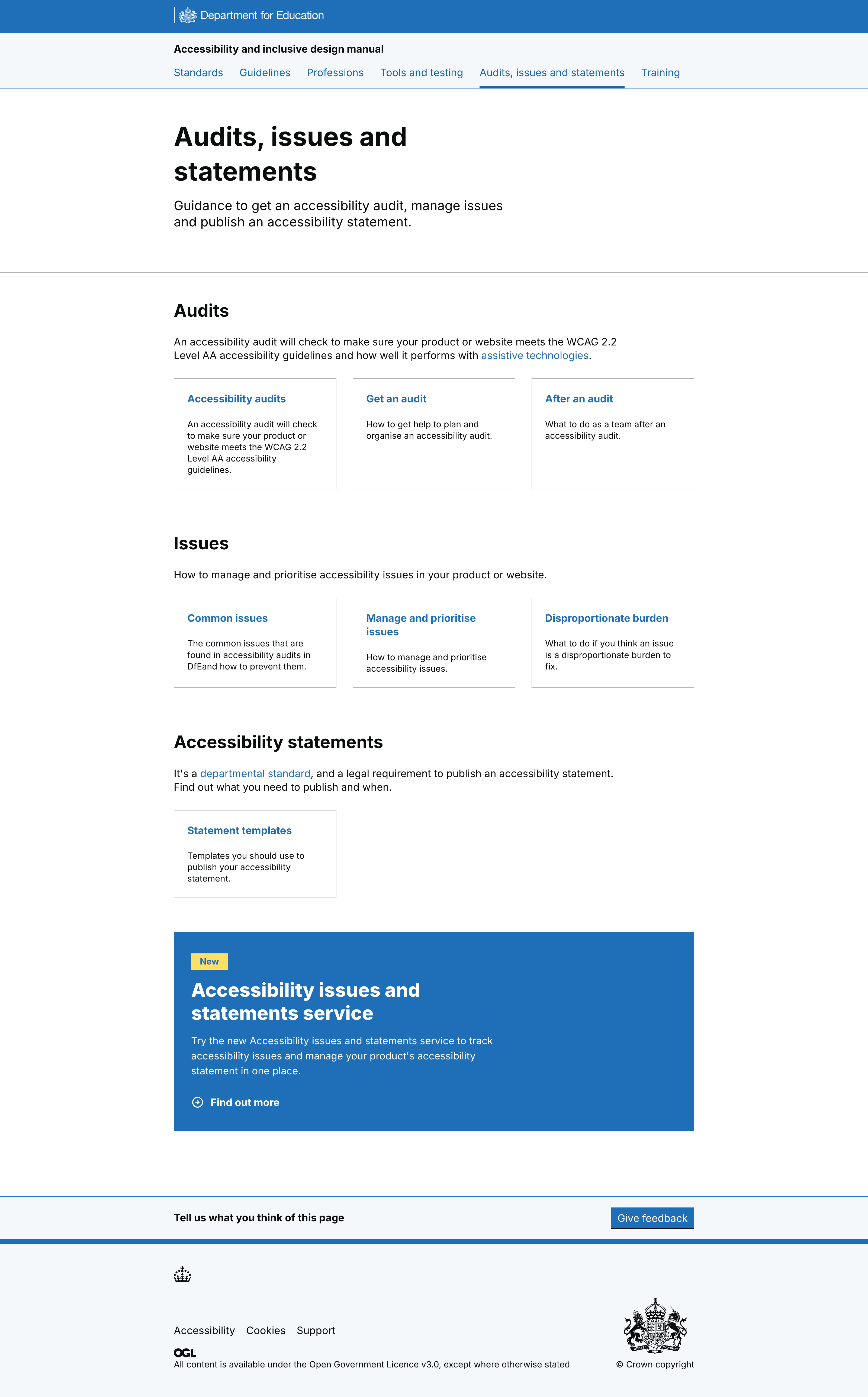 New audit, issues and statements section, containing managing issues
Created a tools and testing section
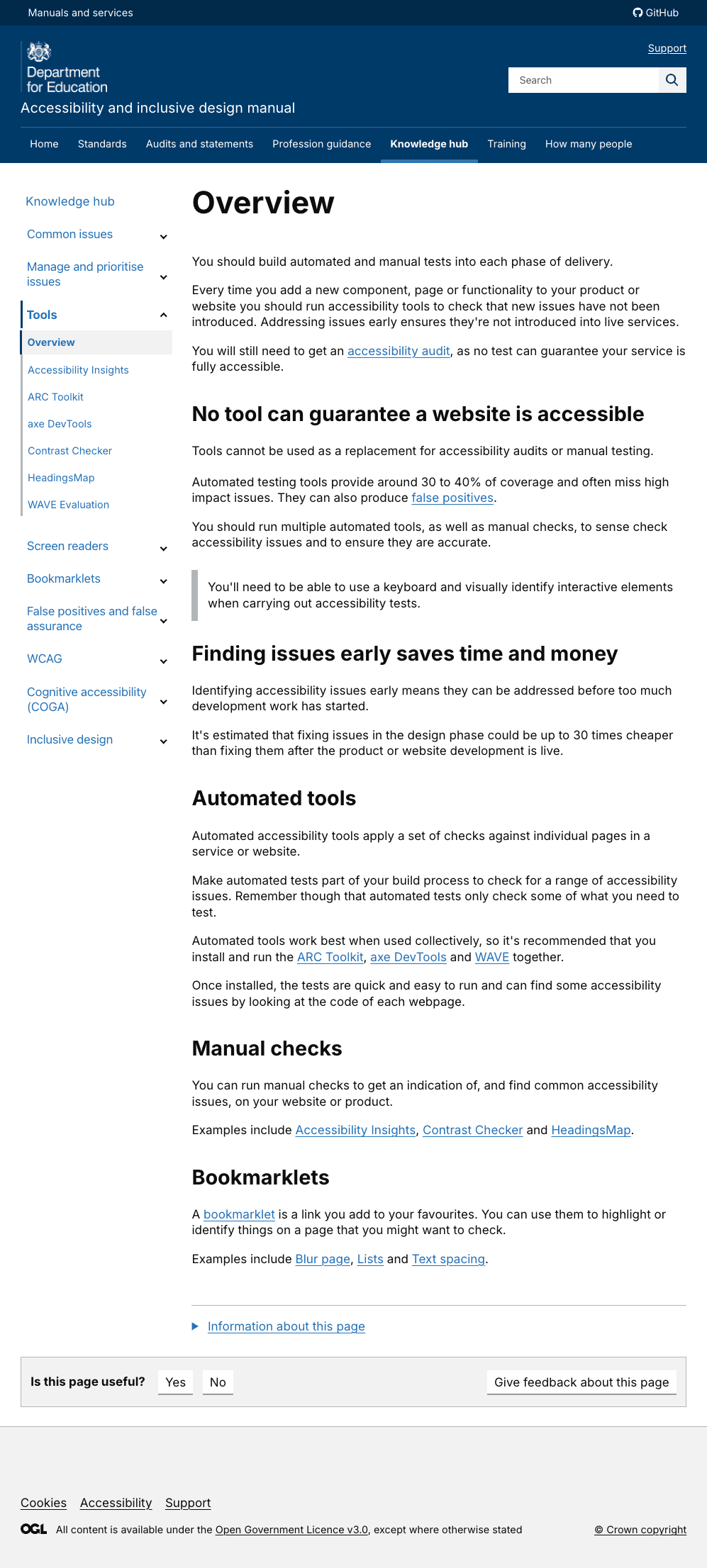 Tools content was difficult to navigate
We saw that tools content was difficult to find and hard to know when to use. Users felt the tools overview section added to their cognitive overload and this content was overlooked.
They approached tools with a what/why mindset, with a need for tools to be specific to the context of how – and when - they would be used.
User quotes included:
‘It feels like it should start with access needs’. Participant 1, user-centred design
Identified a new user need for tools
Our new user need:
I need to know... the different types of access needs people have and the tools and tests I can use relating to that access need
So that I... can make my service accessible for people with those needs.
We then designed content to meet that need.
Designed tools content to lead with disabilities
We created a testing by disability or impairment section.
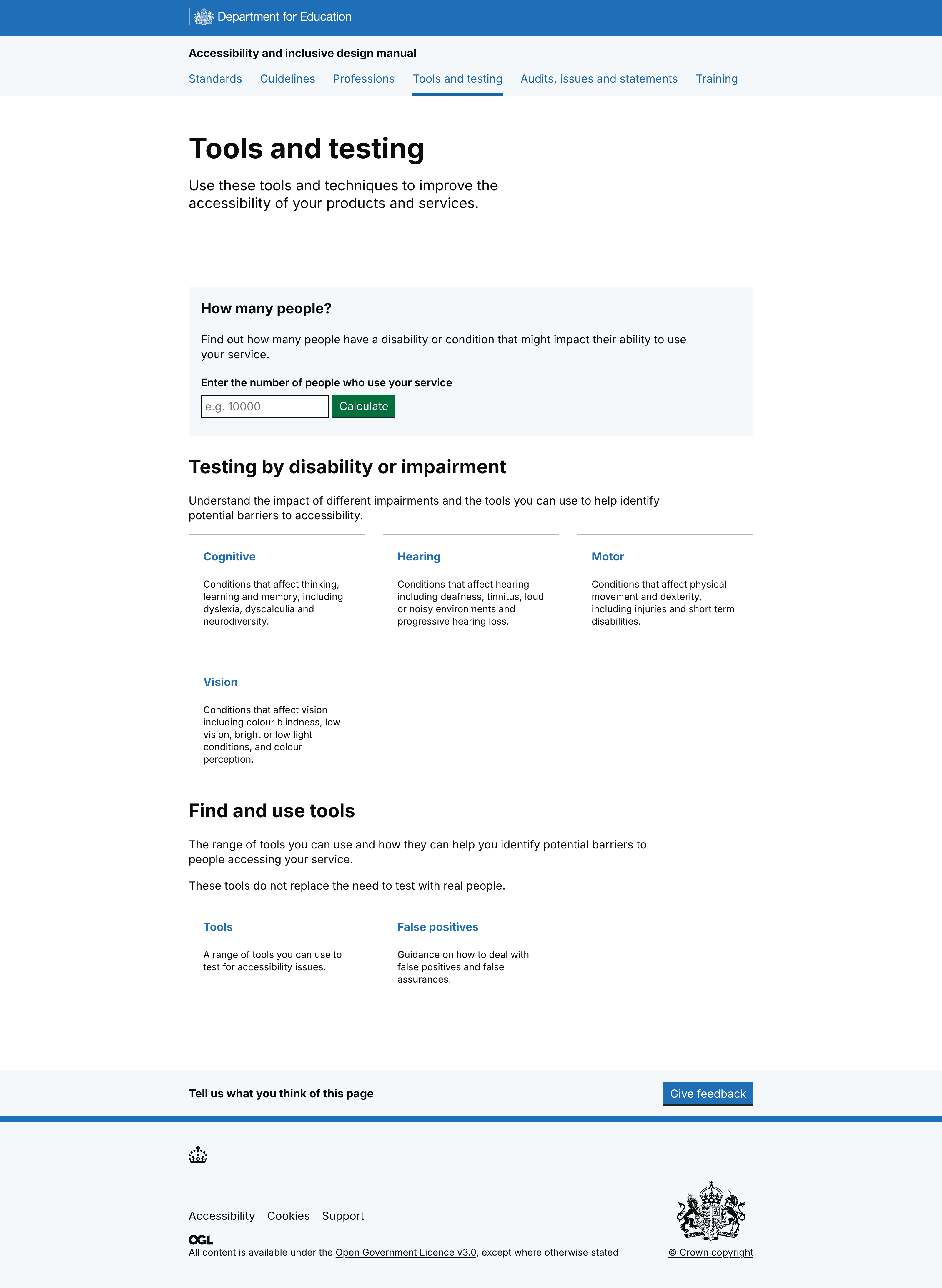 Tools landing page, with information about disabilities and context for tools
On each of the 4 new pages: vision, motor, cognitive and physical impairments, we added content for:
each impairment
challenges for people with the impairment
specific tools to identify accessibility barriers relevant to the impairment
tests to do in a specific order, for example, automated, manual, then screen reader
guidance to test with HMRCs accessibility personas, which also contains tests
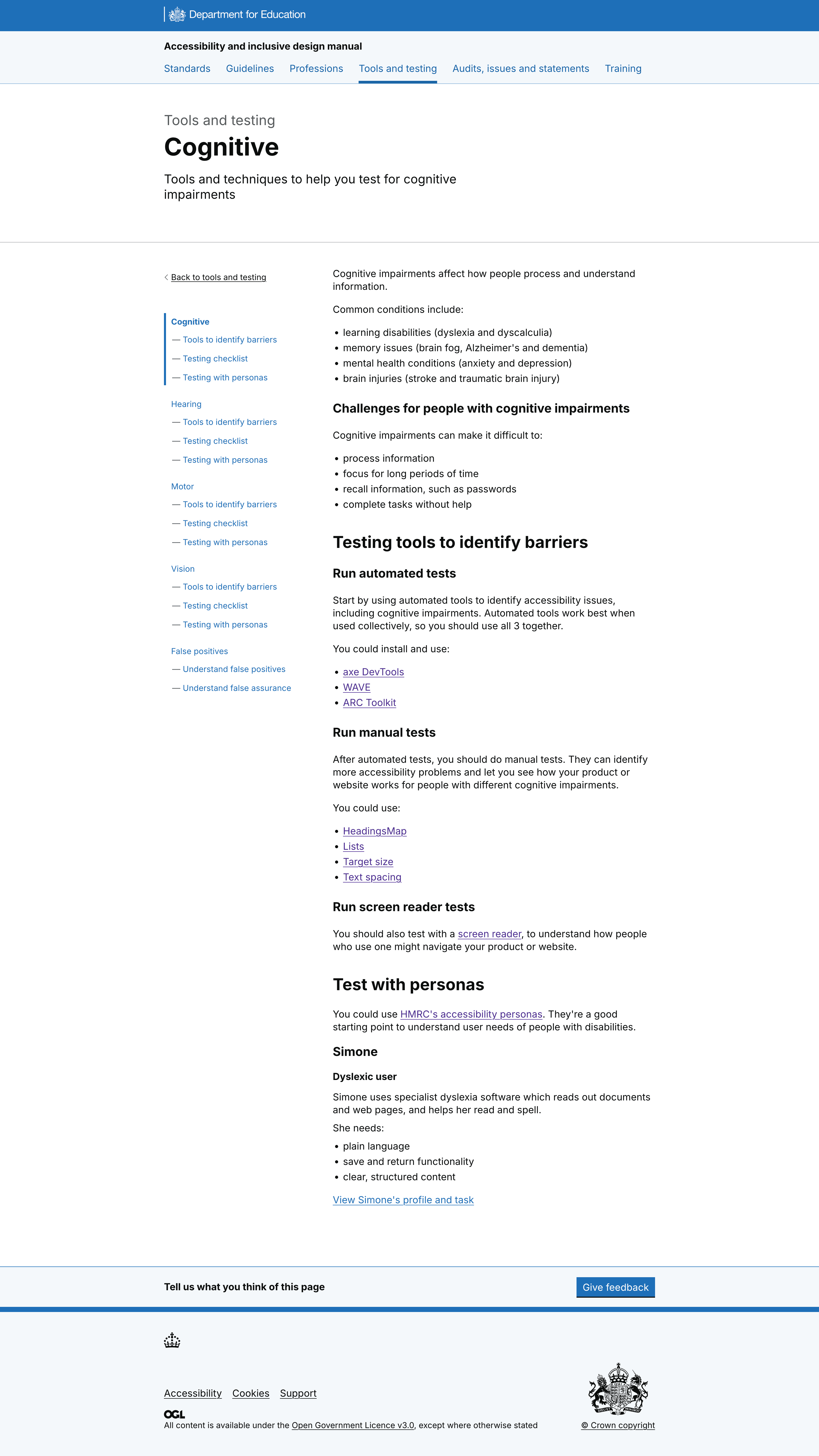 Example of 1 of 4 new disability pages
Created a table of tools with links to impairment
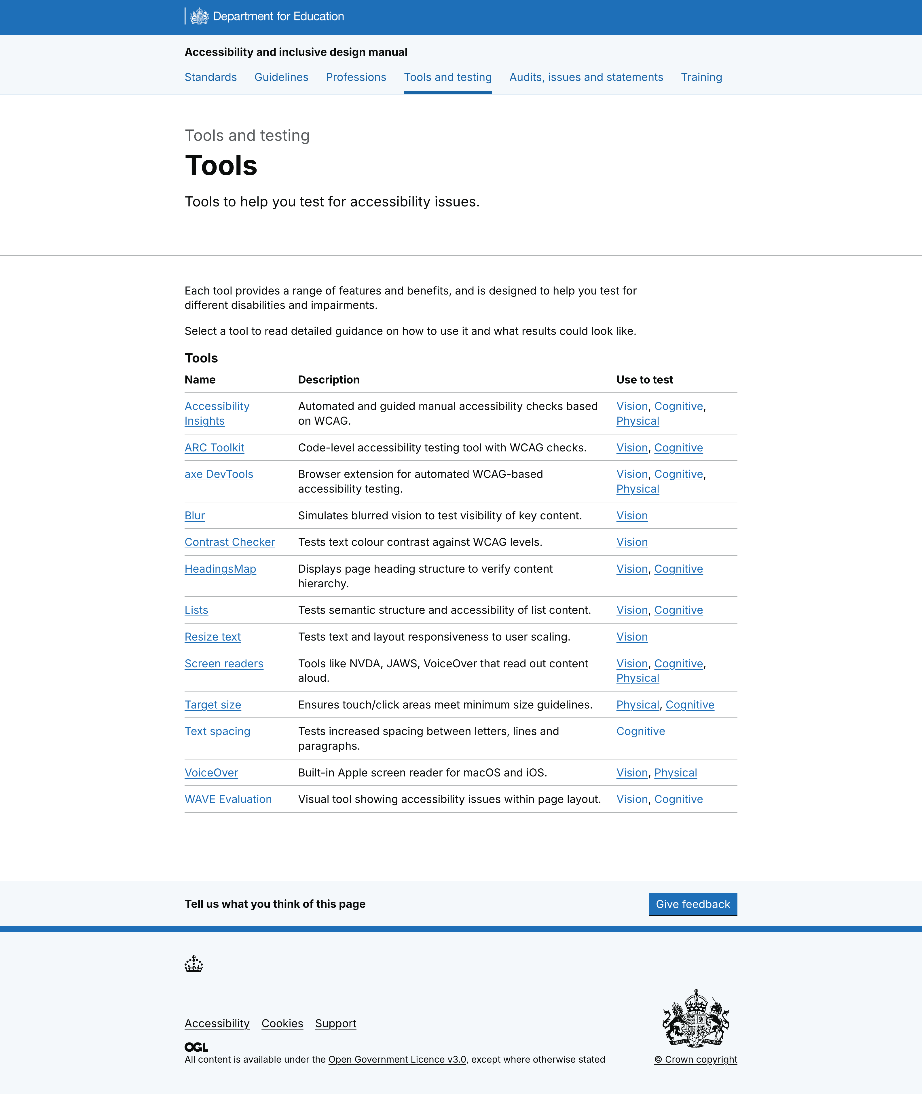 Testing tools table with context and disabilities listed
Some users did want to access tools directly, so we created a table for people to find and use tools as a second user journey into tools and testing.
The table includes the tool name, a description and impairments it could test against.
Users had struggled with some of the tools language. They did not understand what a ‘bookmarklet’ was, for example. So we removed technical language and referred to all tools as ‘tools’.
Navigation of the homepage was confusing
 Original homepage for the accessibility manual
Although people consistently shared that the How many people? tool was useful, the fact it was accessible on the homepage but also in the top nav caused confusion.
Users did not scroll to the bottom of the homepage or interact with content further down. Images and icons were not always seen as relevant.
What we did as a result
Removed 'How many people?' from the top nav but left it lower down the homepage – where people were finding and using it.
Changes to the homepage also included:
deleted 5 images
deleted link to training
deleted Learn about this service section (included the project, design histories and code source)
deleted link to knowledge hub
included links to 3 popular pages, audits, testing and standards
 Iterate homepage
Users expected more than just DfE standards in the standards section
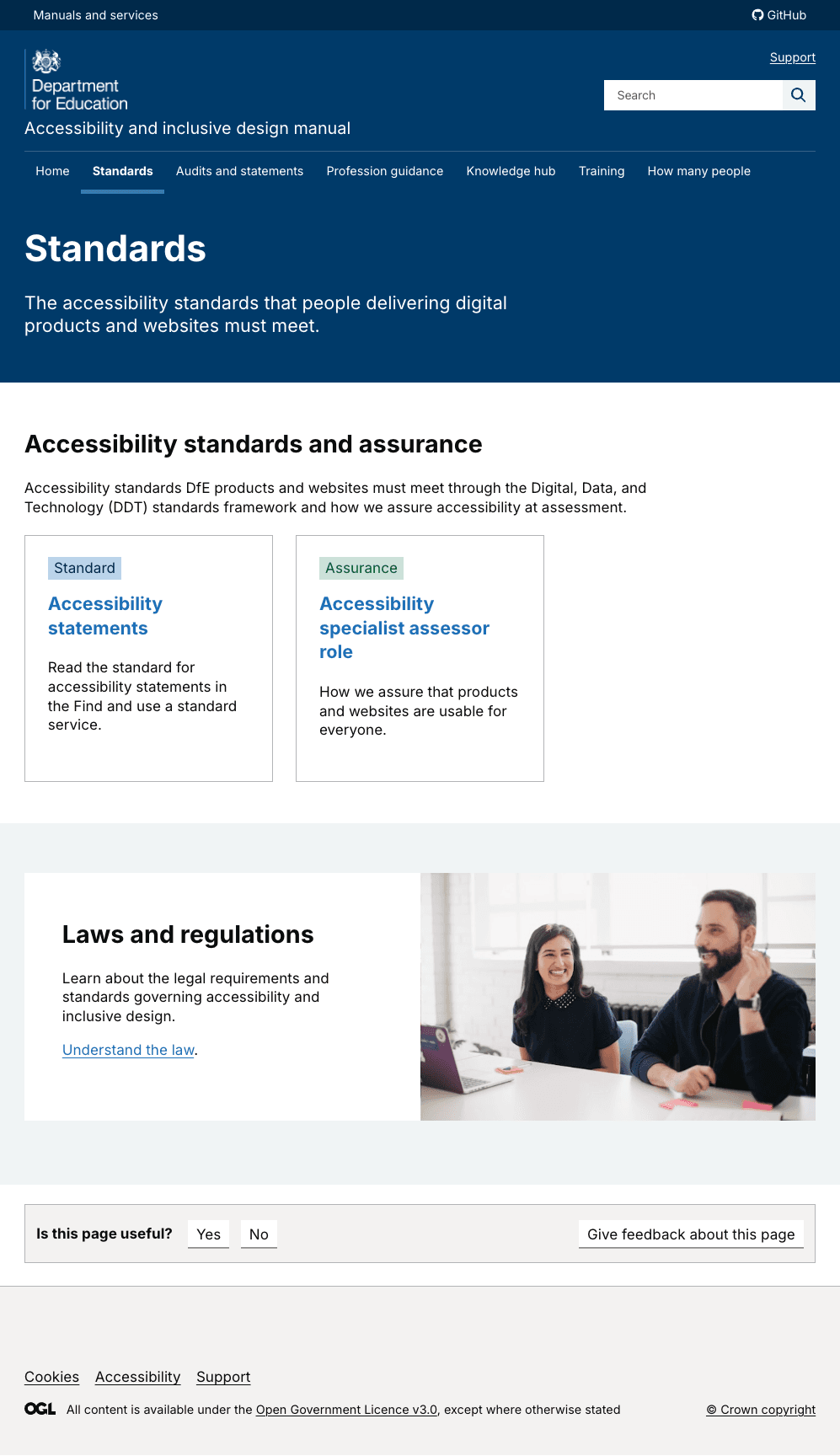 Standards in the accessibility manual
Users expected to see all standards that related to accessibility, including WCAG guidance, and not just DfE standards.
Users also struggled to understand that when they selected a DfE standard, they moved into another manual (the standards manual) and could not navigate back.
What we did as a result
Changes we made included:
opened standards in a new tab to reflect users are leaving the accessibility manual
led with an overview with legal requirements, then DfE standards, then how we assure standards
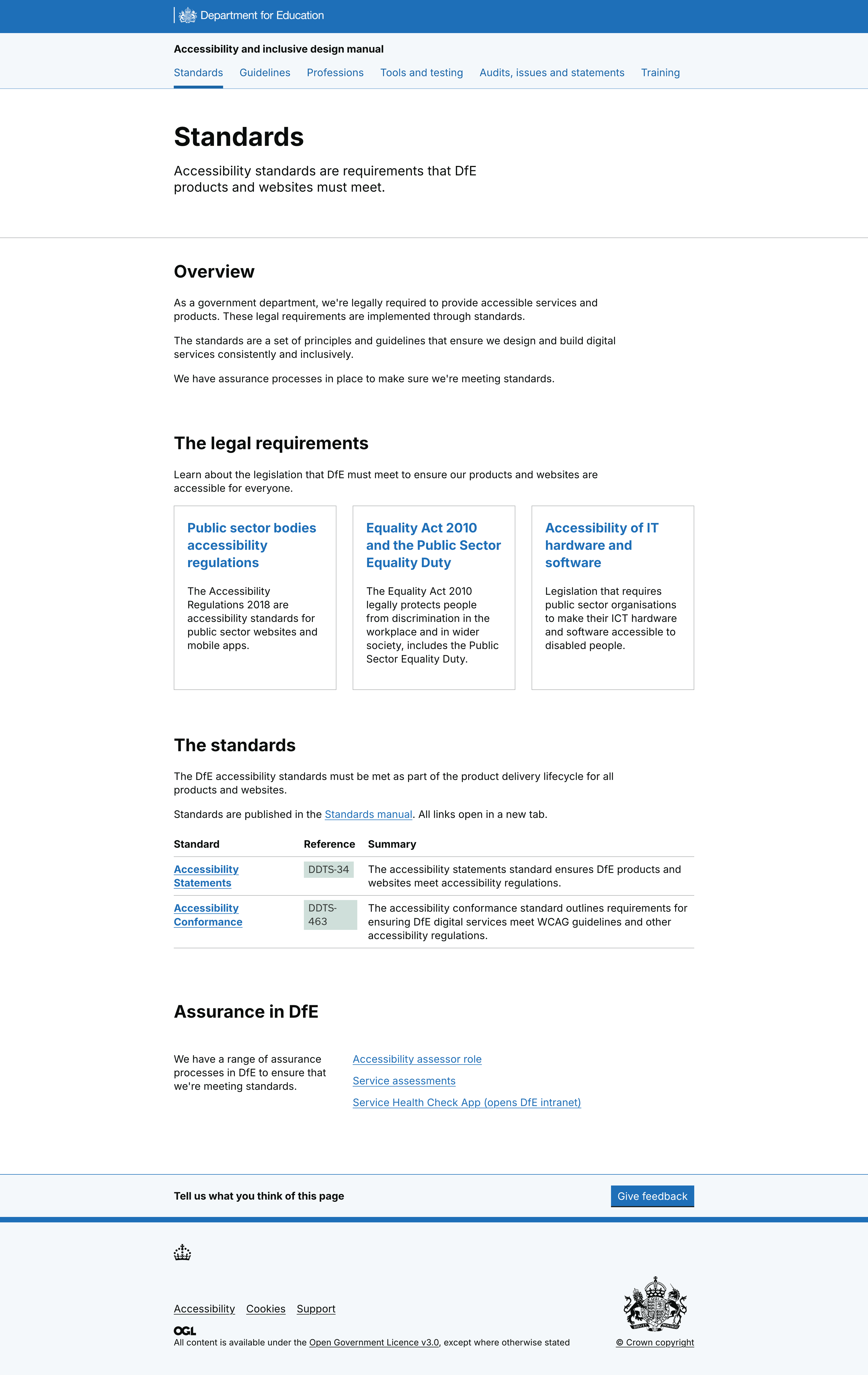 New standards section
Summary of system usability score
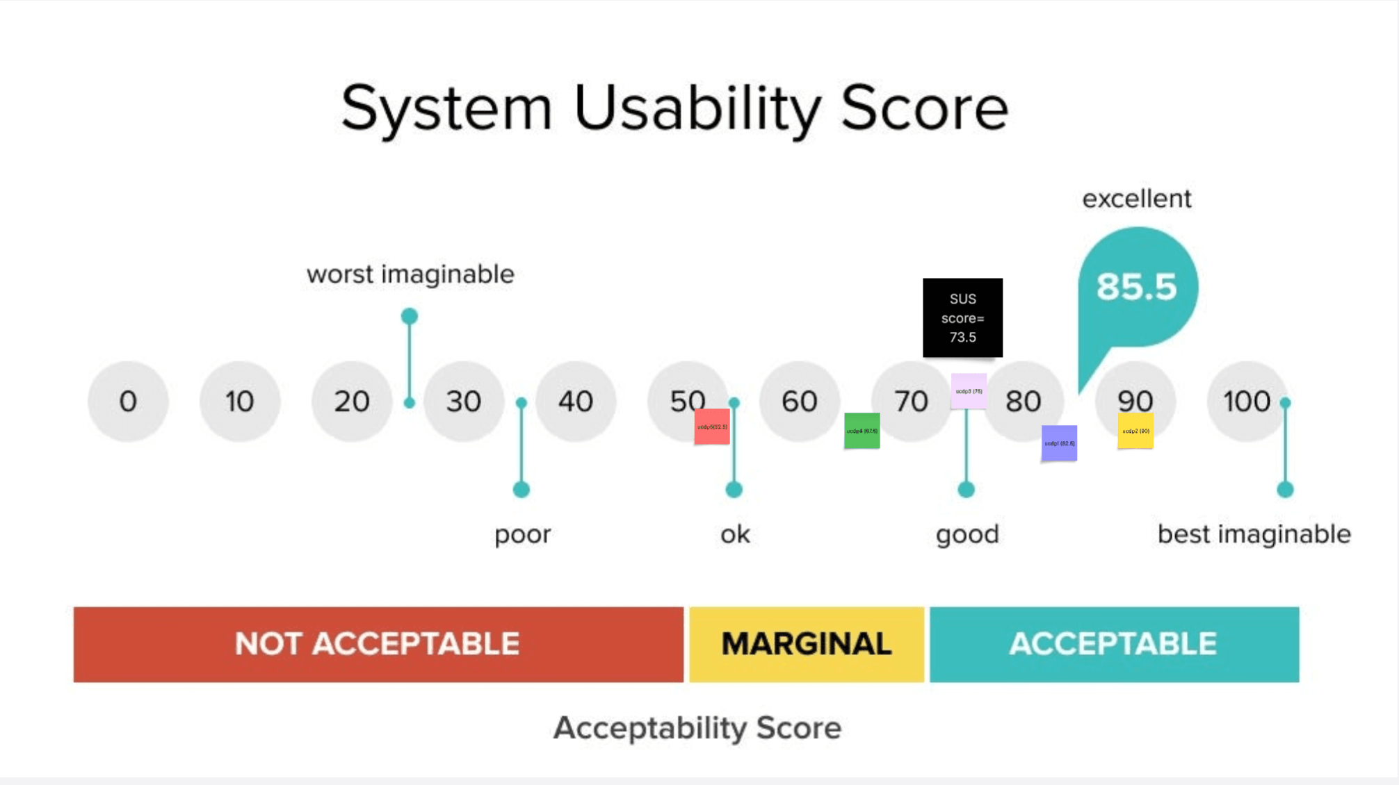 Screenshot of the system usability score for user-centred design colleagues
Overall the usability of the manual tested positively. With product and delivery managers giving an average score of 72.5 out of 100. And user-centred design colleagues scoring it 73.5.
Although users found the manual hard to navigate in the knowledge hub section, content was thought to be valuable.
What’s next
DesignOps will launch the iterated version of the manual and monitor Google Analytics and Clarity data. We will explore as a team what to research next. This could include things like:
user behaviour for the filter option on the WCAG criteria
understanding if the impairments content meets our new user need
We're also looking into developing more profession guidance (currently have content design and product manager guidance) as well as advanced training for accessibility and inclusive design.