
School account – initial design work
In May the School Account team carried out a 3-day design sprint to understand the user experience across DfE services, explore and shape our ideas, test key assumptions and define a direction for School Account.
Knowing that users spend lots of time figuring out what to do, feel unsure whether they’ve done things correctly and have to navigate across disconnected services, we worked to understand how we can join things up, make things clearer, and help users to act.
We explored ideas around personalisation and relevance, timeliness, monitoring processes, clarity and understanding, as well as how users discover opportunities, find guidance, and navigate journeys.
There’s more information about how the design sprint unfolded and our learnings from it in the Design Sprint outputs deck.
Our ‘big ideas’
The design sprint produced five ‘big ideas’ to take forward, which we presented for initial feedback at the Schools and Academies Show (SAAS). These were:
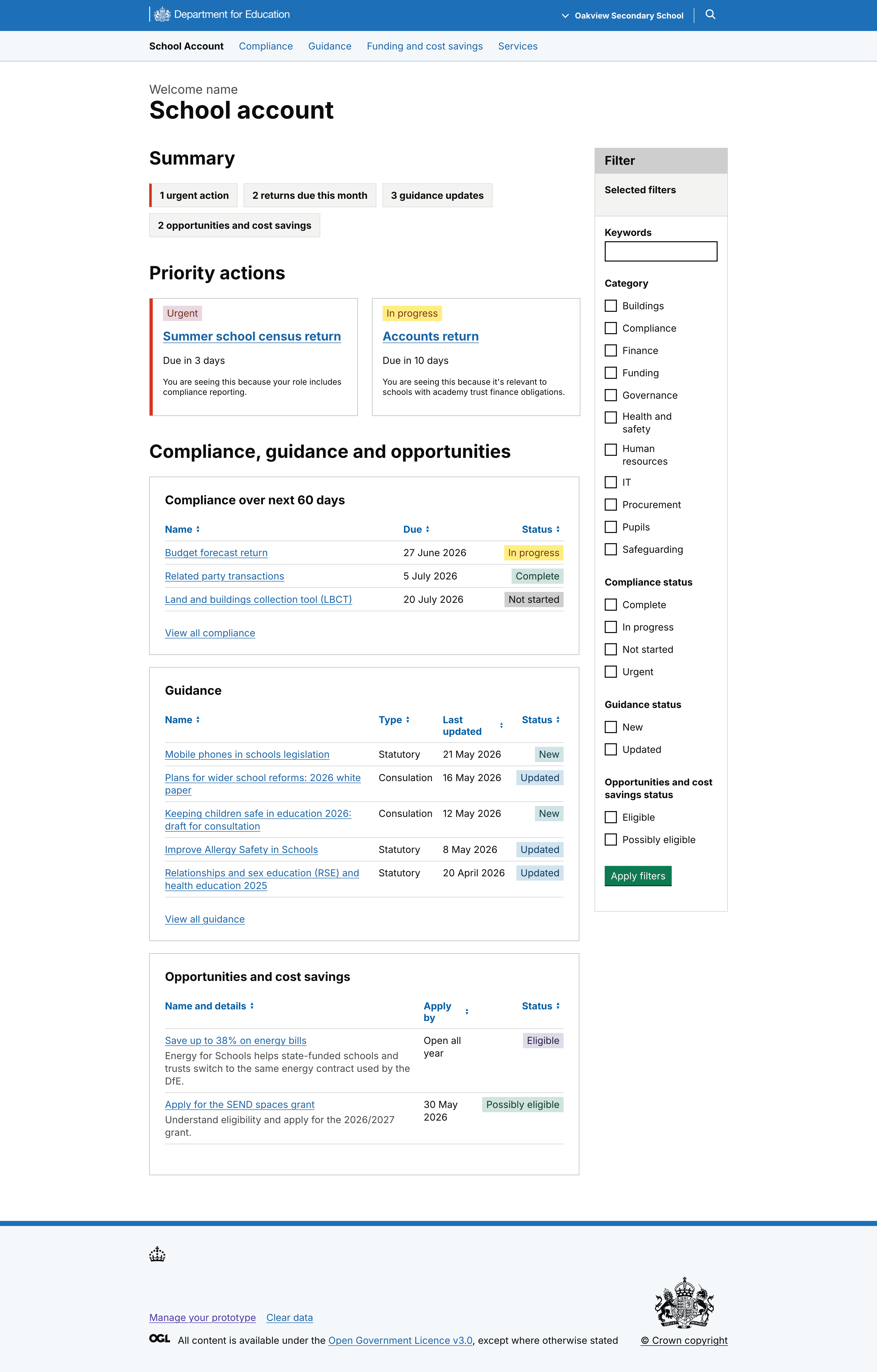
- Home/hub/dashboard
A landing page, updated regularly, showing relevant upcoming tasks, opportunities, and guidance. It’s arranged in categories with statuses to help users understand progress.
- Overview page
A multi-academy trust-level (MAT) combined information screen for several related schools, showing the most timely and relevant top-line stories about the schools in the trust.
- My preferences
An area where users can select and edit areas of responsibility, then choose the types and frequency of communication they prefer to receive.
- Structured guidance
Succinct guidance that can be tailored to a user’s role and organisation, providing the most relevant details and next steps, rather than serving everything to everyone.
- Support assistant
An AI assistant capable of understanding the context of the screen with an understanding of the user’s organisation type and responsibilities.
Using the concepts to gather early feedback
Following the sprint, we created a set of early sketched concepts based on the big ideas and our proof-of-concept journey.
These concepts were used in informal, guerrilla-style feedback sessions to help us understand whether the ideas felt valuable, explore how they might support users in their role and identify which ideas were worth pursuing further.
The team was aware of the limitations of this kind of research and would look to validate and further explore these findings in subsequent concept testing.
The hub page went down well, with users responding to the concept of 'everything in one place', saving them time and the need to search across DfE, or outside it.
The overview page was generally well received. While less relevant for single-school users, there was a positive reception among the target audience.
The reaction to preferences and personalisation controls was positive, underlining that different roles have different needs and showing a desire to control frequency and type of content, reducing 'noise'.
Structured guidance as a concept was also deemed important, since the feedback reiterated that current guidance is fragmented, hard to find and easy to miss.
Users saw the value of the AI chatbot concept, but they had some concerns over trust and usefulness. Some pointed out that it would need to be intelligent enough to offer real value, with some scepticism about whether that could be achieved. While we may revisit the idea later, for now we’ve descoped this idea.
In general, we learned that School Account must personalise rather than just aggregate, replace rather than duplicate, and build confidence for users that things have not been missed.
Round 1 designs and user research
Hub page
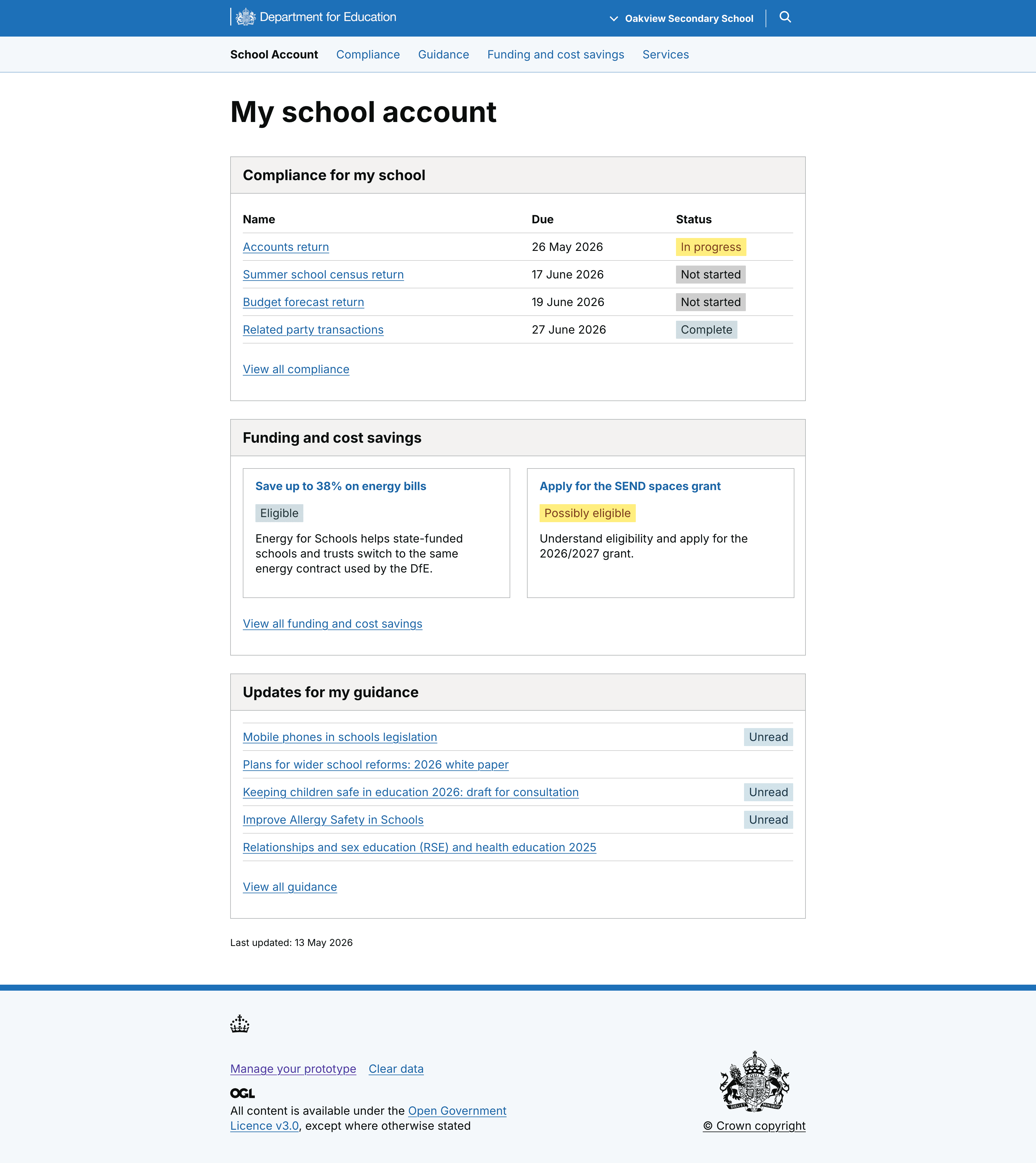
The initial version of the hub page landed well with users, with the idea of a ‘single source of truth’ seen as reducing fragmentation as well as the time spent on searching within and outside DfE. This gave us valuable insight on one of the project’s riskiest assumptions, that consolidation reduces effort.
However, feedback also showed that ‘everything in one place’, isn’t enough – we need to give thought to how the information is organised. We presented information in three broad categories – compliance tasks, opportunities, and guidance – but more granular sub-categorisation, for example in areas like finance, estates and HR may help users to work more effectively.
Overview page
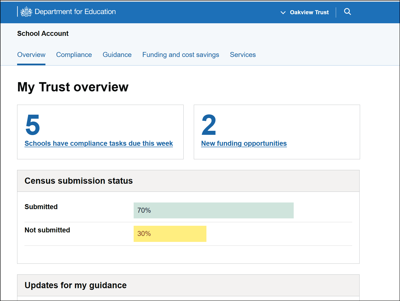
The overview page, while less relevant for non-MAT users, was a reasonable success, with users noting that it's useful to see a trust-level view of compliance and what's been submitted (or remains outstanding,) as well as the guidance section that calls out updates.
Users did note that they'd want to be able to drill down into individual school-level information from this page.
My preferences page
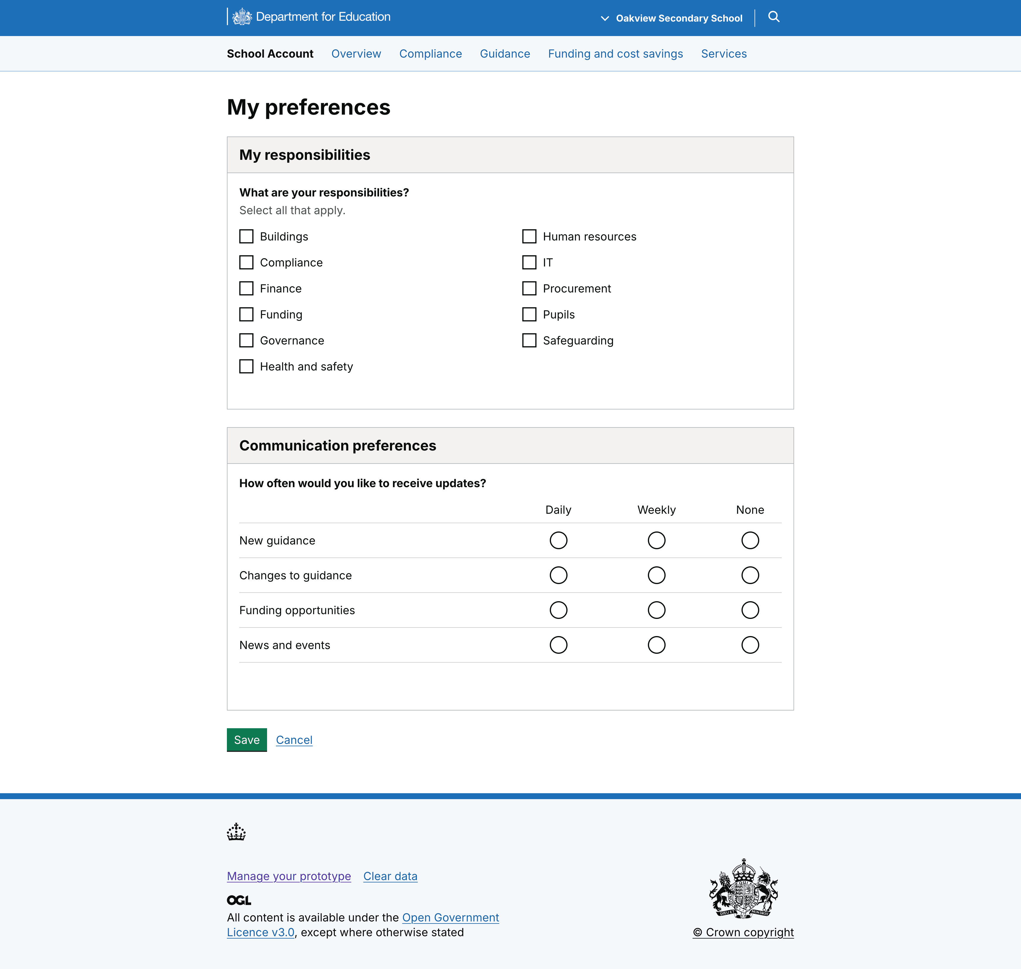
The preferences page was seen as valuable in reducing information overload and improving relevance. We know that emails are an ingrained way of receiving communications, but we also know that users feel overwhelmed by the volume coming from DfE.
For an estate manager with a narrower scope of responsibility, being able to reduce the noise through opting to only receive emails related to estates would save time, reduce cognitive effort, and provide assurance that they’re not missing anything.
Structured guidance
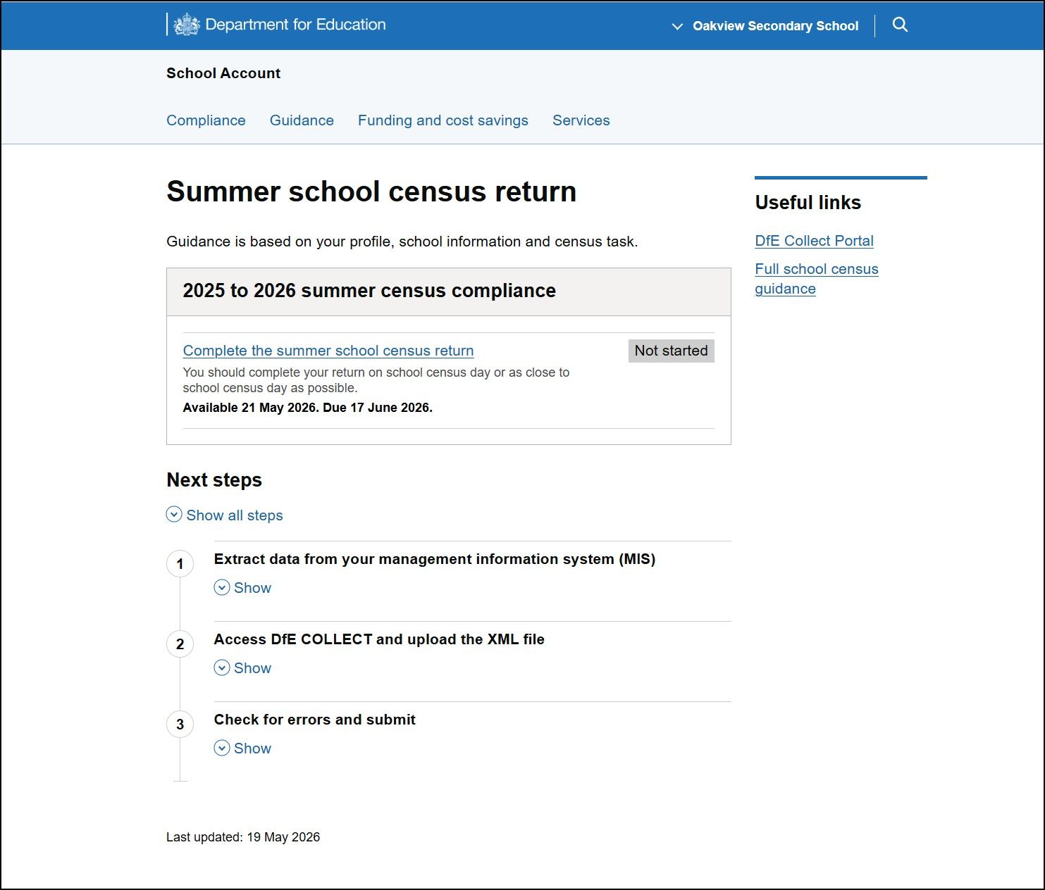
The feedback suggests that the structured guidance approach delivers high value by simplifying complex guidance into quickly understandable, usable content.
However, we also saw that any structured guidance screen would need to balance the needs of more experienced users (not delaying their progress to the action they’re carrying out) with less experienced users, for whom it would need to provide top line need-to-know information before they start.
Next steps
School account is aiming to provide a connected experience that joins up services and personalises information. It will provide tailored guidance and relevant actions to help users prioritise and make the best use of their time.
Based on the outcomes of the research, we’ve already begun iterating the existing designs. Expanding on the ‘everything in one place’ premise, we’ve reworked the hub page to show a ‘combined view’ of compliance tasks, opportunities, and guidance updates with statuses.
Users can filter by action type and status to help them prioritise their next actions, and upcoming and urgent tasks are shown at the top. We’re also working on other approaches to the same page to understand what users need to see to help them plan their workload.
But as we approach our alpha assessment, we’ve also looked at presenting the end-to-end journey more clearly for round 2 of user research, to help users see (and help us understand) how they might arrive in School Account, how they’d behave once there, and where they might expect to go after carrying out an action.
We’ve also reworked the structured guidance page to become more of an interstitial page, with a view to helping users understand the hand-off and hand-back to another service as they carry out an action.
The page would also feature status updates, and in some cases a banner, to confirm an action and to help users to understand where that action is up to.
The aim is, as far as we can, to make the process of arriving in school account, carrying out an action, and returning feel like a single journey.